This entry brings together for convenience my recently published (ie in 2010) incidental interviews, essays and more substantial reviews (for ArtUS) as opposed to my more regular recommendations and reports. These cover:
Rana Begum
Benjamin Beker
Emma Bennett
Byrne & Lau
Rupert Goldsworthy
Damien Hirst
Alex Hudson
Michael Landy
Danny Rolph
Analia Saban
Tomoko Takahashi
Dolly Thompsett
Rachel Thorlby
Samuel Williams
 Singular Applications of Repetition
RANA BEGUM interviewed by Paul Carey-Kent (for Bischoff/Weiss)
Rana Begum’s work looks at how colour reacts with geometric form and repetition, in the context of both western minimalism and eastern patterning. The results have an architectural purity, but also take something from the visual cacophony of city streets. They’re rigorously hard-edged and yet gently meditative, perhaps because they are humanised by being designed to change with both the natural light and the position of the viewer. Begum most characteristic material is intensely-coloured and obsessively-finished aluminum box tubing, but she has also employed card, tape and even drinking straws to playfully subversive ends.
Where did you grow up? In the countryside in Bangladesh, which I recall as very beautiful – though when I returned as an adult, the poverty hit me much more. I moved to St Albans when I was eight, and still remember how incredible it was landing in the first snow I’d ever seen.
What led you into art?I had no English at all when I arrived. As I could understand nothing at school, I was given loads of paper and colouring pencils. I started to draw things from Bangladesh as a way of telling people about where I came from...
Is this a show of sculpture or painting?I don’t see myself as a painter or a sculptor, but as in between the two. These works being three dimensional yet flat don’t really have a place, and I welcome that.
How are the aluminium works made?They use box sections of extruded aluminium. You can’t just paint on them straight away, but I found a way to apply a base colour – white in this show – by commissioning an industrial powder-coating process. I cut them to length, and spray on the other colours myself.
What do you aim to achieve through the colours? I’m fascinated by how colours clash with each other as you walk down the street, and finding that as you move down the street what you thought didn’t work can come into line. That’s one aspect of what I hope the viewer will get from walking past one of my works. And I love the idea that the work can change as the light changes over the day, which relates to my interest in architecture and space.
How does the viewer get involved?I hate to mix colours, as they seem so good in their pure state, so at first I was taken aback by how the overlapping colours bleed into each other when they are reflected. I wasn’t sure I wanted it, but the more I found it happening the more I was fascinated by it, and how, when you look at the work from the front, you don’t really know where the colour is coming from. You have to move past the works to see them fully, but they don’t say ‘hey look at me’ when you see them from the front – but you see that something is happening through the corner of your eye, so there’s that communication, drawing you in.
Where does your interest in repetition come from? Even when I was working figuratively, I explored the way repetition of lines could operate. I love the patterns of Islamic architecture and the incantatory rhythm from reading the Koran. The repetition provides me with a base from which to branch out, and creates an environment which allows the eye to get drawn in and to expand its view towards possible infinities. That makes it flow, and is also calming and meditative.
Although the works are made up of regular forms, their overall shapes are irregular. What lies behind that?Those shapes came from folding sheets of A4 paper, which allows the work to combine freedom and constraint. They imply that the geometric patterns could go on for ever, so my work could be part of something much bigger, as if it’s been cut out. At the same time, though I see the individual sections as part of a bigger piece, they don’t disappear, there is an obsessive attention to them.
How do the works on paper fit in?I was working with how colours react to one another, and getting them bouncing off one surface onto another. These are quick to make so you see the end product quickly – though the way of working is not so far from the aluminium pieces, as I don’t use any mathematical rules or calculate them in advance – I just go for it. And I like one piece to lead to another.

Untitled Block 4
After YugoslaviaBenjamin Beker interviewed by Paul Carey-Kent (for Flowers East)
The young Serbian photographer Benjamin Beker has developed three sets of work out of the former socialist republic of Yugoslavia, which emerged out of World War II but suffered increasing ethnic tensions following Tito’s death in 1980 and then broke up violently. Beker shows us cleanly edited re-presentations of war and liberation monuments; would-be ideal housing fallen on tougher times; and the interiors of former government buildings. He is interested in mixing fictional and documentary registers, and in the series ‘The Blocks’ he combines elements of reality to make artificial constructs in a way which echoes the curious nature of Yugoslavia – which was a melding of different nations into an artificial whole. His work deals, then, with the often tenuous distinctions between the real and the artificial, and with the disappointments but also the persistence of failed dreams and lost ideals.
Not to start too seriously, do people often confuse you with Boris Becker? Not so much me, but my brother’s name is Boris… Both spellings are variants on a common German surname (‘Baker’ in English). My parents chose ‘Benjamin’ as a neutral Christian name which would sound neither German nor Serbian.
You have a rather international background, don’t you? I do. My father is half-German and half-Ukrainian but moved around the world on business. My mother is Serbian. I was born in Bonn in Germany, lived in Hong Kong, Singapore and Japan as a child and then moved to Belgrade – which I had already visited frequently – when I was 15. I stayed for ten years and took a BA in photography there, graduating in 2001. Then I came to London to work but with the idea of taking an MA, which I did at the Royal College of Art in 2005-08.
What led you to photography?I drew all the time as a boy, so painting might have seemed natural, but I had a family friend who helped me buy my first camera, and suddenly something clicked and I started to find I was more interested in the direct reality.
Who has inspired you?Mostly American photographers, such as Walker Evans and William Egglestone. Also Langlands and Bell’s work with architecture, David Thorp’s collages of buildings, and Sophie Ristelhueber and Waalid Raad as photographers who play with fiction versus reality.
Does it feel inevitable that your own work focuses on Serbia?It might seem so: I still go back to Serbia frequently, and most of my projects are based there. But actually Serbia as a subject only started after I left, and had the distance to see how interesting it was. When I was living there, I was always looking to the outside for what to photograph.
You were 13 when the Berlin Wall came down in 1989?Yes, but officially it didn’t come down until the early nineties in Belgrade. Yugoslavia was not in the Warsaw Pact and had a very light form of communism: people look back on the socialist period as a golden time of secure incomes and safety, with none of the repression there was in other East European countries. The big debate is more around the creation of Yugoslavia and all the problems which came with it, leading to the war in the nineties. But I was too young to be involved in that.
So there is no critique of the communist regime intended in your series ‘The Blocks’, based on Belgrade’s housing blocks of the sixties?No, though the buildings may seem inhumane that is a more general issue. They are photographed in New Belgrade, a completely new city built on the other side of the Danube from old Belgrade, using marshland which was dried in the fifties. It’s a bizarre place - you can walk for miles and have the same type of blocks: there are hundreds, all named by numbers so people would say ‘I live in block 70’. If you don’t live there you will never find your way around. They were supposed to make an ideal city with everything you needed: shops and in the basements, playgrounds, parks… but it has become something else.
What condition are the blocks in now?They are still inhabited, but are deteriorating. They have been neglected since the end of the Yugoslavia. They were built for government workers, and new government buildings were built alongside them. Everyone who worked for the Yugoslav government had some kind of flat, usually in Belgrade. But all sorts of people live there now.
How does ‘The Blocks’ vary from straight photography? I use my original photographs as my own kind of building blocks, adding or taking out floors, combining different buildings, giving them interesting stair-like shapes. They end up looking more like Lego. And I remove them from their background context so that the shapes are emphasised by the lack of surroundings. So the fictional is introduced to the documentary, something which I find interesting in general. I don’t manipulate the colour, though, other than choosing a neutral grey background.
How do you decide on the size of your Block images?Each one is different – and I like the mixture in installations – but the scale is always consistent – the units which make it up, such as a window, will always be the same size. The buildings themselves, similarly, vary a lot (so in that way they are quite creative) but are all made of the same basic units.
What are the sources for ‘War and Liberation Monuments’?They are all from around 1950-2000, and celebrate all sorts of different events. The fiction I impose is to de-historicise the monuments, taking them out of their surroundings and recycling them to make the small ones bigger and the big ones smaller so they are all shown at 60 x 60 cm. That lack of respect for size contradicts what a monument is meant to be.
Have Communist era memorials not been removed in the former Yugoslavia, as they have been in other East European countries? They remain in place. There never were statues of Lenin and Stalin anyway, due to the break with the Soviet Union; and Tito was never reflected in monuments. He didn’t have that cult of personality.
Did you consider using more colourful backgrounds?Yes, I was quite attracted to different colours to represent different ideologies, but decided at this stage to use a neutral grey, as with the Blocks.
Are the Monuments and Blocks completed series?
There were 24 monuments in the original series, but I’ve add new ones as I come across them, and there are now more than 30. I have five blocks now, and three in the making, and could make more. I have lots of material I can use.
How easy was it to gain access to the ex-government buildings to make your slide show ‘Interiors of Power’? Most of the buildings have always been closed to the public, and most remain inaccessible. It took months for me to get permission to photograph some of them – I had to use every contact I had, and then I was accompanied all the time - in a friendly way, but still intrusively.
What is the status of the buildings now? Most are unused, and some are just left to rot. They may be used again, it’s not that Serbian and Montenegrin authorities are set against it, just that it hasn’t happened. For example, they don’t know what to do with Tito’s villa in Montenegro. And White Court was a former monarchist residency later taken over by Tito, then by Milošević, which has now been returned to the royal family, but they have not lived in it. There are traces of all the past residents – for example there was a red colour on the chair which came from the dye which Tito used on his hair. Many of the same people, incidentally, are still employed in these buildings, but are now doing almost-fictional jobs – as they have been for twenty years. They are maintaining a hollow version of what they used to do in increasingly old and dated uniforms. It would have been interesting to film them, too, but it was too complicated at the time.
What is your next show?I am in a group show starting in Lausanne in Switzerland, which will go all round the world over the next five years - so I’m very happy with that!
And what are you working on now?I’m in the early stages of manipulating landscapes so that views with personal significance are combined. I like the idea that my main focus is not on taking photographs but on putting the pictures I already have into a different context: in a strange way I have become less of a photographer.

For Want of Sleep
EMMA BENNETT: HOW TO PAINT IN FOUR DIMENSIONS (for CHARLIE SMITH London)
It’s not easy being a painter these days. Not only do we expect some visual seduction, we also demand an original and recognizable style and want some ideas to be tackled. The state of painting itself is always worth a reference. And if a little technical flair could be thrown in, heavy-handedness avoided and continuing development demonstrated over the years, that would be all for the good. Not easy at all, but Emma Bennett navigates those challenging expectations with some assurance in ‘Death and Co’, her new series of large paintings. They show ships in dark waters, apparently sailing into the void-like space of the canvas, their cargoes of fruit and flowers spilling overboard.
The visual seduction comes in a quadruple dose. Each large canvas combines a glowering lamp black void, a series of realistic images sourced from seventeenth century Dutch painting, and an abstract expressionist intervention not unlike a passage of Morris Louis staining. The striking effect of combining those three apparently disparate elements makes up the fourth dose. What’s not to fall for?
The result is also highly distinctive, both visually and in how so much is so seamlessly brought together. Those four elements, for example, can also be seen as four different timescales caught up in one image: the 17th century of the source paintings, the 20th century of the abstract gesture, the 21st century of their combination, the eternity of the void.
That concern with time already starts to suggest big themes. Bennett sees the ships as representing individual journeys through life, and reflecting ‘on the isolated state of people as they make their journeys, whether through passages of calm waters or treacherous high seas’. The paintings are about time, our span of it as living things, the nature of the void we come from and to which we will – or will we? – return. As Bennett says, ‘there is a clarity about the start of life, but an ambiguity about the end’. There are lots of oppositions to get our heads around: life / death; night / day; dark / light; stillness / movement; abstraction / representation; control / spontaneity…. They’re all built in.
Many of those oppositions have been present in Bennett’s previous work, but her newest paintings develop them further by adding ships to the range of Dutch Golden Age images appropriated. The sense of movement, and of the human journey through life becomes more explicit. The history of trade, struggles for power, imperialism, battles, cargo, shipwreck, slavery… there is a whole set of extra implications to think about. But Bennett raises questions rather than seeking to impose answers. Or as she says ‘it’s more about my personal exploration of things that I’m trying to get my head around’.
The question ‘how can painting remain relevant?’ is also addressed. Bennett is a miner of paintings past who picks her favourites from classical and modernist traditions, simply on the basis of what appeals to her and chimes with her own concerns. She then shows how those meanings and techniques can be made fresh for a 21st century context. The result isn’t the more academic type of ‘painting about painting’, in which the main point of the work is to examine different means of representation. Rather, the history of painting and the metaphorical ideas built into the traditions of still life and marine paintings are used to bring history into the work. That’s one way forward with painting: to use its whole past not just as an influence, as every good painter must, but as a direct jumping-off point for doing something new.
Technically, too, Bennett has to operate in four modes. It isn’t the point of the flowers, fruit, ships and smoke taken from classical masterpieces that they are accomplished imitations of the original, but we can admire the incidental fact that they are. The black void against which they appear requires a different discipline, as does the judgement of control and chance which goes into the abstract elements. And then the whole must cohere in a convincing manner.
Furthermore, the themes are built into how the work is made. The paintings are about time, and as well relying on four different periods of time for their content, they use a mixture of fast and slow processes, of precise representation and spontaneous abstract mark-making. The historic is overtaken, as in life, by the modern. The pouring process puts us in mind of the sea’s swell and makes wave-like forms for the ships to sail in. The abstract ground acts as ocean by night, the void we come from and the death we move towards.
There’s nothing wrong with serious topics – in Bennett’s words ‘they cover big subjects but – that’s life!’. But it may sounds as if such themes could come across as heavy-handed. However, there is a sense of play in the use of metaphors from still life and nautical painting being jammed together so there is almost too much going on. It’s done with a wink, I think, and there is also, visually, an element of the absurd in the combinations she makes, in particular in the shifts of scale which pairs giant fruit with ships – or is it model ships with everyday fruit? That touch of humour is necessary to keep any portentousness at bay. We see it again in the replacement of flags with the bows taken from hanging festoons of flowers. It’s there in her previous series, too: fruit which borrows the wings from birds, or deer wearing flowers, for example.
So that is how to paint in four dimensions. The beauty of it is that, although it may sound complicated, and though it certainly gives the viewer plenty to think about, it leads to paintings which are immediately and straightforwardly alluring.
EMMA BENNETT INTERVIEWED BY PAUL CAREY-KENT
Where did you grow up?In Brecon in the National Park in Wales. People tend to say ‘oh how beautiful!’, but nature does have its tough side as well. Maybe that has fed into the combination of elements in my work. But I came to London as quickly as I could!
Was it always painting that appealed to you?Yes, even in school I always liked it as a substance and enjoyed its ability to make an illusionary space.
How has your style changed over the years?I was painting more physically during my MA, starting with a source image but with no figuration surviving to the end and lots of poured elements. I kept some of that but re-introduced more explicit figuration.
Obviously you have a strong interest in classical painting?I do, and there is a particular pleasure in the lusciousness of those painters – though the abstract expressionist tradition and the void-like spaces are just as important to me. But I’m not an art historian at all! It’s more a matter of reacting to a random pool of art history which I’ve sort of found my way around. As it happens I find my interests are going backwards in time as time moves forwards…
So is it a bit like looking for love – it’s hard to be too deliberate about it? I’m treasure hunting for imagery I can connect with in emotional way or which chimes with things I’m thinking about. Often it’s just elements, not whole paintings: I become attached to part of painting. You can’t be sure what will affect you till it does, but I keep my eyes open so I’m ready when it happens. I suppose it is a lot like love.
Why do you set those found elements against a black void? That’s partly just because of the way that allows you to use light: I get a pleasure from the luminosity of the original paintings and can capture that best against a dark ground. It’s also a nod to the notion of a void in abstract painting. And I think of them as night paintings. I use Lamp Black, which felt like the blackest black I could get my hands on.
What is your process once you have laid down that black ground? I start with an idea and allow myself to journey with it. The amount of void I leave just depends on what feels right, what lets me get into the work. I don’t pre-collage the images, though I do scale them up to map out the picture until the composition feels right.
Once I have combined elements from several different source paintings, I then add the poured element. That tends to be shellac rather than the oil paint used for the rest of the painting, so they don’t mix. I have some control of the pour, but to some extent you do have to let go, and that creates an element of tension. Then I respond to what has happened. Sometimes I’ll add more figuration in response to the poured element.
How does that pouring taking place?I pour and move the canvas, tilting it on the floor. Then I prop it so it’s at an angle and the paint can move over the next 24 hours. Sometimes I find the pour covers something I’d painted meticulously for hours and loved, but there is something exciting about taking those sort of risks. You can make really radical changes very quickly to something which took ages, which means you have fast and slow elements, and so the subjects of the painting and how they are made go hand in hand.. Sometimes I think I’ve ruined all that work with the pour, and I’m gutted when I leave the studio, but I don’t hide the poured element. Somehow I always find a way around it in the end: I argue with the work until I reach an equilibrium. The shapes of the pour may suggest what needs to go next. So the abstract can drive the figurative.
How long does a painting take you to make?Probably a month on average, during which I really enjoy seeking a balance between the elements in it.
Presumably much of that time is spent painting the detailed realistic elements?Yes, and the time it takes to make them makes it more of a physical involvement and a life with the work. You’re up close and intimate with it for hours. That is time-consuming but absorbing. I work my own way out, though, rather than trying to research and imitate the traditional techniques. As it’s not about replicating the original, it’s odd when people get the wrong idea and want to compare them with the original to see ‘how well I’ve done’.
Do you stick strictly to the original elements you start from?Not necessarily. I’ll often change the scale and relationships, and anything else if I feel like it. I’ll allow them to be inconsistent in perspective and absurd in how the scale works. There is a playfulness in that, and in how I use the different languages of painting. There’s also a joyous and celebratory aspect, just as the original paintings of fruit and flowers celebrated life while presaging its end.
Your new paintings include ships. What excited you about them?The paintings are very much about life and death, and so I want to include a sense of our movement through life. That is already present in the poured elements, and in how the fruit and flowers in earlier pictures could be falling or levitating. To take that further it was natural to think about travel, and ship paintings occurred to me. I’ve always liked the quality of the light in Dutch still lives, and that’s present in the ship paintings too. So the ships are vessels on a journey towards the inevitable, and the fruit or flowers are the cargo spilling out, standing in for human life and its preciousness.
Are there references to particular issues in human life?Those fragile forms from still-life painting take the place of the cargo and sailors. That could suggest the various ways in which people attempt to add value, meaning and longevity to their lives. For example, accumulating wealth gives some people security and confidence, whereas others are more motivated by developing relationships and seeking rare moments of compassion and understanding.
What is the movement towards?I wanted to represent the movement through life and the certainty of an end, while recognising that there is a clarity about the start of life, but an ambiguity about the end. There is the potential for some energy remaining afterwards, like ghosts or an afterlife. But it’s more to signal that I’m thinking about death, not to propose solutions or say what I believe. I don’t want to be seen to see them as preaching. It’s more about my personal exploration of things that I’m trying to get my head around. They cover big subjects but – that’s life!
There is also smoke from battle scenes?Yes, because these particular ships are from battle scenes. So that refers to the desire of imperial powers to conquer the seas and gain worth. And I’ve exploited how the ships allow the process of pouring and the look of the expressionist elements to remind you of the sea.
Is there also an economic dimension?Yes, in that the work can be seen as questioning the mercantile value system that has become synonymous with the Dutch Golden Age, and is still prevalent in western society today. But the value of life is a more important to me in the paintings than the value of trade.
Why do some ships have a bow where one might expect a flag, and one ship flowers in place of the sails?Because I was looking at paintings of festoons of fruit and flowers, where they are hung up on a peg with a bow on top. That was part of what led me to ships, as I saw a similarity of form between the festoon and the sails. I also felt slightly uncomfortable about waving the flag of a particular nation. And it’s a fun way of tieing in the still life.
Which artists have influenced you most?The fruit and flowers use Dutch and Flemish painters such as Willem van Aelst, Abraham Mignon, Jan Davidsz de Heem, Rachel Ruysch and Johannes Bosschaert. The ships are mostly from William van de Velde. The light against a dark ground is influenced by Rembrandt and Carravagio. I am just as affected by 20th century abstractionists: De Kooning, Rothko, Pollock, Newman and especially Morris Louis: I love his veils of poured colour. Weirdly enough, given that I favour black paintings, I particularly like how Robert Ryman’s white paintings take the act of painting to its logical conclusion.
 BYRNE & LAU - TEOTWAWKI: WHETHER TO LAUGH OR DIE
 (for FOLD gallery)
We all like bad news – not if it’s happening to us personally, of course, but hearing about it. The twin towers footage was rerun obsessively. Last days are a reference point of relish for some religious cults. At the other end of the scale, there’s a frisson in recounting just how badly England’s football team played or learning about a celebrity’s latest marital disaster. The horror film industry is driven by a comparable desire to be scared – whilst feeling, of course, perfectly safe behind the pretence. And the ultimate bad news, surely, would be the end of the world: no wonder speculating on ‘how’ and ‘when’ has been such a persistent source of interest.
So what are the works which address TEOTWAWKI in this appropriately theatrical show? It’s an interlinked fourfold installation.
The first thing to strike you, even before you enter, is the soundtrack that streams from The Precipice, a thirteen minute collage of eight disaster movies. They’re intercut so that we never really get anywhere, but are always set to worry mode. Byrne & Lau have concentrated not on the disasters themselves, but on the characteristic means through which Hollywood transmits tension, concern and fear in the face of an impending catastrophe: cue close-up frowns; gravely authoritative TV news reporters, backed up by serious-looking graphics; threatening music; count-down sequences. Any scenario will do as the disaster: it’s all the same in the build-up, at least in Hollywood’s styling. ‘You realise’, say Byrne & Lau, ‘how basic the tricks are’.
And the 21st century internet-driven world of information overload is here, too. We have too much data on which to speculate, and in contrast to the one big nuclear worry of the cold war period, there’s a proliferation of world-ending scenarios to keep us in anxiety: environmental disaster, terrorism, nuclear war, a stray asteroid, global warming, the big crunch which will reverse the big bang. And while not, perhaps, foretelling the end of the world as we know it, tsunamis, earthquakes, oil leaks, ash clouds and the meltdown of the economy all add to the unease. Byrne & Lau have definitely hit on a central aspect of the zeitgeist.
There are so many ends to be afraid of, in fact, that it gets hard to take them all seriously. Just as charitable giving was said to be affected by ‘disaster fatigue’ in the late 90’s, so we may be affected by ‘potential-end fatigue’ now. None has happened yet, of course, and we haven’t got time to worry about them all. The responses are likely to be either to enter a panic in which the possibilities collapse into a generalized sense of impending disaster, or just dismiss them from our day-to-day thoughts. It’s that edge between fear and laughing off our own alarmist tendencies which TEOTWAWKI explores.
The images in ‘The Precipice’ are fragmented by their projection onto what look like a set of roof beams. They’re propped untidily, but not so disrupted as to be the obvious result of an explosion. Rather, they make us wonder about their origin, and constitute a device which in turn points to the devices which the films themselves trade in - while at the same time the beams splinter the footage to the point at which it is only just legible. That effect chimes with the profusion of the media, its multiple layering of reality, and the confusions likely in the build-up to a disaster. ‘The Precipice’ also provides a contrast with the other three, starker, elements of the show.
But it would be a rare visitor who followed the sound to take in the films as their initial visual impression. For the space is dominated by Impact Point (FOLD), in which a group of buildings lies under the threat of a boulder suspended on a rope like the Sword of Damocles. The rock is comically big compared with the buildings, and the joke in that is emphasised by a candle which stands ready to be set alight, to burn through the rope and send the rock crashing down to obliterate… what? At the centre of the model is one white building among the grey ones around it, and we’re in the white cube of the gallery. It becomes clear that it’s the gallery we’re in which is about to be crushed. Check and, yes, the geographic orientation is correct.
That would be the end of the world as the gallery knows it, but what, one might ask, will that mean for the London art scene, let alone the world as a whole? On that scale, of course, we are all replaceable. It’s hard to take that local apocalypse too seriously, then, and we can also laugh at the scenario because we know perfectly well that no such disaster is about to strike. Unless, that is, we recall such philosophical positions such as Hume’s challenge to demonstrate why the world’s past regularities should continue into the future. What couldn’t have happened since we came in? It is absurd, but is it so far from the frequently-cited small chance of a big enough asteroid crashing fatally through the atmosphere? Yes, it’s a joke, but isn’t there just a momentary tremor of possibility?
‘Impact Point (FOLD)’, aside from its minimalist take on architecture, also references the established artistic strategy of seeking to create out of destruction, and within that to attack the substance of the gallery itself. The motivations for that may range from institutional critique, to parallels with intellectual deconstruction, to making clear the action behind a result, or just exploiting the exhibition space as a good sculptural material. All may be relevant here, but Byrne & Lau don’t pussyfoot around digging holes in the floor, rearranging the interior or smashing the frontage as Urs Fischer, Jorge Peris or Callum Morton have done. They propose to go one further through complete obliteration of the FOLD Gallery, and perhaps by implication of all art institutions, or even of art as a whole.
Five Propaganda War Posters are arranged around the walls: each presents slogans against a monochrome field referencing the USA’s threat based colour coded system. The words are from American posters dating from the World War II, with the images removed to concentrate on what can without them seem rather baffling or even self-defeating worries. If ‘Patriotism Means No Questions’, what sort of freedom are we fighting for? And what pictures, we might ask, would match the peculiar statement-rather-than-question ‘Is This Tomorrow’ or the injunction ‘Don’t Do It Mother’? The effect is to emphasise the absent pictures and reveal the inter-dependency between word and image in such material, as well as building up the background atmosphere of threat. ‘All these things seem to go back to America’, observe Byrne & Lau, ‘they seem to be an anxious people’.
The final component of the show doesn’t fit so obviously. While the imageless, monochrome posters and the blocked-in absence of detail in the buildings modeled in Impact Point (FOLD) may gesture at minimalism but have evident end of world content, Overpressure Key has a fully minimalist look – as if Carl Andre had presented materials for what they were, and arranged them in the format of a target. In fact, it represents the pattern of destruction which would follow a nuclear explosion. The four radii are indicators of structural damage to buildings. They’re regular because they are, in the chillingly contradictory term, ‘idealized’ – no account is taken of terrain, urban density, ground type, weather conditions, and so on. Reading across from the looming boulder puts us at the centre, a ground zero at which stone is pulverized to dust. Two miles out, chunks of stone remain. Four miles out, the buildings still stand but the windows have shattered.
While the blatant representation of impending doom in ‘Impact Point (FOLD)’ makes it hard to take seriously, ‘Overpressure Key’ looks like innocuous geometry but hides a lot of genuine menace. That menace is intensified by its concern only with the infrastructure, not with the impact on ‘liveware’, as people might be called in this context. It’s a target, and we’re at the middle of it. ‘We’re trying to represent how you can measure destruction and order it’, say Byrne & Lau. In that sense, this is organized chaos, but does it really make any sense? To what extent can you deal with enormity by analyzing it?
Like the fractured cacophony of ‘The Precipice’, then, the minimalism and destruction in the other three works is not just an aesthetic choice: it’s a potential consequence of what the works are warning us of, the movement from a world with too much in it to one with not much in it at all.
So our question is, perhaps, how seriously to take all this – whether to laugh or die. We are on the edge of the paradoxical. Baudrillard suggested that the invasive presence of media images in modern life is such that we can no longer experience things independently of their representation. The end of the world is in a peculiar category in that regard: we can only perceive it through its representations – and they probably won’t prove to tell us much about the end of the world, though they may tell us something about how we live now. The actual end of the world is not an event that could ever be reported on. It’s an event which will always be a forecast. So there’s a sense in which it wouldn’t be news at all – and even if it were, might not be bad. As Wittgenstein famously emphasised, ‘death is not an event in life’. If the whole world imploded instantly tomorrow, no-one would suffer and no loved ones would be left behind to do without us. What would the problem actually be?
This is Byrne & Lau’s first collaborative exhibition, and those who have seen their work before would be hard-pressed, I think, to spot much continuity from their individual practices. Lau is mainly a photographer, Byrne is wide-ranging but has most often produced analytical text-based works. And that combination of separate practices to make a different third practice turns out to be appropriate from a personal perspective, too. In real life, Byrne & Lau are about to get married – so it’s a new world for them, which they are celebrating, a little perversely perhaps, with this show. Ladies and gentlemen – be upstanding please for the end of the world as we know it…
Paul Carey-Kent
May 2010

Leather Angel
THE USE OF IMAGES
Rupert Goldsworthy Talks To Paul Carey-Kent (for Saatchi Online)
Rupert Goldsworthy is an artist, writer and curator who has run projects in exhibition spaces in Berlin (1995-96 and 2009-10) and New York (1998-2002). He appropriates images and logos from various sources in his own work, and takes a particular interest in how artists in general re-use images and logos. Moreover, his recent book “CONSUMING//TERROR: Images of the Baader-Meinhof” traces the visual history of the Red Army Faction (the West German terror group) and their logo. I spoke to Rupert about the fascinating issues of originality and copyright which arise for artists, and about his own work. Goldsworthy’s large multi-sourced paintings on brown packing paper are on show in London throughout August at Ritter/Zamet (see www.ritterzamet.com for details).
How did the idea of “image rights” first emerge?The concept of copyright began in Europe during the eighteenth century, as the introduction of mass printing and copyright changed social and economic relations in a profound way. The ‘Berne Convention for the Protection of Literary and Artistic Works;’ (1886) began protected ownership over scientific advances and artistic works beyond national borders, thus introducing trans-national copyright. That encouraged broader patterns of control around all visual and verbal signage. There is no actual “international copyright” but “territorial right”. Every nation has its own intellectual property rights legislation which comes into effect.
What, then, was the position with image rights ‘pre-internet’, say 25 years ago?The current version of the Berne Convention gives authors, artists, and musicians—or the companies they work for—the 'exclusive right' to reproduce, distribute, and perform their works, or to allow others, usually for a fee, to do so. But a “fair use” clause creates an exception to this monopoly control. It allows anyone to copy, publish, or distribute parts—sometimes even all—of a copyrighted work without permission, for purposes such as commentary, news reporting, education, or scholarship.
In court rulings on “fair use”, four main factors are judged: 1. The purpose and character of the new work; 2. The nature of the original work; 3. The amount and substantiality of the original work that was used; and 4. The effect of the new work on the market for the original.
That last is the key clause in most copyright discussion.
But the position was different in communist countries?Yes: communist states did not acknowledge or adopt the transnational laws of the Berne Convention. So until relatively recently the famous image of Che by Cuban photographer Alessandro Korda existed outside copyright. Anyone could use it. This changed in the 1990s. However in capitalist countries, parameters controlling the visual field continue to develop over time. In 1985, in the era before the Internet, these issues of image control were related to geography, visibility, intent, and financial incentive.
Has the law changed in general with the coming of the Internet, or just the way it can be applied in practice?In the Internet era, things become more complex and there is a climate of corporate bullying. Imagery used in the public domain is far easier to access, and harder to track. In a globalized, decentralized mediascape it's harder to spot or claim plagiarism. Laws around image copyright are more difficult to enact because much depends on visibility and vigilance. In China the whole question of artists and originality is completely unique.
In response to the Web, a wave of new legislation was introduced during the mid-nineties. In the US in 1998, the Sonny Bono Copyright Term Extension Act delayed the date for the public domain for works covered by older fixed term copyright rules, and the Digital Millennium Copyright Act (DMCA) stepped up controls around digital rights management. In 2001 and 2004 respectively the European Union passed directives on “Copyright in the Information society” and “Enforcement of intellectual property rights” which cover some of the same issues.
One recent indication of the ongoing tightening of copyright control is the introduction of increased levels of trademark infringement legislation. Recent U.S. patent laws now include the protection of the use of particular colour combinations, letters and styles in public signage, and so prohibit the use in advertising of imagery or colour-combinations that are deemed too similar to the logos of established brands.
I believe some companies, such as McDonalds, take any use of their logo very seriously. What measures do they have in place?Corporations are more vigilant and more geared to protecting what they consider a commercial identity. McDonalds are legendarily aggressive and sue frequently. In one case “the court's opinion noted that the prefix "Mc" added to a generic word has acquired secondary meaning, so that in the eyes of the public it means McDonalds, and therefore use of the prefix could infringe on McDonald's trademarks.” But in trademark law, you always have to discuss whether the customers could have been misled. Another restaurant may not allowed to use the “Mc” mark, but a clothing company could use that prefix.
Does this cause problems for artists? In 2005 New York University’s Brennan Center for Justice issued a status report on copyright laws related to artists in the post-Internet cultural climate, titled Will Fair Use Survive? Free Expression in the Age of Copyright Control. The report notes that artists, writers, historians, and filmmakers are frequently burdened by a “clearance culture” that seeks to make them seek permission and pay high license fees in order to use even small amounts of copyrighted or trademarked material.
Large corporations take advantage of the general sense of vagueness around “fair use” by sending cease and desist or take down letters to individuals they feel are infringing on their copyright. The Brennan report cites how in many cases, artists become intimidated by these letters and the threat of legal action. Many surrender without a challenge, even in cases that a fair use argument would likely win out. Many artists don’t know the laws and don't want to run any risks.
However, there are artists who seem to work with corporate logos without any problems. Daniel Pflumm comes to mind. His work is framed in a very particular way and he is very aware of brand name ownership issues and copyright laws. Artists working with film such as Douglas Gordon and Paul Pfeiffer appropriate from very well known sources (e.g. Hollywood films, footage of NBA basketball games and boxing), but they are not subject to copyright infringement
because they only use the film or video in a particular way, either
slowing it down or repeating small bytes, so their work is protected by the “fair use” clause that considers “the amount and substantiality of the portion used in relation to the copyrighted work as a whole.”
Are printed media in a different position from the Internet?On one level, yes, because taking down an image online is quick and easy. But it depends on the situation, visibility and intent. If the image is professionally printed and then sold, the ruling is more likely to go in favour of the copyright holder.
Given the proliferation of Internet sources, how practical is it for there to be meaningful control?That’s a difficult question. Online watchdogs currently focus on digital piracy and mass theft of intellectual property, such as music and films copied in China and Russia, rather than on digital imagery or footage used by one individual. The image industry, especially the big stock image companies, are pursuing their rights massively, at least in Germany. There are waves of cease-and-desist sendouts rolling through the country regularly. The fast development and easy use of image-tracking systems like Robust Visible and Invisible Digital watermarking make it affordable for companies.
If someone paints, say, a Starbucks logo freehand or uses a projector, is it a different situation to the same logo taken directly from the Web which is then professionally printed? The ruling comes down to what is deemed “fair use”. It concerns the intent and impact of this re-use. The medium and context affects the image's interpretation. You could argue that painting a corporate logo on canvas by hand and displaying it in an art gallery is parodic and critiquing commodity culture and it does not negatively affect the original.
If the re-use is broadly parodic, it is safer. In 1991 photographer Annie Leibowitz sued Paramount Pictures for licensing fees for their parody of her famous Vanity Fair cover image of the nude pregnant Demi Moore. Paramount parodied the image for a poster to advertise the comedy movie Naked Gun 33-1/3rd. Examining the four “fair use” factors, the court found that although Paramount's photographer drew heavily from Leibovitz' composition, in light of Paramount's parodic purpose and absence of market harm the use of the photograph was a fair use. While Leibovitz had argued that she was entitled to licensing revenue from the photograph, the court found that parodies were likely to generate little or no licensing revenue. Paramount won because it didn't harm her market.
On the other hand Starbucks sued a designer and a Manhattan printing company in 1999 for “trademark infringement, trademark dilution and unfair-competition” for printing T-shirts and stickers using the Starbucks logo with the words “Starbucks Fuck Off” instead of “Starbucks Coffee.” The designer was selling these T-shirts and stickers in stores and generating money. Starbucks sued for $3,000 and settled out of court.
So the rulings often come down to financial impact or harm, or the extent or the nature of the use.
You mentioned the famous Che image. What is the current position with that? After the Cold War, left-wing imagery became chic and decidedly less threatening. Since the 1990s, the Korda estate has become increasingly vigilant about what they consider illegitimate or non-acceptable appropriation of Che’s image, due to the increasing commercial use of this iconic Leftist image, and the image has become embroiled in several high-profile breach of copyright cases. Ironically, control of this “anti-capitalist” sign is now policed by the decidedly capitalist Berne Convention.
The Smirnoff Vodka company appropriated it in 1997 for a British subway advertising campaign. They did this without Korda’s approval or clearance, and were forced to pay his estate $50,000.
In a similar case in 2004, Canadian independent filmmaker Bruce LaBruce, was sued for a similar amount by the Korda estate for LaBruce’s use of Che’s image as a backdrop in some scenes of his low-budget, independently-released, gay soft-core art film The Raspberry Reich (2004).
Regarding the Smirnoff court ruling, Korda himself stated in 2004: “As a supporter of the ideals for which Che Guevara died, I am not averse to its reproduction by those who wish to propagate his memory and the cause of social justice throughout the world, but I am categorically against the exploitation of Che’s image for the promotion of products such as alcohol, or for any purpose that denigrates the reputation of Che.”
Korda’s attitude seems to reflect a general consensus. The exploitation of Che's image in commercial settings disrespects his memory and presents an ethical and legal dichotomy. But should Korda have equated the use of a multinational distillery and that of a low-budget gay art film director?
How do you reuse images in your own practice?I’m not an appropriation artist in the Duchampian sense. My medium is predominantly painting, and I'm interested in mixing signs and in random connections. I collect imagery such as food or medicine package labels in stores, or stickers on the street, and gather printed scraps over time from various places. I also take photographs of signs and monuments. Occasionally I'll find something off the Web. But I try to change it and recontextualize it. I collage images together in a way that creates a new hybridized image and identity. I'm interested in how languages, different language scripts and designs interact. I sometimes put Chinese characters or Arabic lettering together. I like to juxtapose a range of very different, forms of lettering and languages to disorient the viewer. You don’t get the whole story, so immediately you start to aestheticize, and interpret on other levels. My aim is to make paintings that are visually satisfying but also contain further threads.
What are the combinations in your current show?Recently I have recently been intrigued by the interesting juxtapositions in the part of Berlin where I live, between the architecture of the 19th Century Prussian military era and the new Moslem design sense now emerging in my neighbourhood, Neukölln and Kreuzberg 36.
A lot of my new work is inspired by an interest in the incongruity between the old and new communities, in the history of the location where these communities live, and also in the style, and the juxtaposition - its awkwardness on many levels and also the links between old German baroque rococo design and many new Arabic and Berber design styles in this area. People talk about Berlin being one of the most interesting cities in the world right now. I would say that this mix is one of the key aspects contributing to that.
I am interested in the awkward disconnects of contemporary Berlin. Paintings such as “Mindfucker” and “Leather Angel” try to subliminally lay out some pointers linking the masculinist culture of Fundamentalist Islam and that of past German military history.
Could you describe how that works?The “Mindfucker” painting is of a military memorial and the reference at the top is to the “Heldentod” (hero's death) of 41 German soldiers from one regiment in “German” S. W. Africa from 1904-6. Wreaths are still annually laid at that monument. For some they still remain “heroes.” No acknowledgement is made concerning slavery and colonial land rape.
In “Leather Angel” I was thinking about in how someone somewhere might one day try to hijack history and propose that there had also been a militant gay movement in Islamic countries during the international student riots of May 1968.
You have painted them on a large scale, and on brown packing paper. Why is that?I like the tactile qualities of packing paper and its ruggedness. I like the excessiveness of the size. These are blueprint plans for possible murals. A work at this scale on paper feels relaxed and intimate in a way that canvas doesn't. I wanted the works to live and breathe on their own terms, to feel expansive, not cramped.
You also use some unusual types of paint?I like my paintings to look slightly dated. I use a type of paint called Flasche (similar to gouache) used by commercial sign-painters in the 1940s and 1950s. It's liquid nylon. I sometimes use gloss house paint. I'm reproducing mass-produced signage, so these materials work well for the kind of effects I want.
Finally, can you say something about your new book?“CONSUMING//TERROR: Images of the Baader-Meinhof” traces the visual history of the Red Army Faction (the West German terror group) and their logo. One of the main themes of the book is: How do “outlaw” or terrorist signs establish themselves and operate as a heretical category amid a closely administered, legitimated, forest of signs?
The use of the Fed Ex logo is tightly controlled, and appropriating or misusing it, incurs a fine for theft of intellectual property. A claim of trademark infringement is submitted by Fed Ex, a fine is meted out by the state’s legal system, and the offending visual is withdrawn from public display.
However, the appropriation of an “outlaw” sign such as the RAF's red star logo, the Black Panther logo, or for that matter, the Hell’s Angels biker gang colours, creates a different kind of uneasiness, because another kind of social control surrounds these signs. Although the state or certain social groups may outlaw such signs at a certain time or place, no clear written ruling controls their use in other settings. Like many other culturally-indeterminate symbols, they are unprotected by legal means, but exist as loaded cultural markers. They exist as signs outside the state’s law. But they still have specific understandings and connotations around their public use. Tracing the history and re-use of this terror logo over time is one focus of the book.
 Damien Hirst
 @ The Wallace Collection & White Cube, London
Lately Damien Hirst has made a well-publicized switch from his largely
delegated signature items to traditionally styled paintings from the
artist's own hand. Being Hirst, he has done this on a grand scale: through
the end of January, there are big shows at the Wallace Collection ('No Love
Lost'), where 25 canvases were hung provocatively close to masterpieces by
the likes of Poussin, Rubens and Titian, and at both the White Cube spaces
('Nothing Matters').
It¹s easy to see why Hirst's shows have been widely panned in the press.
First, however deliberate it may be, the painting is embarrassingly
derivative of Francis Bacon and Giacometti. Second, the handling of paint is
undistinguished. Obviously Hirst wasn't going to match Titian all of a
sudden; but he shows, for example, little of Bacon's flair for mining the
accidental. Third, Hirst's themes are for the most part rather predictably
taken from previous work: plenty of skulls, sharks, butterflies and pills,
along with newer elements such as crows that come across rather like the
established brands. That makes them seem like sculptor's drawings,
but heavy-handedly worked up afterwards rather than dynamically explored on
the go. The exceptions are the blue and white portraits of Hirst's artist
friend Angus Fairhurst, who committed suicide in 2008: leaving aside whether
these succeed in their own terms, they are affecting.
The grimoire turn of the show's two titles and works like 'Walk Away in
Silence' (2008) and 'Turn Away From Me' (2009) suggest something vital is
afoot. Hirst says that in 2006 his painting 'was shit, and I had to go
through a really horrible period of about two years where I just couldn¹t
get what I wanted - then it came to me. Now I imagine things, and I can
paint them the way I imagine them.' That suggests that Hirst believes these
paintings are a breakthrough, but of course that could be an act: such
comments are part of the work, not verdicts from outside it.
Nonetheless, Hirst's 'transformation' can be seen in a positive light. On
the one hand, it is part of the myth-building aura of a would-be great
artist to take risks, and this is certainly a courageous gambit -¬ not just
because such a break with his established practice may be seen to fail, but
that people can read backwards from such a failure to question the worth of
earlier work.
On the other hand, the switch to painting is a theatrical gesture that
captures the mood of the times and gets everyone talking. As such, it can be
seen in the context of Hirst's other recent creations, which have by and
large operated more successfully as events than as individual artworks. In
his 2007 'Beyond Belief' show at White Cube, he made a somewhat less radical
move to painting with photorealist works attributed to others (though Hirst
was said to have finished them). Then came the diamond-studded skull 'For
the Love of God' (2007), which functioned principally as a macabre attention
getter to help promote the company brand. For work that leans heavily on the
scandal it creates, the timing couldn't have been better. During the sale at
Sotheby's the following year, the success of the auction totally eclipsed
the blinged-out totems on offer. Similarly, this last switch to grand
painting could be seen in the same light: a performance using the medium of
canvas, but in which the event itself, not the painting, is the significant
work of art.
If so, the last three years may turn out to be what separates the great
Hirst of the 1990s from the great Hirst yet to come. It's just that neither
we, nor presumably he, can know if that will happen. Seen like that, it's a
massive gamble - ¬but one that could pay off.
.jpg)
Delta
Structures In Time
ALEX HUDSON interviewed by Paul Carey-Kent (for Vegas Gallery)
Young British artist Alex Hudson presents two distinct yet related groups of paintings in his first solo show. Both combine figurative and abstract; both examine man’s relationship to the landscape, for which Hudson has a genuine love; and both contrast nature with artificial constructions. They question what our primary realities are in a media-driven age, and do so against the backdrops of the classical past and our possible futures.
The first group seems optimistic. Small portrait-format black and white paintings foreground mysterious, possibly transcendental, geometric forms which slice into the image against backgrounds redolent of sixteenth century landscape painting. It’s as if Poussin’s mythological action had been replaced by a dream of the modernism to come. Perhaps that tempers the optimism, suggesting that it may be in the past.
The second group is larger, landscape-format views incorporating, or sometimes apparently contained within, fragmentary and presumably failing constructions. There is a less spiritual, more dystopic, apocalyptic feel to these paintings, suggestive of science fiction films such as Bladerunner. That’s emphasised by their colour, which plays off a potentially nostalgic sienna against a toxic, polluted-looking and easily polluted yellow. It’s as if we are looking back from the future at what came of our present systems.
The two sets taken together provide a striking aesthetic contrast and a richly ambiguous dialectical chance to consider both where man’s relations to nature have come from and where they are headed.
Where did you grow up?In Beckenham, South London – well-situated to cycle into the Kent countryside or to venture up to the London galleries and museums.
How did you come to be an artist?My Dad used to be a keen photographer, so there were lots of images around. My teachers showed an interest in my art, and my GCSE work was stolen in its entirety, which I saw as a good omen! Then I studied at Croydon and Kingston and subsequently took my MA at Wimbledon in 2006–07. After the one year MA course I desperately wanted to make paintings, and moving to Dorset enabled me to do this almost immediately. I think being out of London too has helped. Fewer distractions and more time to just get on with being a painter.
Have your main concerns remained similar over that period?I suppose so. My fundamental interests have always arisen through going out into the landscape and photographing things I found interesting and might want to put into my paintings.
What led to the black and white paintings of objects in landscapes?I wanted to make paintings which didn’t use media-sourced imagery and have nothing to do with the popular ideology and the sales pitch of contemporary life. I just wanted to strip everything out, including colour. The starkness of the black and white image appealed to me conceptually. I wanted to make paintings that offer a way out and a way into somewhere else. They represent some portentous possibility and whatever happens beyond them isn’t explained. I like the idea of these structures being discovered at the edge of town, falling or slicing into a classically inspired landscape.
Which could be a slice in the image, not in the landscape at all?I like that, yes. I mean, there could be a John Stezaker thing going on there – and what I like about his work is the amplification of the narrative by pulling disparate elements together. I think I do a similar thing but any hint of narrative has been emptied out, too.
How do they relate to historic painting?I’m interested in paintings by Bellini, Tintoretto, Giorgione, Goya and Poussin, to name a few. Paintings that contain religious iconography where you get tracts of landscape in the background and all the action happening in the foreground. The structures in my paintings replace those foreground figures in some respects.
How specific are the sources?I’ve imagined the structures, and occasionally make paper maquettes from which to draw them from different angles. I enjoy the contrast between the hard-edged forms redolent of modernist design and the mythical landscapes. The paintings pick over the wreckage of modernism and simulteneously find some aspects that may be of use in constructing the future. The landscapes are not taken literally from older paintings, but combine elements from paintings and from my own photographs and drawings. The more fragmented the landscapes become, the more interesting they are, as paintings. I think that years of looking at paintings, too, has enabled me to sort of automatically paint, or conjure up even, a bit of foliage here, a horizontal plain there etc: it’s instinctive.
What is the purpose of the structures we see, or find ourselves within, in the yellow paintings? The fragmented structures aim to make a generic statement about failed systems without painting volcanoes and grounded aeroplanes, for example! I use architecture as a universal motif to symbolize to some extent natural, social, political and fragile systems that affect our lives. I’m trying to invest the paintings with a palimpsest of architectural references, so that layers of time are realized and the work becomes more universal and less fixed in time, more open.
‘Hanger’, in which a structure has broken down completely, is somewhat different? In ‘Hanger’ we’re presented with a structure gathered up. I wanted to invest this otherwise insignificant jumble of stuff with a value beyond mere appearance by placing it in a hanger / warehouse – as though it were imbued with a greater significance ( think of the tangled mess from the Twin Towers… or the wreck of the Titanic). These objects take on an abstract value and become a ‘thing’ in Lacan’s sense, or in other words what Zizek might call the Sublime Object. In some of the works from this series the figure ‘X’ has been built into the paintings, in structures or landscapes, as a means of referencing some of the ideas of The Real explored in Lacanian psychoanalysis.
As is ‘Scene Screen’, in which traces of structures are veiled by undergrowth in a forboding landscape?‘Scene Screen’ represents an ongoing series of paintings whereby the landscape is
littered with the traces of man’s presence, where failed architectural structures and natural phenomena collide in a somewhat perverse harmony. I’m interested in the assimilation of these two elements, one hard edged... steel, concrete and glass etc - the other equally aggressive but organic, living.. and ferocious. Again, it's exploring contrasting elements, as in the small paintings, it's just that these are at the other end of the scale.
They don’t have the spiritual optimism of the black and white series?No, not really although there is something sexy about an apocalyptic landscape, right?
Optimism, no, it’s different and I think it’s hard to define. I think there is an innate fascination and beauty in a ruinous landscape, places that once were, that have been drawn back into the landscape, maybe it’s our own immortality, I don’t know!
The colours are very distinctive…Yes, and deliberately so, ‘Golden Green’ and ‘Sepia Extra’, as though sepia on it’s own just isn’t enough. I wanted the images to be as open as possible. The sepia veers towards historical painting and the yellow is on one hand like urine, sulphur or jaundice as well as gold or sunlight. It’s a slippery colour. There’s a curious thing that happens when you paint a landscape. It could veer towards the picturesque and nostalgic or the romanticized and I figured that using this palette with it’s built in toxicity, if I veer of towards the latter, that’s fine. The yellow is also a reaction against both the Tuymanesque bleached-out grisailles and the Peter Doig saturation of candy shop colours. Both fantastic painters, but so often parodied that it’s almost unbearable.
Are there film references?Yes, of course: the obvious ones like Blade Runner, Apocalypse Now and the Mad Max trilogy, but then there are little gems like Fellini’s Roma and ‘Stalker’a curious film by Andrei Tarkovsky.
How do you see the differences in mood between the two groups of paintings?They could be just different states of mind: you can see the potential in things one day and the following day, none at all. Maybe that’s painting: one day it’s disastrous, the next it’s epiphanous and sublime.
Why are the black and white paintings smaller? I see them as relating to the eye and the mind rather than the body, so I don’t want them sized to the body - which is somewhat of a contradiction, inasmuch as what I want these paintings to do is offer up a kind of metaphysical transportation. I have envisaged these structures being realized for real, in three dimensions and placed within the landscape, which would be very exciting.
There’s an eerie light in the yellow paintings, isn’t there?I like to use multiple perspectives and multiple light sources - it’s beyond naturalism, and becomes more psychological. You’ve got to use what’s in the armory...
Which artists do you particularly admire?Brueghel blows my mind, along with different artists for different reasons. Generally I find the history of art fascinating, especially the duality between events that take place in the world, and the way in which artists respond to their times and subsequently influence them. I’ve been looking at Albert Beirstadt and Hubert Robert lately, and continue to admire Rubens, Constable and Courbet. And the late Turners of course: simultaneously emptied out and full of nothing, they‘re beyond great, they’re... Words fail me.
 Michael Landy: Art Bin
 @ The South London Gallery 29 Jan – 14 March 2010
Michael Landy, who has always been central to the group of ‘Young British Artists’ who emerged in the 1990’s, has made a succession of major installations which consider what creates value in life and art. He came to attention with ‘Market’ (1990), in which the stands and crates typically used to set out market goods were rendered commercially useless because nothing was displayed for sale, but were given a different value through their designation as art. ‘Scrapheap Services’ (1995-98) was a response to the Thatcher government’s failure to value the workers displaced by privatisation: Landy simulated a bogus cleaning company charged with disposing of unproductive people. For ‘Break Down’ (2001) he systematically and publicly destroyed all his possessions in the just-closed C&A store in Oxford Street, normally the hub of Londoners’ acquisitive instincts. Whether Landy was killing off his identity or liberating himself from the encumbrances of a capitalist lifestyle, the reduction of value to the equalising state of rubbish was jarringly apparent.
Landy, then, is interested both in the role of garbage in society and in how what may not seem to be art (the mundane, waste, destruction) can be made into art.
For his latest installation at the South London Gallery Landy reversed that formula: collectors and artists were invited to dispose of art which they deemed to have ‘failed’ in a ten-foot-high transparent skip. The bin pretty much filled the Gallery’s single large space, at one end of which was a platform from which items could be launched into the condemned zone. It was also performance of sorts: the personable Landy was on hand throughout the six week run to talk about the project and approve and record the disposals.
This resulted in an impressive-sounding if unorthodox group show, reflecting Landy’s extensive art networks: works by Damien Hirst, Gary Hume, Tracy Emin and a sixty-part Keith Tyson sculpture were among the 600 or so contributions semi-visible when I visited mid-run. The skip was no more than 5% full, however, so one could only imagine the considerable aesthetic impact – akin, perhaps, to one of Arman’s ‘accumulations’ – which a full bin might have had.
Conceptually, there seemed to be two main aspects at play. First there was a poke at the commonplace view that modern art is rubbish. The gallery handout played on that by reproducing old art-bashing newspaper reports: the nation’s money ‘squandered’ on Carl Andre’s bricks, the time a Tate cleaner accidentally threw away a Gustav Metzger work. That linked to a sort of reversal of Duchamp: rather than taking everyday objects and recontextualising them in a gallery context as art, the bin recontextualised art as non-art, as just more of life’s detritus.
The second aspect stemmed from Landy’s description of the project as ‘a monument to creative failure’. That could be viewed positively as an opportunity for artists to clean out the past and start afresh, and as an acknowledgement that success will always be built on experiments which don’t always work. Or else it could be read more negatively as putting on public show what a lot of failure there is in art.
But do those two aspects sit comfortably together? If the art had already been judged to fail, how radical was it to destroy it? Some also saw a celebrity culture showing-off in what was perhaps the more pertinent issue of altered value: that leading artists could afford to throw away what might have been sold for thousands, failure or not. And how did that play in the context of a recession? Is it a bit late to satirise the consuming mania of the art market?
It was, then, a fascinating project. But compared to Landy’s others there was a less clear-cut logic and a less convincing connection to life beyond art. Perhaps, however, that did make its own sense: a bin the size of the Tate’s Turbine Hall please, for Michael Landy’s bin.

Chamberlain
DANNY ROLPH
Abstractions of Everything (for Poppy Sebire Gallery)
Danny Rolph makes complex multi-level ‘triplewall’ paintings and also work on canvas and paper. They share a teeming sense of the numinous world reflecting the range of Rolph’s interests: it feels as if there could be everything in there. That openness feeds an all-over energy reminiscent of Pollock’s classic drip paintings, which Rolph himself describes as ‘amazing in the control and anarchy of their dance across the surface’.
Rolph is slightly unusual name, isn’t it?
People often link it to the German Christian name, but it’s Huguenot, and probably used to have an ‘e’ on the end. My family were in the East End for generations, and I grew up near the top of a 1970s tower block near the Barbican .
Do you think that has fed into your work? Maybe there is a sense of modular units and of looking over multiple perspectives. And I tend to look down when working, in that I paint flat on the floor. These things can feed in subconsciously: I remember reading how Peter Halley had thought he was working with pure geometry, and then noticed that he was reproducing the bars on the window of his studio.
What led you into art?An amazing art teacher, Ian Rutherford. I bunked off a boring lesson and wandered into his room, and he opened a book on Mondrian and asked what I thought it showed. I said they are paintings of light coming through from behind a structure (he told me later he’d asked that often and other boys always saw Mondrian two dimensionally). Then he gave me oil paints instead of the powder paints we had in lessons, and told me to just run with it.
What is the twinwall and triplewall which you use? It’s an almost clear polycarbonate, mainly used for conservatories in England, though it is used more widely for buildings in Japan and Germany. I paint and collage on all the surfaces. The triplewall has one layer either side of a fluting down the centre. The reason I started using that, rather than twinwall, was that optically it shifts things round more and provides an extra level of obfuscation.
And how did you come to use it? I was on a scholarship at the British School in Rome in 1998, and feeling frustrated at the lack of spatial dynamic in my paintings. Then some drawings I was working on were blown onto the floor and landed on their flip side. That interested me because it registered as the impression of the initial expression. I thought about using glass or perspex to catch that in my paintings, but glass was too heavy and fragile and loaded with religious history, and perspex bent too much. Then the Director of the British School suggested I go to a Roman hardware shop. The owner took me into a storeroom full of twinwall, and I knew instantly it was right. It has a sort of tangible emptiness, and I liked its being an everyday industrial material: I’m a massive fan of Judd and Andre, and truth to materials was really important in my early work.
Would you like to make a conservatory out of your triplewall paintings, returning them to their origins?I would like to make a building. Architecture is a big inspiration for me, and I’d create a space in which the division between painting and architecture becomes irrelevant.
How do your various strands of work relate to each other? Gradually over the years I’ve tried to bring the unusual spatial dynamics of the triplewalls into the work on canvas. Obviously they do different things, as canvas absorbs the paint (though I then shine it up to give it an echo of the triplewall), whereas it sits on the surface of the triplewall with a more transgressive graffiti-like quality. But they do now bounce off and inform each other. In the same way I’ve been keen to bring collage aspects from my drawings into the triplewall. So the three strands of triplewall, canvas and paper are in dialogue.
The triplewalls are increasingly complex yet appear controlled. Do you plan them? There is no pre-planning, no. It is instinct informed by all that I am: no reference to photography, just memories. 90% is done fast, the last 10% is the tuning which creates what I sense is the right degree of disorder and also makes it more overtly pictorial. That 10% takes longer. I used to show the triplewalls leaning against the wall to present them sculpturally as expanded painting, but after looking at – for example – Matisse, I saw that you can have it all up there: space, light, colour, architecture…
The works have rather familiar titles…I can’t bear ‘Untitled’ – that’s a dull way of hedging your bets. But my titles are mainly for listing purposes rather than to describe the work, and at the moment I’m using the sequence of British Prime Ministers for my paintings. The drawings shown with them are ‘PMQs’ – as in Prime Minister’s Questions – because they are interrogations after the paintings. I don’t draw in front of the paintings, though, so I have to rely on memory and the drawings become twisted takes on them.
What about the show’s overall title – ‘Automatic Shoes’?It’s from Telegram Sam by T Rex. I think it’s funny and somewhat preposterous. That combination reminds me of Picabia. He’s a massive influence on painters like Kippenburger, Oehlen and Salle for his attitude in sending up modernity as well as his techniques. And the superimposition of images in his overpaintings can be related directly to the triplewalls.
Where do you find your collage material?At least half is just found in the street – I came across a book of Spanish cathedrals on the street yesterday which looks promising… I like the idea of someone discarding something and I reclaim it to re-emerge elsewhere. I also visit car boot sales, and pick up books and photocopy elements from them.
Do you read a lot?
I’m always reading: 19th century ghost stories, philosophy, Marx, popular physics, phenomenology. Music also feeds in – experimental jazz, funk, late 70’s trance disco.
So there’s a sense in which your work tries to have it all, isn’t there? There are a lot of competing elements, yes, and that really excites me. My reading in astrophysics comes to mind. How do we make sense of the beginning of time? That nanosecond before t = 0 interests me, when everything which will make up the universe is there together. I have no hierarchies: my only idea from the age of 15 was to make a painting, and so I don’t see abstraction as a separate style – the formalism of some dry-arsed abstract painting is just so dull, as if making it too interesting would signal that you are not a Marxist any more.
Given all that, how abstract are they?There is a sense of the familiar. People have said in a riddling way that they are like ‘representations of abstraction’. I like to see them as open-ended crosswords: all the clues are there, but it’s as if you have the grid from The Times but the clues from The Telegraph. Right crossword, wrong clues.
How much do you alter as you go along?Plenty. And I’m in good company. Look at all the under and over painting in Matisse –
his great ‘Red Studio’ was only painted red on the last day. I can overpaint a triplewall, or rip bits off. If it leaves a mark, that can be incorporated. That’s in line with the history of painting at the end of the arm, Venetian style, rather than making designs into which the colour is plopped, like the Florentines. I love artists like Tintoretto, Tiepelo and Hals for the risks they take, the potential for failure, for messing up.
Is Cubism an influence in your work? Not so much Picasso, but Braque for how he brings drawing, colour, touch, edge, greasiness, sand, and all these cruddy things together to emerge with a new version of space. I feel a real affinity for his late work, in which what’s real and what isn’t in space and time just get pulled around, and you feel the effect first and then the craft comes forward and leads you back into the effect. Also Gris for colour and Leger for volumetric space…
Would it be right to describe your love of colour as almost childish? Well, I have three boys and that directness of children is amazing. And I give my children things to colour in, and incorporate the results into the work as collage. That way the boys are not just a handy labour force but also, in a way, a part of me put into the painting. As for me, I just feel the colours intuitively – I rally against any theories of colour. The choice is emotive and just is: there’s no such thing as a ‘right colour’.
The works all strike me as active and forward-looking, but they do vary in mood, don’t they? Yes, and I like that. In ‘Automatic Shoes’ I’m showing six works which are all the same size and on a blue sapphire ground, so the effect of their special differences will be overt – how some recede into space like looking at the stars, one is like a big shop window selling everything off, one feels like a great big game of kerplunk in space, and there are varying amounts of chaos. Because my work comes out of random thoughts it doesn’t just relate to the history of my painting, but to things I read, hear, imagine… I think of Bergson: we are the perpetual present and my aim has always been to record my presentness without any hierarchies. I may be in the studio but my mind is somewhere else: some feel like they paint themselves, and I can’t remember afterwards how I made the marks…
Finally, if you could live with any work of art ever made, what would it be?The National Gallery’s ‘Battle of San Romano’ by Uccello, just ahead of a Matisse.

Acrylic in Canvas with Ruptures: Brushstrokes
THOUGHT PROCESSES
Analia Saban interviewed by Paul Carey-Kent (for Josh Lilley Gallery)
The young Argentinean painter Analia (say Anna-Lia) Saban has lived in Los Angeles for ten years, where she studied with John Baldessari at the University of California. She makes ingenious, metaphysical and yet humorous deconstructions of the elements of painting, adopting a different concept for each show. Previous works have included cutting out all the parallel lines from a Sol Lewitt and letting them fall as they would; sticking individual brushstrokes to the canvas with tape; and applying arrows to found paintings to show the direction of the brushstrokes - which then read wittily as wind directions on a marine or surgical plans on a portrait. She has also unpicked the threads from cheaply purchased figurative paintings and reknitted them into abstracts; and combined many unpicked paintings into a big group show of a ‘Painting Ball’. The one thing she hasn’t done – at least in public – is to apply paint directly with a brush onto the final canvas. That doesn’t change in the subterranean and transcendental subversions of her new show, ‘Information Leaks’. Downstairs the paint is stored in bags of canvas: some of it bleeds through laser-cut holes in the canvas to form rudimentary images, while most of it dries into sculptural forms. Upstairs the paint is pressed between canvas and a Plexiglas template of an image, which it attempts – with just a hint of comical vanity – to move beyond.
You have concentrated on two types of work at Josh Lilley. What else could you have shown?I have three different current bodies of work I could have put forward for this space, but after looking at it I wanted to use the two levels actively. One other current body of work cuts out and sticks on marks: drawings using just one line over and over again on scotch tape, or paintings which reuse the brushstrokes from other artists’ paintings - all labeled with the name of the original artist, but in different colours and reordered. The other body of work encloses paintings in plastic, vacuum-packed (in a process used for food) so they are sealed and remain quite wet underneath.
But you are showing one shrink-wrapped painting downstairs ‘off stage’?Yes, there is one. It’s funny how the viewer never normally gets to see the fresh paint, only the artist, who gets the fun of it flowing and changing and mixing things. So it’s a fun way to show the pleasure of paint, alive. I like to play a little with clichés of painting in these. Here it’s a suitably fresh bunch of flowers, though the painting is three years old. I also have some works in which I follow the same process but take the plastic off as a way of producing different effects.
Let’s start downstairs. You could say, at the most basic possible level, that any painting is a canvas on which paint is stored. But you’re taking that a little further, aren’t you?Yes: there are eight bags of paint in the basement which I call ‘Acrylic in Canvas with Ruptures’ - instead of the usual ‘acrylic on canvas’. That allows me to change the usual order, so that the paint is behind the canvas, and the canvas is active in making the image. That was fun, and is also a commentary on the idea that there may be too much paint out in the world, too many images.
How are they made?
I set up canvas and support in the studio so they are held vertical, then fill the canvas with lots of paint, so it becomes a heavy object. It’s expensive to buy so much paint, so it tends to be from left-over stock, or cans rejected because it was not mixed properly. I then use a laser machine which carves into the canvas, almost as if you cut your skin and a little bleeding goes on. In many cases the paintings in the show are still wet inside.
What is the basis for the images which seep through the laser pricking?Acrylic in Canvas with Ruptures: Pipes (in Perspective) plays with art conventions by reproducing an illustration from a book of how to draw in perspective; and I chose pipes to illustrate that, as they could also flow with paint. Then there is a still life. Others are geometric: Acrylic in Canvas with Ruptures: Grid looks at what happens when the modernist grid is made to burst and suffer accidents. Paint does whatever it wants and I have to embrace it. There are also pictures of brushstrokes. Those Lichtenstein sculptures of brush strokes were an influence on them.
There is humour in them, too. One is lying flat on the floor… Yes, with one prick causing a tiny bleed from the chest and a little tail coming out, too! That was an accident. Its placement plays with the idea of vomit on the floor. And it emphasizes the painting as object in a different way.
Are they paintings or a sculptures, given that they are bulky and not hung on the walls? To me paintings are sculptural objects even if they are hung as usual on the wall. Acrylic becomes a plastic thing. I like to let the work do whatever it needs to do, and being heavy these paintings needed support, and nothing falls from the floor! I was concerned, though, that they might not have sufficient presence, being low down, so I included some taller, more assertive pieces.
What is the process upstairs, in the ‘acrylic on canvas offset’ paintings?Here the paint transcends the form. The technique is related, in that I cut a layer of Plexiglas with a laser machine, which presses over the paint to form a very basic form. The clear Plexiglas is my way of representing a very basic form: no other contents, no volume, no colour. That form is then subverted by the paint, which at the same time acts as a glue to hold the Plexiglas in place. Some bits of paint escape at the edges – maybe they will transcend it and go into another painting somehow. There is always something existential going on with the paint drying, aging, changing – paintings do have a lifetime. They age, travel and change over time. I embrace the change as a tool, though controlling it to some extent.
What are the images upstairs?The vase is the same image as I use downstairs. The pipes are similar. And there is a tree, which also reads as a map, and looks out of focus in some areas, which I find interesting. As downstairs, they play with the conventional subjects of paintings and also through the raised elements go back and forward between sculpture and painting.
Do you like setting yourself rules?I guess so. Sol LeWitt is a big influence, and I was good at maths as a child. Once you have a rule you want to see how far you can go. As a teacher, Baldessari was an influence too, of course, but there were no rules there – he is not at all dogmatic, and was always pushing me to do whatever I wanted.
Are you deconstructing painting in a critical way?Some people think that, and I can see why, especially when I unpick them. But I think of myself as looking at painting in a different way, not in opposition to it but so you can appreciate the elements in a different way. I demonstrate how much information and structure goes into a painting. It’s a dialogue, not a fight.

THE WORLD ACCORDING TO TOMOKO (for de la Warr Pavilion, Bexhill)
Paul Carey-Kent talks to Tomoko Takahashi during her residency in Bexhill-on-Sea ahead of her first ever major retrospective, at the de la warr pavilion 3.7 – 12.9
‘There’s no art’, according to Shakespeare, ‘to read the mind’s construction in the face’. Similarly, artists as people may not come across as anything like their work – but Tomoko Takahashi is just the modest, playful, and endearingly quirky character one might expect from looking at her installations. I met her in the garden shed which has landed with delightful incongruity on the first floor balcony of the arch-modernist de la warr pavilion. She is painting it white and installing the furniture and found objects to recreate her ‘Wet Paint’ piece from 2001.
Tomoko arrived from Japan as a student some twenty years ago, in order to be with her then-boyfriend, but already knowing that she wanted to be an artist. She went to Goldsmiths College in London because, she says, ‘it was the only one I could apply to from Japan’. Serendipitously, she was then in just the right place to surf the 1990’s surge in British art.
Originally Tomoko painted, but when her tutor suggested she give sculpture a go, was immediately attracted by the contents of a skip. She enjoyed how the objects in it could become part of an art work while retaining their previous history – the way, as she puts it, ‘functions could get out and turn into something else’. That set her on the way to her typical method of collecting and re-presenting some of the many things with which the world already teems, initially as installations and from 1999 as sculptures, too – though those, she says, ‘are really mini-installations’.
The resulting works may seem chaotic at first, but their contents are in fact selected very carefully and rigorously ordered. The detail of that choice and organisation arises from where Tomoko is working and also what is happening to her personally – most directly, perhaps, when she received an ultimatum to leave the country in 29 days in 1998. Her response was ‘Clock Work’, in which hundreds of clocks, with working mechanisms but with faces broken, counted down the days at Hales Gallery. Happily, she beat that threat, and went on to make headlines when she invaded the pristine Saatchi gallery with a vast installation the next year. That led to her nomination for the 2000 Turner Prize. In 2005 she filled the Serpentine Gallery with games which were given away at the end of the show, completing a cycle of objects into art and back again. ‘That was a good day’, she says, ‘with people playing with the games in the park afterwards’.
Tomoko’s work is, of course, ideally set up for those who think modern art is junk, but she is cheerfully unconcerned by that: ‘If people can get it, that’s really nice’, she says, ‘but if they can’t, that’s OK, people have different tastes and you can’t force them’. So what is it they should be ‘getting’? I suggest that her installations work like music heard by someone who knows no musical theory: such a listener cannot explicitly identify the compositional system, but can sense that there is a system, and the presence of that system has an aesthetic impact. Tomoko likes that, and adds that, for her too, the order can develop mysteriously: ‘Even I don’t know what I’m doing until I’ve done it! And that’s quite scary when there’s pressure to finish a show before the opening.’
Having become a mother recently, Tomoko has taken something of a break from art, and is less inclined to work with objects. ‘As you can get everything from the skip’, she explains ‘I stopped going shopping for myself and collecting things for fun, and I’m not so attracted to objects any more’. Instead, her new work - produced on site - is ‘Paper Work @ the Sea Side’, a whole walk-in room collaged with thousands of black and white pictures photocopied from manga comics. Tomoko does read the graphic stories herself, but the direct application of her Japanese background – triggered, she speculates, by having a child – is unusual for her. That said, the installation actually looks more restrained and less manga-like than you might expect. The pictures are grouped by categories such as office life; transport; sea and sky; hands… and clocks. Very few people are in view. Some elements are emphasized by being magnified by up to 800% in the copying. As ever, the process is visible: the photocopier remains, and discarded off-cuts form waves of paper which break against the walls to remind us that we are in a disused seaside café.
Not just a life, then, but a whole culture has been inventoried and recombined to interact with another, apparently alien, culture. But is it so different? The separation and coexistence of the natural and manmade, the magnified clocks flagging a concern with passing time, an ordering tendency buffeted by the forces of nature… all suggest we’re people together, making what we can of the world – the world according to Tomoko Takahashi.

Encampment by Water
Saatchi Online Artist of the Week:
Dolly ThompsettDolly Thompsett, who shows in London with Ritter/Zamet, won the Artsway Open competition last year. Her prize is a solo show (at Sway in the New Forest) this autumn. That will be worth seeing for the striking layering which her paintings achieve - both physically and conceptually.
Let’s start with the physical. Viewers need to be drawn in to a painting, and Thompsett makes sure they are by building up layers of paint interspersed with resin, and painting in and on all the levels – both conventionally and using embedded materials such as glitter and sequins. The images weave their way seductively through the different layers, sometimes thrown up from gloomy depths, sometimes lit up front from a bright surface. Most of her work is landscape-based with any figures relatively small in scale, and many are set at night. Those characteristics increase the drama with which Thompsett skews the spatial logic in her pictures. She does that through variations and dissonances between the elements’ apparent scales, their presumed distance from the viewer in reality, and their positions in the layering of paint. Physically, then, they are paintings in which to get immersed.
Conceptually, too, there is lots of layering going on: of different languages, times and emotional states. One might describe Thompsett as a knowing post-romantic. She constructs atmosphere through the painterly language associated with the 19th century sublime. Her landscapes feel as if they might reflect human emotional states in the manner of the ‘pathetic fallacy’ or ‘objective correlative’. But the romanticism is filtered through a teasing awareness of Hollywood film conventions, to which end she applies her own gloweringly shiny special effects. And Thompsett’s subjects are drawn from the grittily real world, typically originating from documentary photographs: of open cast mining, shipwrecks and overseas combat missions such as Guadalcanal. The underlying theme is of ordinary people being overcome by extraordinary events, hovering somewhere between disaster and transcendence, between watery depths and heavenly heights.
So there we are: stranded in beauty, wondering which way to turn...

Between the Living and the Dead
Questions of Permanence
RACHEL THORLBY interviewed by Paul Carey-Kent (for Madder 139)
Rachel Thorlby works in sculpture, collage and drawing. Her first solo show revisited the past in various ways: by turning historical portraits into ramshackle sculptures; through the collage series ‘Shadowlands’, in which the figures in classical paintings were replaced by their backgrounds; and through drawings in which the faces in portraits were obscured by found objects. Her new show expands the range of references and materials through which she engages with the traditions of both portraiture and landscape painting. In so doing she creates dialogues across time and art forms by moving fluently between the two and three-dimensional, the grand and the humble, permanent motifs and less permanent materials, the fragmentary and the unfinished…
How did you come to be a sculptor? I’ve always wanted to be an artist and to work in three dimensions – at school we had a really good ceramics department, I seem to remember I spent most of my time in there messing around with clay.
What was your aim in this second solo show? I’m still interested in looking at our experience of early sculpture – eg classical remains – and in particular at fragmentation and the formalistic devices of portraits. But this time I wanted to look at the different formats of portraiture as a whole, not just the classical bust but also the standing as well as the seated or enthroned figure. They’re all fragments, and they all have this sense of a person as an idealized being whom we encounter now through portrait painting and sculpture.
All your work seems to play with time, whether through landscape or portraits. Why does that appeal to you? I like the condensing of time through the surface of a portrait, the way that an image can stand in for someone who lived hundreds of years ago, and how it is then re-encountered by me. And the landscape is a space which has time built into it both literally in terms of geology but also there’s this mental image of the landscape that is still based on depictions from the past, that sense of the idealized that was captured in Romantic and Picturesque painting: because of that I think we still picture this space as a place of sanctuary when we want to get out of the city – I’m reading this great book at the moment by Robert MacFarlane called Mountains of the Mind where he talks about our fixation with mountains and how they have captured our imagination over the centuries, exploring how the effects of them in history, maps and images have fed our desire for wild spaces.
What do you seek through your encounters with the past? The exchange between the artist and the sitter is completely of its time so we can’t witness it directly. It’s often very loaded and complicated – for example there’s a gap between how a person looks and how they want to be represented. I find the power of that image as I discover it -usually through Google -really compelling, and actually that initial encounter with the original becomes less relevant, so often I’m making work from portraits that I’ve never actually seen.
Is it important that the encounter is through painting and sculpture?
Yes, I couldn’t work with old photographs because I want that sense of mediation. I’m interested in the hand of the artist and how that plays a part in someone’s appearance. Thorvaldsen’s version of Mrs Pellew looks so like the classical ideal it seems impossible – but we have nothing else to go on. In a sense it’s all a fiction, but I’m trying to revisit that fiction and create some sort of presence.
How do you choose the starting points for these encounters? I’m always drawn to images where I feel I can literally cut out the subject from its
background and realize it as an object. These reproductions -often in the form of just a basic black and white copy -live on my studio wall until I’ve figured out how I’m going to reinvent it.
You must have quite a collection of sources to select from for your latest series of collages, ‘Long Lost in the Forgetfulness of the Forgotten’? It is a constant search, yes. These new collages use stock photography – they’re designed for advertising and there are literally thousands of images out there. As I’m dealing with the idea of an ideal landscape, as in say a travel brochure or a calendar, it makes sense to use someone else’s ‘view’ that has been made in response to demand, to what they think will sell…
There’s a lot of traffic between two and three dimensions in your work, for example the use of photocopies stuck onto the sculpture ‘Between the Living and the Dead’ and the landscape in a box ‘Paradise Found II’…
Yes, I have an interest in the illusory nature of painting and our willingness to believe in that surface – so that a painted surface can dominate a sculptural form, and it becomes very interesting when there’s that conflict between two ways of perceiving a work. As a sculptor I tend to look at landscapes almost as objects. When I saw those large scale landscapes in the American Sublime show at the Tate a few years ago, which were so theatrical both in scale and the way they were hung, it seemed such a small step for the viewer to enter the picture plane even though their frames were so conspicuous and decorative -I started to wonder what it would be like to be literal about the edges of a painting. The cardboard edge becomes a framing device and the space inside a functioning backdrop, a space into which you might
project your desire for escape or refuge. These works deal with how landscape functions in our collective memory as a fantasy space: people still carry round an idea of what ‘the sublime’ looks like.
Fragments obviously interest you. It’s easy, isn’t it, to slip into thinking that the Greeks liked white marble fragments? Yes, they have been broken up and have lost their paint, and then we discover these pure white remains and think that this was their sense of the ideal. Working with fragments becomes a vehicle for you to imagine the rest of the figure, but the fragment also deals with the disjointed or broken figure – and taps into how our sense of wholeness has been disrupted. I think this is reflected in our suspicions about the monument and because of the upheavals in our more recent history that sense of the fragmented is ever-present, and we can no longer accept those monumental representations of figures which have been imposed upon people.
The bust is odd in that it’s a fragment, but is presented as an established and whole convention of the classical tradition… Its interesting that the Greek idea of the body as the site of ideal beauty was all about wholeness – it was the Romans who really developed the genre of the portrait bust which was essentially a fragment, but which has in turn gained a kind wholeness of its own. A presentation of busts lined up brings to mind how the process of forgetting begins as soon as someone is immortalized in marble: memory starts to fade, they become unknown and the material makes that sense of petrification literal. It brings to mind a fantastic display of cast Regency busts I saw recently in the Ashmolean in Oxford, by Sir Francis Chantrey. There are dozens of busts that hang together in a massive group on one wall: the overall effect is really arresting but each anonymous face became hard to pick out - because of the repetition
of this classical format of the bust - so in the end it was the hand of the artist which was more memorable.
Why do you use such humble materials – plaster, paper, polystyrene?
There are several reasons. There is a shift in social status -a rich person commemorated in marble is now seen in polystyrene and paper. I like the way the lack of preciousness in the materials goes against the original magnificence of the image. Those traditional materials now have no meaning for most people and my choice of materials is also a kind of comment on that.
How deliberate are the effects in your work? It’s very important that a sense of flux in all the materials that I use is retained -the clay is unfired, the plaster is allowed to run and is left unpainted. Plaster was traditionally used to make casts both from the actual face to make life and death masks, and also to cast up portrait busts from clay originals. But I like building with it and letting it run and drip over my polystyrene constructions, these then take on forms of their own which I’m not fully in control of, I like working in with these happy accidents – so that the work ends up somewhere between the representation of a figure and a representation of a process. Sometimes things work best when there is a struggle and that becomes manifest in actions I undertake and then decide to leave. For example I didn’t know how high I wanted the seated
figure ‘Untitled (reconstruction)’ - so I kept elevating the feet using blocks of wood -then I decided to keep them there, to leave it like that as an incomplete -halted -sculpture. There's an honesty in that process which excites me.
How does that apply to the photocopies stuck on sculptures?
I go with the accidents -the glue distorts and puckers the thin copy paper, I leave gaps on the surface and the pixilated effects from low-res print outs are used. I like that despite its pixilation, the readability of an image is still fairly intact even though it’s effectively breaking down. I associate this aspect of the work with my web searches, which have a kind of endlessness about them.
And where do the collages and drawings fit in? In the collages the way the edges of the thick paper are overlapped very crudely and literally compared with say the option of using Photoshop -becomes important. In the ‘Shadowlands’ series of collages there was a sense of the landscape being a backdrop in which the figures were smothered by the material of the landscape itself, and I wanted to do that very directly. That’s why they weren’t glazed: I wanted everything to be immediate and visible. The drawings on the other hand are very detailed and meticulous and serve to underpin the sense of fluidity and the accidental in the other work.
Could you name one contemporary artist for whom you feel a particular affinity? Hiroshi Sugimoto for his Diorama’s and Wax Museums series, the way he photographs
museums’ natural history dioramas over a long period of time so that the horizons are thrown into the far distance making these artificial spaces seem really real, is I think extraordinary. Similarly he photographs wax works in a way that takes them back to their origins in Holbein’s paintings – he has referred to himself as a ‘sixteenth century photographer’.
.jpg)
The Function of Myth (Chipboard)
Online Artist of the Week:
Samuel WilliamsLondon-based Samuel Williams isn’t due to graduate from the Royal College of Art’s MA course until next year, but has already made an impact in several shows with his sculptural practice, which has two related strands.
First, objects which on the one hand look as if they might aspire to be sleekly minimal, but on the other are obviously made of scrappy materials and wear very visible signs of their rough and ready making. Thus Williams’ forms might be seen as skew-whiff versions of Judd or LeWitt; he uses odd sections of shelving and left-over bits of wood, cable ties and ping pong balls; and a feature is made of the screws, drill holes, tape and hardened drips of glue which show how they were - just about - put together. Williams has recently extended the approach to a kinetic work which causes a pool ball to go smoothly up and down a ramshackle tower.
Even better, perhaps, are what you might call his ‘video sculptures’. These follow a parallel logic by reducing a traditionally considered, exacting and time-consuming process to the absurdity of ridiculously rushed performances. ‘Twenty Second Sculptures’ (2009) shows Williams making twenty original sculptures in twenty seconds each, for example by frantically sticking together plastic cups with sellotape, or drilling in ten screws at two seconds each – it’s addictively funny. ‘The Natural World’ adopts the same format to ‘remake’ twenty iconic works of Land Art and Arte Povera in twenty seconds each: so Walter de Maria’s vast ‘Lightning Field’ is ‘recreated’ by sticking cutlery in the ground; and Williams finds a muddy enough field to make a passable attempt on Richard Long’s meditative ‘A Line Made By Walking’ in the allotted time. Williams’ latest video, ‘We Are the Robots’, shows the tooled-up arms of robots tackling the medium of instant sculpture. It’s reassuring to find they’re amusingly incompetent, especially in the absurd task of banging nails into potatoes.
In both strands, the balance between tribute to and deflation of modern sculptural practice is beautifully and wittily struck, and through that the work takes on its own appealingly tenuous allure.
-1997-WEB.jpg) Paradox of Praxis 1 (Sometimes Making Something Leads to Nothing)
Paradox of Praxis 1 (Sometimes Making Something Leads to Nothing) Static
 Remains
 Grey Areas (2008)
 Cecily Brown: New Louboutin Pumps, 2005
 Sarah Lederman: Ascending in Tights I, 2009
 Tiina Heiska: Untitled from the series Butterfly Caught (no. 5), 2008
.jpg) Helen Carmel Benigson: still from the video Wet/Wet, 2010
Helen Carmel Benigson: still from the video Wet/Wet, 2010


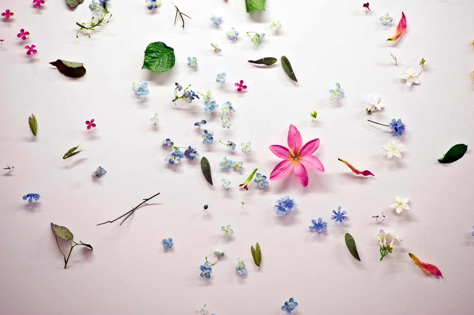


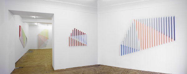


.jpg)


.jpg)
