Saturday 28 September 2013

OLD MEETS NEW IN AMSTERDAM


The old and the new sit easily with each other in Amsterdam, especially now that  its three powerhouse museums have all been reopened following extensive restructuring. So a weekend there was a good chance to see how the past is picked up in current trends. To that end, I visited:

John Chamberlain's Naughtynightcap (2008), Ritzfrolick (2010), Fiddler’sfortune (2010) and Wishingwellwink (2010) outside the Rijksmuseum
 ·         The Rijksmuseum, as stunningly restored as you might hope – as, indeed, it should be after 10 years and £500m.  It’s huge, and might be described in British terms as the V&A and National Gallery rolled into one – except it’s nearly all Dutch, bringing home just how rich their history is. Oddly, in that context, the vista on approaching is dominated currently by the biggest sculptures of John Chamberlain and Henry Moore.
 
Lucy McKenzie: Something they have to live with (detail) 

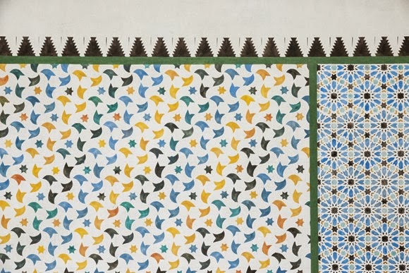
·        The Stedelijk Museum, which spans the modern and contemporary.  I caught the openings of major shows by Paulina Olowska (on the ground floor) and  ) Laurence Weiner (in an impressive new subterranean space) on the first anniversary of its reopening. Upstairs – by coincidence? – there was already a major show by Olowska’s friend Lucy McKenzie. Their double take on the interfaces between modernism and other cultures made for a rich pairing (Olowska with Malevich, Communist neons, Polish knitting designs and French street art in the max; MacKenzie with the Alhambra’s patterning, Glasgow bedsits and an interior by Adolf Loos).

Outside the Van Gogh Museum
 ·         The Van Gogh Museum, the last to reboot, opening in May 2013. The new display tells Vincent’s familiar chronological story through the lens of a concentration on his working methods, which has the advantage of emphasising the effort behind the genius which is so obvious to any reader of his letters, but not always part of the popular image.

Recreation of the extensive collection room, the spending on which was one factor in Rembrandt's bankruptcy
·         The Rembrandt House Museum, which looks nothing like it did 350 years ago from outside and has almost no original content inside (due partly to its all being auctioned when Rembrandt was made bankrupt in 1656), but which does nonetheless  provides a persuasive account of his daily life.

Alexander Gorlizki: Looking Out Looking In, 2013 at Galerie Martin Kudlek, Cologne in Amsterdam Drawing
   ·         The second edition of the work on paper fair Amsterdam Drawing, held at the NDSM Wharf on the northern part of the city with 40 galleries – mostly Dutch – each given a 15 meter run of wall space in varying formations. It was, appropriate to its medium, pleasurably intimate. If there was a trend here, it was perhaps away from minutely realised detail and towards broader effects, in both figurative and abstract work. Plenty of the latter might be termed ‘rough minimalism’, in which a casual approach is applied to geometry. An exception were the work of  small-scale works of New York based Briton  Alexander Gorlizki, which look like collages but turn out to be fully hand-painted - by the artists who work for him in India.
Dawn Mellor: from The Final Hoe-Down, depicting an imaginary artistic community in Austria at Galerie Gabriel Rolt
 ·    Maybe half of the fifty-odd contemporary galleries attractively clustered around the canals. The was a triple British presence: highlights included Roger Hiorns’ new foam sculptures and plan for burying a plane (at Annet Gelink); a new series by the ever-pungent Dawn Mellor (Gabriel Rolt); and the most eye-catching opening featured a tattooist who turned some visitors into permanent records of the titles in  Harland Miller’s latest set of paintings of tweaked book covers. 

Kuang-Yu Tsui: still from Sea Level Leaker, 2006
·         De Appel Art Centre, crisply themed in apple red and green, where Artificial Amsterdam was a lively compendium of the city’s interaction with art made in it. The wittiest and most economically pointed was Taiwanese Kuang-Yu Tsui’s four minute film of himself walking around in a jacket which sprayed water whenever he was below sea level, which of course he mostly was. Thus the archetypal Dutch struggle with water levels was highlighted at a time when its relevance could become far wider.
I traveled courtesy of the very helpful tourist authorities www.holland.com , along with  www.artsholland.com and stayed at the comprehensively-equipped 'Swiss passion' of the Movenpick hotel, one tram stop from the railway station: www.moevenpick-hotels.com/en/europe/netherlands/amsterdam/hotel-amsterdam. I could have spent longer relaxing there, but outside was Amsterdam! As I tracked across this mix, older works often reminded me of newer ones, confirming how history’s inevitable impact on the present was especially clear here...  

Willem Claesz Heda: Still Life with a Gilt Cup, 1635 in the Rijksmuseum

As the separate still life genre developed in the sixteenth century, Haarlem’s Willem Claesz Heda (1594-1680) found fame for his scenes of breakfasts, sometimes called ‘tonal banquets’ for their subtle interplay of the different but unifying greys in his exacting near-monochrome depictions of silver, pewter, glass, fish  and mother-of-pearl along with the occasional accent of gold or lemon. 

 
Piet Modriaan: Composition with Yellow, Red, Black, Blue and Grey, 1920 in the Stedelijk Museum

Mondrian is normally associated with work restricted to black, white and primaries. Yet the 1920’s works which initiated his mature style typically included grey, which only disappeared in the 30’s. They also had some delineating lines stopping short of the edge of the canvas, generating a less decisive, less settled sensation which has its own attraction. 


Frank Badur: Untitled, 2008 at Galerie Michael Sturm, Stuttgart in Amsterdam Drawing

It’s no surprise that Piet Mondrian remains influential: you could see dancers cavorting with animated versions of his grids at Der Appel as well as plenty of related work at the Drawing Fair. German artist Frank Badur has for many years been utilising and undermining the grid, traditionally a starting point in eliminating subjectivity, as a site to be subtly infected with personality. He contrasts rigorously regular sections with sensitively humanised irregularities.


Pieter de Hooch: Woman with a Child in a Pantry, 1656-60 in the Rijksmuseum
Vermeer’s Delft contemporary was a master of rendering internal spaces, here by a doubled view through doorways into contrastingly-lit rooms beyond. Also not wholly unrelated to Mondriaan. That's a boy, by the way, as indicated by the jerkin regardless of the long hair and dress; and may be de Hooch's son.
Pius Fox: Untitled, 2012 at Patrick Heide, London in Amsterdam Drawing

English-sounding Berliner Pius Fox’s small paintings on paper on board (which qualified for the Fair although any application of paint to canvas was banned) might reasonably be classified under the rough geometry trend as mentioned above.  Quite a few could also be read as doorways, visually punned with the framing of the picture itself.  There were, incidentally, two London-based galleries at the fair: Patrick Heide and Hidde van Segelen.


 Rembrandt van Rijn: Three Crosses,  State IV, 1660 in the Rembrandt's House Museum

Rembrandt’s mastery of dramatic darks was shown at its most concentrated in the etchings at his house. These included the blackest stage of the various printings of Three Crosses, made years after he signed the third state. This state erases subsidiary characters through extended shadows, score dramatic curtains into the sky and hides one of the thieves - suitably enough, as it illustrates the moment of Christ's death, when 'there was darkness over the whole land' (Mark 15:33).


Levi van Veluw: The Collapse of Confusion at Galerie Ron Mandos

Something of that atmosphere fed into the latest installations and charcoal drawings by Levi van Veluw.  The latter are a recent development, but are of a piece, being derived from his plans for installations. Having previously established his own language of obsessive order featuring thousands of square bricks, van Veluw turns to darkness and disorder in both media in his new show, in which desks collapse and cupboards fall as if returning to molecular origins. The results are gloweringly atmospheric. 


Adriaen van der Werff: A Couple Making Love in a Park Spied on by Children, 1694 - Rijksmuseum
Rotterdam painter Adriaen van der Werff (1659-1722) is hardly a star of the Rijksmuseum, though he was found immense success and wealth in the 18th century. There is, however, an attractively modern complexity to the voyeurism of this small painting: not only are there near-hidden children in the darkness, there are also statues, one as if looking on, and one turned cheekily away. 

Paul Klemman: The Approaching Star, at Witteveen Visual Arts Centre, Amsterdam in Amsterdam Drawing

Paul Klemann has been painting his dreams for forty years, taking the process far enough that - although he spends ten hours a day in bed - he sets his alarm clock several times a night in order to scribble notes. The results often bring a child-like freshness to what might be seen as decidedly adult obsessions: the examples at the fair included a dish of penises being seasoned with salt as well as what looked like a rather touching scene between snow people.  Are they people, then, or statues? And surely children might be looking on...

Karel Appel: Questioning Children 2, 1949 at the Stedelijk Museum

That childlike quality could also have been traced back to the CoBrA movement, which is well-represented in the Stedelijk. Karel Appel is the best-known representative of the 'A' in Copenhagen-Brussels-Amsterdam (he was a founder in 1948, along with Constant, Corneille, Christian Dotremont, Asger Jorn and Joseph Noiret.  Questioning Children 2 itself undercuts the childlike spontaneity by its origin in Appel seeing children begging in post-war Germany. If it looks familiar, by the way, that could be because the first version of Questioning Children is in Tate Modern.
Charlie Roberts: Dance Party 3 at Vous Etes Ici, Amsterdam in Amsterdam Drawing

Vous Etes Ici,  whose directors started Amsterdam Drawing in 2012, have recently moved to  big space near the fair's site. Kansas watercolourist Charlie Roberts tends to depict manic collectives, but his engaging recent series of parties of masks-come-houses is comparatively orderly and doesn't seem to have much of Appel's hidden angst, but who knows? 


Vincent van Gogh: The Courtesan, 1887 at the Van Gogh Museum

Van Gogh was, of course, strongly influenced by the Japanese art: he collected  hundreds of prints, made several painted versions and fed its inventive perspective, dramatic cropping, strong diagonals and blocks of plain colour without shadows into his own style. Van Gogh added his own border to this copy of Eisen's courtesan. It’s a combination of typical motifs from Japanese art which amplifies the central subject by reference to French slang of the time: a ‘crane’ being a prostitute, and a ‘frog pool’ a brothel.
Yuko Murata: Untitled, 2013 at Gallery Side 2, Tokyo in Amsterdam Drawing

It wouldn’t be hard to speculate that the Japanese influence runs the other way in Yoko Murata's paintings of animals and landscapes: there’s a freshness and passion to her paintwork.  The results, as in this ghost of a mouse, aren't quite sweet: as she herself says, we cannot understand what animals are really thinking so however much we cherish them, they may bite us, and 'to people who think 'Oh, how cute', I want to say 'You're being fooled by my animals!'

Erik van Lieshout: Ego, 2013 - installation of 9 drawings at Annet Gelink Gallery, Amsterdam in Amsterdam Drawing
What, though, would van Gogh be doing were he alive today? Quite probably making charged installations driven by his idealism and difficulties, including the love-hate conflicts he had with his family. That might make Erik Van Lieshout  a truer successor than any painter. At the Stedelijk he was showing The Commission, his pointedly wacky record of his stint as artist in residence in a Rotterdam shopping centre, and had a complicated, personally-driven group of drawings at Art Amsterdam, mixing his own conflicted family (who are mainly social workers) with politics and pornography – and bringing a dash of John Baldeserri to the anarchy through the literal representation of a ‘sex bomb’ (which does indeed work similarly as ‘Seksbom’ in Dutch).


Vincent van Gogh: Newly Mown Lawn with a Weeping Tree  - Van Gogh Museum
Another match which appealed to me was between this Van Gogh, notable for its layering of different greens, and the saviours by herman de vries (it's not me, it's him, by the way: de vries disallows the hierarchical tendencies of capital letters). 


herman de vries: The Saviours at Art Affairs, Amsterdam in Amsterdam Drawing
The veteran Dutch conceptualist has several interesting streams of work, including making monochromes from as many different rocks and earths as he can obtain. The Saviours here are plants which can be used as drugs,  set out in a range of languages with random changes in the hue of green with each change. de vries, too, connects to the natural world and sets out its variety of greens – even if they're tinged with lost innocence.


Images courtesy of the relevant galleries and artists. Trip courtesy  www.holland.com ,   www.artsholland.com and the Movenpick Hotel, Amsterdam


PAINTING AND SCULPTURE MEET PHOTOGRAPHY AT BASEL

June 2013: Article for F22 - www.state-media.com/f22

There’s quite a bit of art on show during the Basel Fair week: I saw 500 galleries across four of the seven Fairs, the hundred large works and projects of Art Unlimited (in the Art Basel Fair) and Art Parcours (out and about in the city), plus half of the twenty-odd significant non-commercial exhibitions in the city. Given that volume, it would probably be possible to find enough work to support any number of trends. For example I came across various depictions of lightning and flooding (how close are we to natural end times?) and insects (will they take over?). On a more widespread basis, there were certainly fewer jokes and more abstraction than a few years back, and that was true of some photography as well as lots of painting. I wouldn’t claim that there was, numerically, a trend towards combining photography with other disciplines, but there was certainly enough of it to choose ten interesting examples, starting with four German heavyweights...


Gerhard Richter: 924-1 STRIP, 2012, at Marian Goodman (New York / Paris) in Art Basel

One answer to doubts about the importance of painting now that digital technologies dominate might be to technologise it, and that’s what Richter does to an extreme degree putting the scanned template of his Abstract Painting 724-4, 1990, to generate thousands of computer transformations (he has documented some of the interim stages in a book) which conclude with twenty-foot-wide display of more than 8,000 stripes. Each outcome of the procedure is unique, and could be seen as a photograph of the painting, albeit one which fetishises – by maximising - the distortions which occur in any photographic process. Result: an abstract representation of an abstraction.
  Anselm Kiefer: Für Paul Celan: Rutengänger (For Paul Celan: Diviner), 2005-2007, at Galerie Thomas (Munich) in Art Basel

Anselm Kiefer is famous for attaching anything from mud to branches to lead submarines to paintings of enormous size, ambition and sometimes grandiloquence. It’s no surprise then, that there are twigs on this refreshingly intimate photograph with pencil additions. They suggest divining rods, and some also seemed shaped into some potential symbology – both are appropriate to Celan’s poem in which the diviner’s shadow 'does not obliterate the scar of time’.


Thomas Ruff: phg.02_I, 2013, at David Zwirner Gallery (London / New York) in Art Basel

Thomas Ruff’s new series is sort of Richter-in-reverse: from pure computer to a painterly endpoint which, push come to shove, I’d still term a ‘photograph’. Ruff is already known as a photographer who doesn’t take photographs: rather, he finds, re-presents and remodels material from other sources to push against the limits of what photography might be. One way to go, then, is to carry out the refinement from no source at all: what look a bit like photograms (in which objects are placed directly onto light-sensitive paper) derive purely from a virtual studio built by a custom-made software program. 


Franz Ackermann: Hotel Talabashi, 2013, at Mai 36 Gallery (Zurich) in Art Basel

Both Mai 36 and Meyer Riegger showed report-outs from the increasingly complex psycho-geographies of Franz Ackermann. His world-ranging travels feed into constructions in which multiple layers are cut literally away, with various paintings, objects and his own photographs thrown into the frenetic mix. India, Afghanistan and – as shown – Turkey were the inspirations for dizzying evocations of local colour, which also suggest that the imposition of modern values has a certain sameness across the world.


Naomi Safran-Hon: Wadi Salib: Interior Landscape (Purple Wall), 2013, at the Slag Gallery (New York) in the Volta Fair

The Haifa-raised, Brooklyn-based Naomi Safran-Hon sets up a tension between the domestic safety and the political trauma of her home neighbourhood of Wadi Salib, where many of the buildings from which Arabs were ejected in 1948 are now dilapidated. Safran-Hon mounts her own photographs of its walls on canvas, cuts holes in it, mounts lace on the back, pushes concrete through the lace and then adds acrylic. This complex hybrid of photography, sculpture and painting produces powerfully literal and charged abstract effects.


A Kassen: The Colour of Things (Chair), 2013 at Nicholai Wallner (Copenhagen) in Art Basel

The Danish collective A Kassen push equivalence to the limit in their series in which a pulverised   item is smeared on the wall as a  monochrome painting, beside a photograph of how it used to look. What depicts the truer reality?  There were examples at two fairs, each with a different subsidiary logic: at Madrid's Maisterravalbuena in Liste, a guitar was rendered decisively mute; while the chair in the main fair seemed designed to take Joseph Kosuth’s famous contrast between an actual, pictured and verbally defined chair ('One and Three Chairs') that one step further.


Rachel Harrison: Sunset Series, 2000-2012, at Greene Naftali Gallery (New York) in Art Basel

These are very much sculptor’s photographs: Rachel Harrison bought a conventional sunset view from a flea market, then set about both manipulating is an object, eg by bending it; and re-photographing it in various ways, eg altering the lighting, focus, angle of approach, proportion shown etc. Result: a set of 31 analogue variations on the same source which look surprisingly different. Possible subtext: even if we think we share the same dreams or ideals, we may mean rather different things by them…


Alan Michael: three Untitled paintings, 2013, as installed by the Micky Schubert Gallery (Berlin) at Liste

There wasn’t a lot of photorealist painting around the fairs, bit it’s an approach which Scottish artist Alan Michael has said appeals to him for its ‘alienating effect’, and has become the main mode for his depictions of widely-sourced images (he also paints texts). This set of three make a cold fetish of the way a rapid exposure photograph can catch liquids in motion. They’re taken from the publicity shots for the launch of a style magazine, and the use of such laborious and slow means to catch something so fleeting and inconsequential may be no coincidence in that context.


Jimmie Durham: Belo Horizonte, 2013, at kurimanzutto (Mexico City) in Art Basel

Jimmie Durham is known as an artist who campaigns for Native American rights, but his work ranges widely, as in this beautifully balanced and tactile assemblage which uses what Durham himself describes as ‘a HEAVY piece of flat stone. in brazil i got an old foto of a jaguar in a cage, at the flea market. then in rome i had it transferred to a tile, like they put on graves’ and then ‘many objects in the studio all wanted to be part of the piece --- but they were all too much, because the stone is so magnificent (it looks like an aerial foto of of the amazon)... then i found the last rattlesnakeskin. that completed the rather quiet work...’


Harold Ancart: Untitled (Seascape), 2013, at Xavier Hufkens (Brussels) in Art Basel

The Belgian Harold Ancart, best-known for sculptural installations, also alters net-sourced photographs of tourist destinations by burning them and adding flecks of paint. The typical effect is a picture of fire made out of smoke - 'no fire without smoke', if you will. The suggestion of trauma in would be-paradisaical places can be traced back to his own childhood experience of witnessing a major fire while on holiday. Here, though, there’s also the alleviatingly witty paradox  that it’s water which seems to be burning.


AN ABSTRACT OF PINTA


Earls Court Exhibition Centre 4-7 June 2013  - article for STATE - www.state-media.com/state


With 60 galleries, Pinta, the Modern & Contemporary Latin American Art Show at Earls Court, was a big enough to provide for differing tastes while small enough to navigate with ease. Not surprisingly, the most consistent quality was in the solo shows celebrating the influential veterans Cesar Paternosto and Luis Tomasello; and in the ten solo project booths curated by Catherine Petitgas and Kiki Mazzucchelli. But there was plenty of spirited work on view elsewhere.  Looking at that which – broadly speaking – adopted the language of painting, there were two main camps: geometrically and kinetically inclined abstraction in the South American neo-concrete manner, which was the dominant mode; and more emotionally and politically charged representational work. Much of the former was successful within somewhat predictable limits; the latter was – to be kind – rather hit and miss. Yet there was plenty of interesting work, much of which combined the best of those tendencies by charging the abstract with the personal or political.  If, however, you think of a ‘painting’ as a single, traditional surface – such as canvas – covered in paint to depict something recognisable, then my eight choices might surprise you: not one of them meets that definition!  Most aren’t even close.  Yet perhaps that suits Pinta which, though well-programmed and endearing, has its eccentricities: no cloakroom for bags or coats; no printed map; open Wednesday-Friday but not at the weekend... 


Cesar PaternostoTrio 14, 2013 at Durban SegniniFlorida

Two fine long-running abstract painters were highlighted by solo shows: 98 year old Argentine Luis Tomasello, who has often shown in England; and 82 year old Spanish-based Cesar Paternosto, who’s less well-known here. His triple architectural wall installations emphasise the space between elements, their inter-relationships, and their constructed depth, encouraging oblique viewing which promotes the side views as much as their austere frontages. Such has been Paternosto’s consistency over the years, one assumes he is demonstrating a sufficient affection for the margins to make a mild irony of his central billing here.


Patricia Camet: Emoticons 23, 2011 at  LAMB arts London / Galeria Paralelo, Sao Paulo 

For twelve years the Peruvian artist Patti Camet has been collecting packaging – from phones, chocolates, pills, eggs, scissors etc – and casting them in ceramic. Here a square metre of them, mounted on pine board, bring anthropomorphic qualities to a combination somewhere between still life and abstraction. It's one of a series which anthologises various different emotions – by way of email emoticons – in this way. Attractive, for sure – but are we, then, no more than the sum of what we’ve consumed?


Héctor Arce-EspasasCLP-A8 (Black & Landscape), 2013 at De la Cruz Projects, San Jose

This freestyle riff on a Puerto Rican jungle by a young New York based artist born in San Juan makes plenty of play of its raw linen background and the mud, collected from the site, which is smeared over much of the acrylic. There’s a long lineage of abstracting from trees, and I saw this as a refreshingly spontaneous take on Mondrian’s more studied way of tackling the theme. There’s also a political protest built in, consistent with Arce-Espasas’ broader installation practice, which often exposes the falsities in the apparently paradisaical: for what does deforestation produce but mud?


Ivana BrennerUntitled, Diptych, 2010 at jaggedart, London

What looked like infestations of mussel shells or sections of ruched curtains solidified into scallopings of petal turned out to be… paint hardened over metal armatures (which, incidentally, had a comparable elegance from the back). Argentine Ivana Brenner made a good first impression in Britain through her fungal way with what looks like ceramic, and so played well against Livia Marin’s deconstructed and stitched up crockery at jaggedart. Brenner’s work is alluring, yes, but on closer viewing unnatural enough to discomfort.


Ximena Garrido-Lecca: Composition II, 2012 at Max Wigram, London

The Peruvian artist’s solo booth had sculpture, drawings, and a huge collage of agricultural sacks which moved into painterly territory. Composition II cunningly combined branded sacks with a Pop art feel with unbranded sacks with cheerful patterns which happened to echo a good few of the Fair’s abstract paintings. The patchwork result also delivered on Garrido-Lecca’s wider strategy of importing personally infected everyday Peruvian life into a western art context: such sacks are indeed made into blankets and curtains in her home city of Lima.


Célio BragaUntitled (07 meters), 2013 at Galeria Pilar, São Paulo

Célio Braga’s compositions were the stand-out among many dissections of the grid: they  caught the flux of personal history by using strips of his friends’ clothes and characteristically Brazilian ‘wishing  ribbons’ (tie round wrist with three knots: make one wish per knot, and they’ll come true when the bracelet wears away and falls off). The resulting barely-there paintings-of-sorts are named for their length – the longest one framed the booth’s entrance – and have the ability to change formation: as above, the artist wore one around his neck. Hung slightly away from the wall, shadows magnified their vulnerable irregularities.


Toby ChristianPer Pluma Qap, 2013 at Galeria BaróSão Paulo

If you think Toby one of the less Latinate names, you’d be right: Christian’s a London artist who qualified for the fair by making work in Brazil. This is from a series of texts the upcoming writer and artist wrote on blackboards, developing his thoughts but then clearing their grounds the next morning. Drawn to the accidental results, he preserved them. The mop was wet enough that a cloudy whiteness resulted as the chalk was wiped (hinting at Dubuffet’s 'Texturologies' of soil); and old enough that it deposited bits of string, here accidentally forming what might be read as the artist’s initials (recalling Antoni Tàpies’ use of ‘AT’). 


 Manuel MéridaCirculo Britanico, 2013 at Espace Meyer / Zafra, Paris / New York

There was quite a bit of kinetic art at Pinta, bringing to mind the Venezuelan lineage of Jesús Rafael Soto and Carlos Cruz-Diez. Their countryman, Manuel Mérida (born 1939) may well have been the leading crowd-pleaser with his combination of spectacle and respect: a Union Jack themed set of four rotating circular paintings. There were monochromes in red, blue and white plus a threefold combination. They spun at the same speed, but due to the varying mixes of wood particles, sand or chalk acting as carrier behind their glass fronts, the pigment inside formed and unformed shapes at differing speeds.  


ART STUFF ON A TRAIN: 11-20


HERE, FOR CONVENIENCE, IS A GATHERING OF THE SECOND TEN
WEEKS OF MY QUIRKY WEEKLY COLUMN FOR FAD ART NEWS


Aug-Sept 2013

Most days art critic Paul Carey-Kent spends hours on the train, traveling between his home in Southampton and his day job in Surrey. Could he, we asked, jot down whatever came into his head?

20: ‘One Leg Good’


176 Hans Hartung 01 ART STUFF on a plane # 20: ‘One Leg Good’
Hartung in action

Paralympics for art would make no real sense, so it’s rather perverse to ask ‘who painted best from a wheelchair?’ Naturally age can lead to frailty: Renoir and Matisse made iconic late works that way. More youthfully, Frida Kahlo’s last works before she died at 47 were made after losing a leg to gangrene, and Chuck Close has been confined to a wheelchair since 1988.
In some of those cases – notably Matisse’s cut-outs – physical limitations directly affect the type of work; and that’s true of the last years of the German-born, mostly French-dwelling Hans Hartung (1904-89). His unusual life included marrying Norwegian artist Anna-Eva Bergman both before and – having divorced in 1939 – after the Second World War, in which he lost a leg while fighting for the French Foreign Legion. Hartung’s studio is preserved on the hills above Antibes, along with various implements for applying paint: brooms, branches, forks, curry combs – and a garden spray attachment much-used during his last decade. That found Hartung, considerably aided by assistants, in ‘a trance-like state… partly induced by wine and an insulating barrier of Baroque music played extremely loud’*. Those many late works – e.g. 360 canvases in his 85th year! – have been considered of dubious status, but now the centrality of Hartung’s direction of events from the wheelchair tends to be recognised, however far from the vigorously mobile archetype of the heroic painter.

* from Jennifer Mundy’s excellent analysis of the late work at www.tate.org.uk/download/file


T1989 E46 1989 hartung ART STUFF on a plane # 20: ‘One Leg Good’
Hans Hartung: ‘T1989-E46′, 1989 

19: ‘Where's the Picasso Museum?’


pp whitefaun picasso ART STUFF on a plane # 19: ‘Where is the Picasso Museum?’


White Faun Playing a Double Flute, 1946 

Picasso is readily associated with Malaga, where he was born; Barcelona, his teenage home; Paris, where he found fame; and the Riviera, where he grew old – and all have museums in his name. There are also four so titled elsewhere: in Berlin, where a recent refurbishment dedicates a whole building to the immensely impressive Picasso holdings of the Berggruen Collection; a much more modest selection in Madrid, derived from a friend; Münster, with 800 prints; and Lucerne, which concentrates on a photographic record of Picasso the man. Perhaps there are more, but I know of none outside Europe, which – after all – Picasso hardly left.
On the Riviera, Picasso lived mostly in Vallauris (1948-55), where he discovered ceramics and painted the giant murals ‘War’ and ‘Peace’, which form the basis of its Picasso Museum; Cannes (1955-61); and the village of Mougins above Cannes (1955-73). Yet just a two month residency in the Chateau Grimaldi, Antibes in the summer of 1946 forms the basis for one of the best of the nine: 23 paintings and 44 drawings with plenty of shown where they were made: nymphs and fauns, including the famed ‘La Joie de Vivre’ make for a beautifully coherent and joyful set. Picasso required that they stay put – so, to Antibes…


pp bardot ART STUFF on a plane # 19: ‘Where is the Picasso Museum?’ Picasso and Bardot seems like plenty of Riviera

18: ‘How Much Is Not Enough?’


louise thomas Isla Nublar Lagoon ART STUFF on a train # 18: ‘How Much Is Not Enough?’
Bischoff Weiss are currently showing Louise Thomas’ fascinating paintings of amusement parks’ fantasy landscapes, such as ‘Isla Nublar Lagoon’
Galleries vary in how much information they give. Some believe a press release is too reductive or demeans the purity of the work, so a list of titles is your lot. Saying that little tends to come across to me not as cool, but as lazy or arrogant – unless there’s genuinely nothing worth saying about the work: if so, perhaps there should be a disclaimer to that effect! Occasionally there’s a press release, but it isn’t available physically (‘it’s on the web site’, you’ll be told, as if to emphasise how awkwardly old-fashioned it is of you to turn up in person). Such reticence is unusual, though: most gallerists see it as part of their role to make explanations available in writing and orally, and many make quite an effort. This seems unrelated to the size of gallery or the reputation of the artists involved: Cabinet and Corvi Mora, for example, do the bare minimum. Some do plenty, but largely on a chargeable basis: Gagosian, Annely Juda and White Cube tend that way. Others belie apparently modest resources with both a press release (for a rapid overview) and a free quality booklets for most shows: Bischoff Weiss, Austin Desmond, the Hua Gallery and Maddox Arts, for example, take a bow…


maddox objeto magico 3 1 ART STUFF on a train # 18: ‘How Much Is Not Enough?’
Maddox Arts’ ongoing South American ‘Visual Poetry’ show includes this florally-adapted typewriter ‘Objecto Magico’ by Glenda León
 

17: ‘How to Get In’


theft contemplation gagosian ART STUFF on a train # 17: ‘How to Get In’
A visitor contemplates the possibility of stealing a Henry Moore…

Every now and again I hear an artist wondering how they can get into a show. Artists aren’t always the most practical types, but actually it’s fairly straightforward. Points to look out for are that some small galleries are erratic in their opening hours and it’s best to phone first; entry intercoms can be a pain; there’s the odd gallery three floors up with an eccentric lift; and Gagosian’s doors are unusually heavy. That said, Larry does employ impressively muscular security with the dual function of opening the door and providing the art with an aura of value, even if – his Henry Moore show was a case in point – vandalism of any impact would be difficult and theft impossible without a at least a forklift truck.
So what is the best way of getting into the world’s top gallery? I recommend approaching too swiftly for the doorman to react, applying far more force than a casual opening would normally require, and then strolling through with cool independence. As for the related question, of how to get one’s work in… Assuming that, too, isn’t of a weight requiring heavy equipment, Banksy solved the matter some years back with his guerrilla placement strategies. Why do artists persist in asking these questions?


gag filename p1020698 large ART STUFF on a train # 17: ‘How to Get In’
… only to find there is a guard on duty

16: ‘Marooned with Caulfield’


caulfield record ART STUFF on a train # 16: ‘Marooned with Caulfield’
Stereophonic Record Player, 1968

Some artists are strongly associated with a particular colour: Van Gogh’s yellow, Klein’s blue, Reinhardt’s black etc. I wouldn’t put Caulfield in that group, but I was struck at Tate Britain’s exemplary overview of his paintings (closes 1st September) by the number in which dark reds predominate.The usual Caulfield tropes are certainly in evidence, too: plenty of time in the restaurant; no one else around yet; the Cubist still life flattened out and then expanded into architectural settings; persistent traffic between reality and artifice; an interest in the exotic smuggled into the everyday; sharp shadows; the black outlines which – until the late 80’s – fix and almost imprison objects, so contributing to an atmosphere of bittersweet melancholy; the late mix of styles through which Caulfield reflects, pre-internet, on how our perceptions are largely constructed second-hand by images. But anyway, Stereo Record Player, Tandoori Rest, Registry, Happy Hour and his last painting, Braque Curtain, are all predominantly dark red. Happy Hour includes a glass of claret, reflecting Caulfield himself and triggering the thought – most of these are wine-dark tones. That fits with his recurring interest in food and drink, and also matches the sense that we’re balanced somewhere between the anticipation of pleasure and the expectation of regret. Still, I’d rather be marooned with Caulfield than in the parallel Hume or Lowry shows.


caulfield braque ART STUFF on a train # 16: ‘Marooned with Caulfield’
Braque Curtain, 2005

15: ‘The Separated Tongue’


hart08750 24147 ART STUFF on a train # 15: ‘The Separated Tongue’  
Emma Hart

There’s an attractively visceral semi-obscenity to the tongue, which is like – indeed, which is – something you find inside the body. And yet it comes out into the world, physically and as communicator. You can tap some of that just by sticking it out, but what if you want to isolate the tongue as an item of sculptural interest? You can poke one out of a picture or wall, as in Urs Fischer’s widely-shown Noisette (2009). Otherwise, as Emma Hart explained when she found herself making any number of ceramic tongues for her engaging Dirty Looks show at Camden Arts Centre (to 29 Sept), you have a ‘plinth problem’ – on what are the tongues to be put? Artists haven’t been put off by this recently, though: 2013 has seen something of a stand alone tongue fest. Henrik Potter showed a real ox tongue at IMT. Martha Friedman sculpted giants and stuck them in the ground at Frieze New York. Michael Dean had concrete tongues curl around the edges of tables at Herald Street. Hart herself has tongues on trays and picture frames, as trowels, rosettes, door handles, napkin rings etc. All part of a riotous show which captures life’s confusion and excess through a call centre, gargoyles, gardens, persistent coughing, hidden videos and, of course, a gaggle of tongues…


dean ART STUFF on a train # 15: ‘The Separated Tongue’
Michael Dean


14: ‘ Feathers and light’


mccgwire 2 ART STUFF on a train # 14: ‘ Feathers and light’
Surge, 2012

It’s natural to concentrate on what an artist is showing, but where makes a big difference. Kate MccGwire’s ‘Lure’, on tour to the Discovery Centre, Winchester this summer, originated at All Visual Arts, who – long with Pertwee, Anderson & Gold – have shown MccGwire extensively in London. Both galleries favour the gothic drama of spotlit darkness, and it was a welcome change to see the work in daylight. MccGwire has been using feathers – sourced from an extensive network of pigeon fanciers and farmers – since 2006, and if that sounds a gimmick on a par with building ships out of matchsticks, the naturally-lit results belie any such equation. Rather, MccGwire marshalls various feathers into a rich and darkly animate minimalism in which all parts get used, from the thousands of full feathers teeming into abstracted yet creature-like forms such as ‘Gyre’, to the quills of crows: laid flat, they make for serial mark-making akin to Hanne Darboven’s; stood on end (‘Surge’) they seethe like an organic version of Gunther Uecker’s nail works. Then, peeping at fanned pigeon feathers through lead sheeting (‘Stigma’), I was reminded of the burned works of Alberto Burri. And a promising new strand creates a version of one of Hans Haeckel’s illustrations of underwater forms, neatly combining the freedom of the air with life in the watery depths.


mccgwire ART STUFF on a train # 14: ‘ Feathers and light’  
Stigma, 2012


13: ‘ MinimumValues'


Emma Hart

There’s an attractively visceral semi-obscenity to the tongue, which is like – indeed, which is – something you find inside the body. And yet it comes out into the world, physically and as communicator. You can tap some of that just by sticking it out, but what if you want to isolate the tongue as an item of sculptural interest? You can poke one out of a picture or wall, as in Urs Fischer’s widely-shown Noisette (2009). Otherwise, as Emma Hart explained when she found herself making any number of ceramic tongues for her engaging Dirty Looks show at Camden Arts Centre (to 29 Sept), you have a ‘plinth problem’ – on what are the tongues to be put? Artists haven’t been put off by this recently, though: 2013 has seen something of a stand alone tongue fest. Henrik Potter showed a real ox tongue at IMT. Martha Friedman sculpted giants and stuck them in the ground at Frieze New York. Michael Dean had concrete tongues curl around the edges of tables at Herald Street. Hart herself has tongues on trays and picture frames, as trowels, rosettes, door handles, napkin rings etc. All part of a riotous show which captures life’s confusion and excess through a call centre, gargoyles, gardens, persistent coughing, hidden videos and, of course, a gaggle of tongues…


Michael Dean


2013 07 11 18.20.44 ART STUFF on a train # 13: ‘ Minimum Values’  
Martin John Callanan with two ‘Fundamental Units’

White Cube’s Masons Yard summer show includes six of Martin John Callanan’s striking series ‘The Fundamental Units’. Callanan uses thousands of exposures via a 3D optical microscope at the National Physical Laboratory to achieve intensely detailed (400 million pixels) images of the lowest denomination coins, here printed at over 50 times life-size. This elevation of the near-worthless reveals the construction and traces of circulation invisible to the naked eye. It also has a mournful aspect, as many of lowest value coins (Callanan has captured 16 of the 166 currently in use) will doubtless be withdrawn from circulation soon enough. As you can see at www.greyisgood.eu, Callanan has good form for obsessive projects, such as taking 2,000 photographs of floors in important buildings with restricted public access .
‘The Fundamental Units’ reminded me of a similarly-sourced but psychologically contrasting series : Moyra Davey’s late 80s series of 100 ‘Copperheads’, which concentrate on one coin – the US one cent – to show the range of scratching, rusting and tarnishing inflicted on the most famous American. These, focusing on one national economy at a time of recession – and currently on display at Tate Liverpool during the next recession – become harder to read as the damage tends towards abstraction. But then, isn’t the whole convention of money an abstraction of sorts?


moyra ZZ050613tate 002JPG 4066402 ART STUFF on a train # 13: ‘ Minimum Values’
Moyra Davey with ‘Copperheads’


12: ‘ What About The Ceiling?’


04 IRWIN RYB 7217 25 v02 JPEG ART STUFF on a train # 12: ‘ What About The Ceiling? Who’s afraid of Red, Yellow & Blue³ III

Painters make little use of the floor, which they tend to leave to sculptors, and also seem reluctant to use the ceiling, despite the lack of competition and the historical example of Michelangelo. Step forward Robert Irwin: not only is it good to see Pace give a debut London solo show (to Aug 17) to Californian master of perceptual effects, and to see the locally-specific 47 tube light work Piccadilly, it’s also refreshing to see that the whole room installation Who’s afraid of Red, Yellow & Blue³ III consists of paintings which fully cover the floor and ceiling, while the walls remain bare. I struggle to think of another example of this, save Irwin’s previous (San Diego, 2007) expansion of the iconic 1969-70 Barnett Newman painting. Who’s afraid of Red, Yellow & Blue³ III covers 1,400 square feet of floor and a matching amount of ceiling with brilliantly reflective lacquer and polyurethane paint on six honeycomb aluminium panels, arranged so that matching colours reflect each other. At the crowded opening the many movements around and through the panels (you can’t walk on them) made for a busily changeable scene. When I returned later, in contrast, I was able to appreciate its more meditative and inwardly reflective side, when the windows mirrored in the ceiling and floor came fully into their own.

 irwin ART STUFF on a train # 12: ‘ What About The Ceiling?
Piccadilly


11: ‘ What Isn’t There'


Are Merlin James ART STUFF on a train #11:  What Isnt There

Merlin James: Are, 2006-13 (courtesy artist and Mummery+Schnelle, London, Photography: Andy Keate)
There are two ways of reviewing a retrospective: on the basis of what’s in it, or according to what’s missing. I’m more interested in the merits of what I can see than of what I can’t, so it rather annoys me when a show-off reviewer concentrates on the latter. Looking round the latest offering from the excellent Parasol Unit, then, I’m inclined to focus on how the non-chronological hang in a large space of Merlin James’ intimately-scaled, gently hesitant experimentalism allows for 44 paintings to build up rhythms and thematic repetitions which feed lovingly off a gamut of other artists.
But here’s the rub: the show could be a little less polite, a little more surprising. There’s no sex – though this has been a major strand of James’ work, and one which would have allowed for more radical irruptions; and there are only a couple of the recent paintings on transparent surfaces; which expose their own construction and can feature, for example, rather absurd little houses placed in the visible supports. That stream feels to me like the distinctive place towards which James has been travelling. So I’m breaking my own rule… In which case I may as well ask: why does the Tate’s Lowry retrospective include none of  his seascapes, nor any of those creepy constrained-marionette drawings which the aging artist gave to his niece?
lowry  49556689 ballerinasketch ART STUFF on a train #11:  What Isnt There
                                                         LS Lowry, untitled

About Me

My photo
Southampton, Hampshire, United Kingdom
I was in my leisure time Editor at Large of Art World magazine (which ran 2007-09) and now write freelance for such as Art Monthly, Frieze, Photomonitor, Elephant and Border Crossings. I have curated 20 shows during 2013-17 with more on the way. Going back a bit my main writing background is poetry. My day job is public sector financial management.

Followers