Saturday 15 February 2014

ROTTERDAM 2014: DOUBLE DUTCH

Skyscrapers cluster along the Wilhelminakade along the river Meuse, where the Object design fair took place in the stunning new  Rem Koolhaas building

Art Rotterdam (6-9 Feb 2014) is the primary national opportunity for the Netherlanders to showcase their own artists and galleries, and both are good. Logic, then, dictated that I make a ‘Double Dutch’ selection: Dutch artists shown by Dutch galleries. My first choice is obvious, and initiates what emerged as a sub-theme of human interaction with nature.


Jan Dibbets: Double Dutch Mountains, 1972 at Willem Baars Art Consultancy, Amsterdam

Jan Dibbets (born Weert, 1941) has been creating a dialogue between geometry and landscape since the late sixties, most famously through his ‘Perspective Corrections’ and tilted versions of sea and land, all consistent with his view that what counts isn’t taking the photographs, but thinking about them – that, to put it more bluntly, ‘nice pictures are the problem’.  This comically extreme account of the subjectivity of the horizon tracks a Dutch beach across a dozen 15% slices, and records its own logic by way of studies within the study. The resulting curve  is, the title suggests, as close as the Netherlands is likely to get to a mountain region.


Melanie Bonajo: Matrix Botanica – Biosphere Above Nations at Akinci, Amsterdam

I’ve previously been struck by Bonajo’s ‘Furniture Bondage’ photographs, in which she puts herself in somewhat Freudian thrall to the domestic environment. Currently a resident artist at PS1 in New York, she won the Dutch ‘MK Award’  for a twenty minute film in which she speaks, composes and sings as nature, urging us to imagine ourselves as plants (‘a year and then bloom! – think of the sensation - and everyone would see it!’) and counselling against ‘those humans who treat relations with nature like a one night stand’ when ‘if you see your relation to nature as a relation to your own body – could you have a one night stand?'. Bonajo pulls off the fey charm of this through the cutely accented sincerity of her delivery and the glorious fantasy costumes she and her protagonists wear for ‘re-earthing’ rituals in which tribal tradition meet contemporary art bricolage. 


Zeger Reyers: frontal view of  'A Glance Through the Shades' 2014, at Galerie Maurits 
van de Laar, The Hague (photo Martin Zwaan)

A Glance Through the Shades was originally shown across museum windows as part of exploration of unusual interactions between humans and environment. That fitted well with  installation artist Zeger Reyers’ preferred theme of how we change our surroundings by manipulating nature, in the course of which we become somehow alienated from the natural by how we distort it. Moreover these mushrooms,  which Reyers has preserved at the point of just starting to wither, are an hallucinogenic variety, so there could be a metaphor for artistic inspiration built in to the screening off of the world outside.


 Annegret Kellner: Selfmade Laziness in 'We Like Art!' - www.welikeart.nl

‘We Like Art!’  was a subsidiary gathering of work under 1,500 which – unlike many such – was of comparable quality to the main fair alongside, and featured many of the same artists.  Annegret Kellner seems an interesting figure: blogger, curator, partner of cloud-making photographer Berndnaut Smilde (show forthcoming at London's Ronchini Gallery), and with a sense of humour evident in both this neat and environmentally sharp on the laziness of plants (laid on the floor and rotated) and her taking part in Daan Samson and Jeronimus van Pelt’s project at Amsterdam's Torch Gallery which depicted 'the most delectable babes in the field of contemporary art’!


Peter Schuyff: Untitled, 2013 at Gabriel Rolt, Amsterdam

Dutch-born artist and musician Peter Schuyff came to prominence as one of the Neo-Geo painters in New York in the early nineties, but moved to Amsterdam a decade ago. For some years his practice has included generating the rhythm for geometries from the found paintings over which they are painted. His most recent work, on view here, sees his motifs escape into their own, more sculptural, space. These snake-club-melons are  lively yet mysterious, not such an easy combination to pull off. 


Marleen SleeuwitsInterior No. 37, 2013 at LhGWR, The Hague

Marleen Sleeuwits builds environments in order to photograph them, here using paper towels. Until recently that was one at a time, but for 18 months now she’s had the rare chance to work simultaneously a vacant sixteen storey office block in The Hague. She says she explores ‘places with which it seems you are unable to make any connection’, trading on the sense of in-betweenness which Marc AugĂ© found in 'non-places' to yield abstract environments, ambiguously placed between digital and real, with strong emotional resonances: mental spaces, if you will. And new at the Fair was Sleeuwits' first foray into sculpture shown as itself, not photographically...


Folkert de Jong: Trouble in the 5th Dimension #3, 2012 at Galerie Fons Welters, Amsterdam

What’s this, the violent and psychedelic story of a darts player’s descent into madness? Maybe, but Folkert de Jong often focuses sardonically on being an artist so it makes sense to read this distinctive polyurethane foam work in that light, as referring to the extremes an artist may be ready to go to in order to come out on top in the competitive world of art, together with the combination of luck and skill which is required. Or maybe it’s just a murderous distortion of abstract ways: prime target, Kenneth Noland.  


Bob Eikelboom: Untitled (Magnet Series No. 1), 2014 at Boetzelaer|Nispen, Amsterdam

At just 22, Bob Eikelboom has already explored three ways to undermine the monochrome. First, he made his paintings shiny and rounded so that the uniform surface picked up reflections – there was one of those in adjoining display of the 92 artists who received grants from the Mondrain Foundation in 2013. Second, he curved rectangular monochromes across at the top, so that the variable self-shadowing caused colour differences. Now, he places car magnets over a monochrome field, insouciantly sampling and reusing art history so that, for example, Matisse’s leaves become unruly pubic hair. Visitors weren’t encouraged to move things around, but if you buy one then Eikelboom very much sees that as part of the process of undermining the traditional sanctity of the work. ..


Floris Vos: Set for Hope, The Hallway
Floris Vos: 1:1 Sets for Erwin Olaf at Het Nieuwe Instituut
The double Dutch highlight among the museums was highly unusual: the architecturally oriented and architecturally stunning New Institute showed just how far Erwin Olaf follows through on his view that in making his staged narrative photographs of the suspended moment when an emotional reaction begins, he has ‘no interest in reality’: it presented six of the elaborate, life size sets built for him by Floris Vos. Background research, diagrammatic sketches and Olaf’s  commentary on the themes were also provided – in each case leading to just the one final image. Here’s the set and outcome for a 2005 shot, set in the 1960’s,  which now looks a little like a Madmen prequel. Not only that: 15 walls of artists’ wallpaper were also included (the sharp-eyed might spot Sarah Lucas' Soup above right), along with a very slick technological set-up to enable visitors to get their own designs onto a spare wall with gratifying immediacy. 

Erwin Olaf: Hope, The Hallway, 2005
Another Dutch highlight was Anne Wenzel’s immersive and impressively scaled gathering of vanitas ceramics at TENT – not that the home team had all the best institutional moves, Belgium (David Claerbout’ s new film at the Fotomuseum) and Germany (Sabine Hornig at the Museum Boijmans Van Beuningen, which also featured Medardo Rosso, Brancusi and Man Ray’s sculptures alongside the artists’ own photographs of them.  On the other hand there was Witte de Witte’s  forty-strong group show ‘The Crime Was Almost Perfect’: the show wasn’t even close.


Jan Henderikse: Kratjeswand,1962, reconstructed 2011 & Daan Van Golden: Composition in Green, 1963

The Stedelijk Museum Schiedam has replaced one eccentricity – until recently you could enter only via the basement – with another: the labels in its 100 work, 60 artist survey of Dutch art since 1945 could only be read by treading on a foot pedal which illumined the text. That novelty soon palled, and it can be thirsty work anyway. Welcome, then, to Jan Henderikse’s Kratjeswand ('Crate Wall'). The Delft-born co-founder of the Dutch Zero group in 1960 is a considerable assembler of life’s basics, from bales of shredded banknotes to golf balls to this 12 x 12 x 11 grid of 1584 bottles of beer, cunningly placed near one of Daan van Golden’s  formally similar  handkerchief-like abstracts.

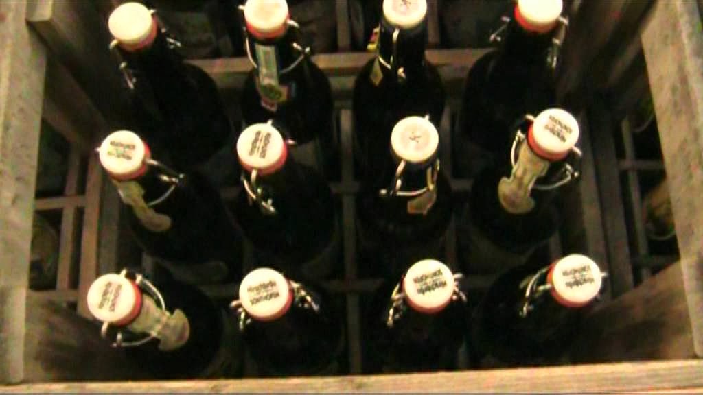
Were those Henderikse bottles a participative work?


ROTTERDAM 2014: BRITAIN IN THE NETHERLANDS


Rotterdam remains Europe's largest container port, though recently overtaken in world terms by Shanghai and Singapore. It has a distinct dynamism and, having been obliterated in the 1940’s, a modern architecture to match.  The demise of Art Amsterdam has consolidated Art Rotterdam’s position as the leading Dutch fair, and this year (February 6-9) it moved to a striking and spacious  new location at Van Nellefabriek, a former coffee, tea and tobacco processing plant, built in 1925-31, which is something of a modernist industrial icon.That enabled various pop-up shows and the unusual video section to be brought together.  The Fair was busy, but the pace was measured. According to Seventeen’s Dave Hoyland, continental collectors take their time, returning to consider work repeatedly before buying, and the sales action is spread out over the week. That contrasts with America, where almost all sale are made in the first three hours: the assumption is that anything which no one else wants immediately can’t be much of an investment.

Van Nellefabriek
There was the usual range of eccentric projects. Mobile inflatable sculptures; a five day concert made by ‘playing’ the factory’s fuse box and adding street sounds; a booth turned into a bar, where I was buttonholed by a comedic woman (she asked if I wanted a double entendre, and I agreed she could give me one) who turned out to be an art action. All the leading Dutch galleries attended, yet the British, along with Germans and Belgians, were also very much visible. There were eight of our galleries among the 118 attending, and plenty of British artists popped up elsewhere: Jonathan Callan, Charles Avery, Shezad Dawood, Kate MccGwire and Julie Cockburn were among those making a good impression. The weather also felt British: just as wet as back home just now, and with enough wind swirling around the buildings that Maria Stenfors complained that there was nowhere calm enough to smoke...


 Marlow Moss: Red, Blue, Yellow and White, 1957-58 in the Stedelijk Museum, Amsterdam

I called in on Amsterdam en route. Unusually, no British artists have shows there at the moment, but I was struck by this painting. Marjorie Moss (1898-1958) tends to be as renowned for changing her name to Marlow and dressing as a man from 1926  as she is for the paintings in which her Dutch connections are evident (she was in Mondrian’s Paris circle and her lifelong partner was the Dutch writer Antoinette Hendrika Nijhoff-Wind). Her star is in the ascendant just now, with a Tate touring solo show (in Hastings to 23 April). The dynamic way in which white earns its colours in this late work certainly does that no harm.  Let's start Art Rotterdam with other British work which bears the trace of Mondrian...


Tom Benson: Imaging, 2014  at Hidde van Seggelen, London

Hidde van Seggelen, who’s Dutch but runs a gallery in London, is well-placed to assess the nations’ differing taste. He says their collectors have much in common, though the Dutch do particularly admire precision in the making. Tom Benson’s Imaging should have appealed, then, as a gleamingly high-end aluminium production, albeit with provisionality built in: it would be easy – though Benson would not approve - to switch around the various elements attached to the exhaustively hand-engineered pegboard background. Those sculpturally shadowed shapes hang from steel pins, their angle determined by how gravity acts given the placement of the hole in them. Worlds are anthologised in the elegant dance of shadowed elements which results: exhibition invitation cards, a sharp accent of red, reflections of the space and rogue incursion of sprayed glitter paint.


David Saunders: 901-1, 1985 at Mummery & Schnelle, London

David Saunders was a co-founder, in 1969, of the Systems Group, which aimed to build up to abstraction through logical processes. He’s had a low profile recently: this teaser for a forthcoming solo show in London included black and white canvasses not shown since the 1970’s.  Saunders moved into colour in the mid 80’s, and this radiantly rigorous painting is one from a series which uses equal areas of each primary -  but with the different shapes creating some doubt that it’s so. Saunders also adjusts his colours from the pure forms you see in Moss, aiming at equal density of impact. He believes that requires that the yellow, to be successfully saturated without turning green, must be light in tone, and the red and green mid-tone else they tend to blue, whereas blue can maintain saturation across a wide range of tonalities.


Mary Reid Kelley: Priapus Agonistes, 2013 at Pilar Corias in ‘Projections’
  
South Carolinan Mary Reid Kelley certainly puts the work in. She writes energetic rhyming pastiches of mythical  classics, rich in risquĂ© wordplay. They become the scripts for films in which she takes all the main parts as characters made up in black and white against greenscreened backgrounds to very distinctive visual effect.  Top marks for style, then. What about content? I have to say that no clear intent emerged from this 20 minute mash-up of American High School, basketball and beach culture with the tale of the bull and the Minotaur – but I did enjoy it. Perhaps if I’d watched it twice, but there were three sets of headphones and a queue. .


Andrew Norman Wilson: The Inland Printer - 152, 2012 at Edel Assanti, London

The framing of American artist Andrew Norman Wilson's series ScanOps  takes its title from Google’s book scanning operation, is a found collection of anomalous shots which literally reveal the labour behind technological business as workers' hands are accidentally captured. Moreover, if Google is a factory, says Wilson, it includes not just the anonymous workers and co-founders Sergey Brin and Larry Page, but 'the pink finger condoms, infrared cameras, the auto-correction software, the ink on my rag paper prints, me, the capital required to fund the project' – and us, as we’re all 'performing freestyle data entry' towards Google gathering its income from the exchange of information and knowledge. The framing echoes the parallel way in which Elad Lassry presents photographs to emphasise their materiality.


Philip Newcombe: Blow at Maria Stenfors, London

One of the most striking stands in the New Art section of solo presentations was by German-born (1970) but London-based Philip Newcombe: ten richly playful yet barely-there works ranged like occasional notes across the stand’s white score.  They ran from a trumpet mouthpiece, attached as if to suggest the full instrument behind the wall, painted with Vaseline and hung hip-height to accentuate the sex in the title, Blow; a gobstopper-as-planet which had been sucked whilst 'thinking about heavy shit'; and a 'No Games' sign which appeared to have been vandalously inverted: there certainly were games here, so it was natural to read the words as ‘Game On’. 


Andy Holden: Eyes in Space, 2012 at Works | Projects, Bristol

2103 was very much Andy Holden’s year, with hugely inventive multi-media extravaganzas  at Kingston and Anita Zabludowicz. A collectible way to buy into his unique vision is his collages on National Geographic images, which give the night sky a multitude of googly eyes with which to stare back at we watchers of the skies while disguising themselves as stars…  Where gallerist Simon Morrissey needed the eyes, though, was in the back of his head, having made the mistake of showing a fragile sculpture in the middle of his corner-spanning space, which proved to be a handy short cut through a crowded fair…


Sachin Kaeley: Plaster, acrylic, lighting gel and acetate on board at Seventeen

Recent graduate Sachin Kaeley’s small paintings – a first venture into the medium for Seventeen, and one which has generated a healthy waiting list – have been tagged ‘post-internet’ for the way their tactile surfaces, finger-sculpted into thick acrylic, are cast in plaster and spray-painted in the manner of an image being digitally tweaked. Here he introduced further levels of intervention by covering some with a semi-transparent sheet of polyester lighting gel - which itself bore subtle traces of paint. Seventeen is about to move to Dalston: all Kaeley has to do now is to up the scale or productivity sufficiently to fill the new, much larger  space which his next show will initiate. 


Toril Johannssen: Unlearning Optical Illusions at Tenderpixel

Tenderpixel has been operating, somewhat below the radar, for five years from a former shop space among the vintage book dealers off Charing Cross Road. The name suggests a meeting of technology and feeling, and certainly the Norwegian artist Toril Johannssen brought scientific rigour to an impressive new book 'Unseeing', which analyses perception studies  across cultures, using that to stand in for how subjectivity enters our understanding and suggesting that what we perceive as optical illusions can be unlearned as we are conditioned to understand them with modernised eyes. Alongside that, she applied the patterns of optical illusions (such the MĂĽller-Lyer illusion, seen above right, whereby stylised arrows may appear to be of differing lengths) to the locally appropriate medium of batik, which has a strong Dutch colonial history.


Friday 14 February 2014

PAUL'S ART STUFF ON A TRAIN 31-40

PAUL’S ART STUFF on a train # 40: ‘Beattieful London’

February 4, 2014 


Dominic Beattie: Untitled, 2013 – Ink, aluminium tape, enamel, foam, wood, and hardboard ‘Beattie’ is an unusual name, meaning, of course, ‘one who holds land on condition of supplying food to those billeted by the chief’. True, a Google search yields 3 million results, but Nash gets 28m and Jones 236m. So it’s a surprise to find that two unrelated painters so called – Dominic, 32 and Basil, 78 – should have London shows running for the same five weeks to 22 February. Both look to the past. Dominic, at FOLD in Clerkenwell (and also in Saatchi’s New Order II), colourfully approximates the forms of constructivist abstraction using odd scraps of wood, plastic, card etc, as if countering its purity – in Ben Street’s words – by assembling a half-remembered version out of the discarded stuff of contemporary life. Basil, just east at Hales in Shoreditch, looks back to the visibly energetic mark-making of abstract expressionism, but applies it to archetypal forms with potentially symbolist import. This selects the biggest and best of his steps motif, the oldest of which was made 20 years ago. They come across as to me as optimistic ascents from left to right, but then I’m not Chinese. Neither quite achieves beauty, but then I doubt if they aim for it. What’s the word for ‘aesthetically pleasing, but not beautiful’? ‘Harmonious’ isn’t quite edgy enough here, and ‘attractive’ sounds slightly condescending in an art context. Let’s settle for ‘beattieful’.


Basil Beattie: Step Up On, 2013

Paul’s ART STUFF on a train # 39: ‘Mid-Century Fair’


Paul Nash: River, 1932
  The London Art Fair has improved a little each year recently, with more adventurous and fewer dire galleries in the mix and a good curated photo exhibition. The 2014 edition (14-19 Jan) also saw some stimulating match-ups in the project section, for which young galleries were invited to share a stand. All the same, its USP remains as an enjoyable, if unrevelatory, place to find the leading British artists of the last century: plenty of Nicholson, Hepworth, Lanyon, Heron, Riley, Hitchens… Yet there are always less familiar examples mixed in with the more predictable fare. This year my favourites were a Paul Nash at Piano Nobile and the Wilhelmina Barns-Graham retrospective at Art First. Nash’s unique chord is strummed when an aspect of the surreal insinuates itself into the landscape without going the whole ham-fisted hog. Just so, the watercolour River foregrounds an oddly-placed and potentially symbolic pair of empty swings, hinting at childhood trauma or political uncertainty. Barns-Graham (1912-2004),the pre-eminent female painter among the St Ives group, outlived all the men and enjoyed a particularly late phase. Emerald and Cadmium Green is from a lesser-known stream of her richly varied oeuvre, one which merges abstraction and landscape by equating the scientific waves of particle physics with natural waves – here of the sea, perhaps, or of wind in the grass. The result is a buzzy study in dot dynamics which forms some sort of event horizon.


Wilhelmina Barns-Graham: Emerald and Cadmium Green, 1971

ART STUFF on a train # 38: ‘That’s New!’


tomma abts   hepe   2011 3299 ART STUFF on a train # 38: ‘Thats New!’  
Tomma Abts: Hepe, 2011

There’s always pressure on artists to move on, but meaningful change can be quite subtle. Tate Britain’s quietly interesting ‘Painting Now’ (to 9 Feb) selects five contemporary artists not likely to shift sensationally. The highlight is seven mostly recent works by the 2006 Turner prize winner Tomma Abts. As ever, they take their titles from German names and are scaled like life-sized portrait heads, so we seem to meet the paintings as personalities. Their patient, additive, multi-year processes can be traced. They achieve an all-over absence of emphasis through the precise use of formal devices which Mark Godfrey’s accompanying text categorises as lines and areas interrupting each other; toning down colours to prevent dominance; and introducing competing types of illusion, such as fake shadows. Small wonder, perhaps, that I overheard the view ‘she hasn’t developed’. Is that right, though? Most shifts, such as towards the increased optical shimmer of Zebe (2010), are bound to seem slow and organic, given for example that Jeels (2010) was in her studio for a decade, and so may actually be older than Theiel (1994). Yet this selection includes two rather sharp departures from Abts’ norm: Hepe (2011) is divided into two pieces so that the gap effects a particularly radical means of interruption; and Jesz (2013) isn’t a painting at all, but a bronze cast from a painting (destroyed in the process), which Abts felt she couldn’t otherwise resolve. The green patina hauntingly picks up the painting’s relief patterns. So I thought: ‘Wow, that’s new!’

Jesz Abts ART STUFF on a train # 38: ‘Thats New!’ Tomma Abts: Jesz, 2013

Most days art Critic Paul Carey-Kent spends hours on the train, traveling between his home in Southampton and his day job in Surrey. Could he, we asked, jot down whatever came into his head?

ART STUFF on a train # 37: ‘Drawn Together’

January 21, 2014 

blog martin ART STUFF on a train # 37: ‘Drawn Together’
Kenneth Martin
Chance, Order, Change, Time Sequence II, 1983


Teachers often marry teachers, actors marry actors etc, so it’s hardly a surprise that artists marry artists. Often, though, as they don’t share a name, the partnership may be unsuspected to the outside observer. Nicholson-Hepworth, Kahlo-Riviera, Krasner-Pollock et al were hardly secrets, but such as Bruce Nauman and Susan Rothenberg, Bharti Kher and Subodh Gupta or Mark Wallinger and Anna Barriball may be less familiarly linked. It’s simple, though, to connect Mary and Kenneth Martin. They married in 1930 and exchanged approaches continually, engaging strongly with the more idealistic aspects of modernism through their constructivist work; their reputations have edged up pretty much in parallel since they died in 1969 and 1984 respectively; and the recent dual show at Annely Juda was the sixth such. Their drawings took centre stage, mostly beautifully precise studies developing ideas for paintings. Both favoured angular abstraction, but Kenneth’s drawings have a technical feel, often setting out their chance-driven genesis in a paradoxically rigorous manner; while Mary’s feel more intuitive and organic, even when mathematical patterns lie behind them. Chance, Order, Change, Time Sequence II makes explicit Kenneth’s typical procedure of plotting points and drawing numbers from a bag to determine which lines go between them: arbitrary as that sounds, it produces a characteristic look. Permutation shows Mary thinking through the possibilities of linear interactions with a tentativeness enhanced by the visible corrections to end up somewhere which looks systematic yet proves teasingly hard to pin down.


martin 2 blog ART STUFF on a train # 37: ‘Drawn Together’

Mary Martin: Permutation, 1968
  Most days art Critic Paul Carey-Kent spends hours on the train, traveling between his home in Southampton and his day job in Surrey. Could he, we asked, jot down whatever came into his head?

ART STUFF on a train # 36: ‘Have I Gone Too Far?’


Man on a Rope 1858 ART STUFF on a train # 36: ‘Have I Gone Too Far?’
Honoré Daumier: Man on a Rope, c. 1858


How does an artist know if a picture is finished? It’s a standard interview question, and the answers can be fun but tend to be unilluminating – whether flippant (Pollock: ‘How do you know when you’re finished making love?’), circular (Richter: ‘I work until nothing is wrong anymore; then I stop’), gnomic (Rembrandt: ‘A painting is complete when it has the shadows of a god’) or earnest (Auerbach: when ‘every force, every plane, every direction relates to every other’). Modern tastes differ from tradition in this respect, as I was reminded in the wonderful Daumier show at the Royal Academy (to 26 Jan). That includes several paintings Daumier may have meant to take further, yet which probably communicate better to us than they would if conventionally finished. These days any stage could be the end-point, but the problem remains: how many paintings pass through an arguably superior state before reaching their chosen conclusion? ‘The gravest immorality’, claimed Matthew Smith, ‘is to try to finish what isn’t well begun. But a picture that is well begun may be left off at any point’. That fits with Delacroix’s rueful observation that ‘one always has to spoil a picture a little bit in order to finish it’. No wonder Giacometti lamented that ‘the more one works on a picture, the more impossible it becomes to finish it’. Oh for the simplicity of a word limit: you know you’re done when you run out of

Honoré Daumier: Ecce Homo, 1850

ART STUFF on a plane # 35: ‘Collisions in Space’

December 31, 2013
Alison Gill: Detector (Kissing Gate), 2013

The location and atmosphere of an exhibition is a big part of the reason to see it, the more so given that some idea of the work can often be gleaned from the internet. I’ve recently been involved in two differently dramatic sites: curating a Maria Marshall solo show in a storage room off the side of a food factory near King’s Cross, stacked with such a quantity of tins and machinery we were tempted to claim it as an installation; and writing an essay for a show at the Compact Muon Solenoid (CMS), one of the four experiments at the Large Hadron Collider in Geneva, where a scientific community of 6,000 work at the furthest edge of sub-atomic knowledge. The sophisticated 27 kilometre 4 metre diameter tunnel in which protons are smashed together at close to the speed of light is itself a stunning sight, well captured by Michael Hoch’s cross-section photograph below. Alison Gill’s installation To See a World was in a hall directly above a tunnel access point. An unusual site can have its hazards, though, and on the day I was visiting it proved necessary to ‘open the plug’ to bring materials above ground. All I saw were the sculptures unceremoniously stacked to one side, one of them broken, and a gaping chasm down to the mouth. Happily, all is now repaired and reinstalled, allowing a boundary-challenging meshing of physics, poetry, psychoanalysis and sculpture to take forward CMS’s sub-agenda of countering the modern separation of science from art.

Michael Hoch: The Hadron Collider at CRS

ART STUFF on a train # 34: ‘The Christmas Kiss’

DSC 5770 ART STUFF on a train # 34: ‘The Christmas Kiss’ Nezaket Ekici: Emotion in Motion (detail)

When it was pointed out to me, at the Art Monthly Christmas drinks party, that I had a smear of lipstick in my face, I was able to give an answer rather wasted on a non-paramour: Ah yes, I was kissed by a Turkish performance artist. She was Nezaket Ekici and her performance is part of a lively retrospective (After) Love at Last Sight at the welcome new Turkish-run Pi Artworks (55 Eastcastle St to 25 Jan). I had no call to feel privileged, as she was kissing everything – the gallery walls mostly, but also furniture, vases, photographs, cushions – in a three day performance which had already made her lips and chin sore by the first afternoon. Yet, Nezaket said, she doesn’t see endurance as an integral part of the work in the way of her teacher, Marina Abramovic, but simply does what’s necessary to reach her desired result. That instant kiss was of a piece with the press release’s citing Walter Benjamin’s idea of ‘love at last sight’ as typical of city life’s fleeting encounters, in which ‘the final farewell coincides with the moment of allure’. Lip marks have some painterly aspects – uniquely personal, yet different every time, flirting with serialism, yet resisting it – but they lack paint’s permanence: by the time I got home, there was nothing left to explain to my wife.


DSC 5754 ART STUFF on a train # 34: ‘The Christmas Kiss’ Nezaket Ekici: Emotion in Motion

ART STUFF on a train # 33: ‘Stoned’


woodrow fossil ART STUFF on a train # 33: ‘Stoned’  
Bill Woodrow: Untitled, 1979

I guess it won’t surprise you – it’s a critical commonplace with which I’d disagree if I could – to learn that Bill Woodrow’s retrospective at the Royal Academy is a tale of two halves: a brilliant run of prolific invention c 1977-83, typically reconfiguring found objects; then a subsequent move into wholly produced sculpture, typically bronze, in which the wit tends to get clogged up in the deliberation. Yet that first half of 30-odd works constitutes one of the best shows in town, not simply for new-to-me examples of the well-known cut-outs, in which new forms emerge from metal items, but also the Breakdown series, in which appliances are disassembled well before Damien Ortega set out the parts of a Volkswagen; seven smashed TVs telling of their blindness; the magical environmental equation converting bicycle frames into a tree; and the Fossil series in which items such as the phone above are covered in plaster, skilfully rendered as stone so that they seem to have emerged from rock. Validation of the ongoing relevance of that last stream came at Alison Jacques, where my favourite piece in Matt Johnson’s new show (to 21 Dec) had the feel of an unmade Woodrow: a bicycle lodged, in theft-proof impracticality, in the middle of a large boulder.


matt stone with bicycle 2013 ART STUFF on a train # 33: ‘Stoned’  

Matt Johnson: Stone with Bike, 2013

ART STUFF on a train # 32: ‘The Surprising Nude’


hitchens nude ART STUFF on a train # 32: ‘The Surprising Nude’   
Ivon Hitchens: Figure on the Blue Cushion,1968

It’s interesting to see atypical works by famous artists: John Chamberlain’s paintings, Barbara Hepworth’s photograms, Hiroshi Sugimoto’s sculptures, Cy Twombly’s photographs, John McCracken’s mandalas. Think of Ivon Hitchens (1893-1979) and you’ll think of his elongated landscapes, typically of wooded scenes in the South Downs. Indeed, there are 10 lush examples in Richard Green’s current exhibition Ivon Hitchens: Romantic Modernist (to 14 Dec). Yet I hadn’t previously realised that typical Hitchens exhibitions during his lifetime sprinkled nudes and still lives among the landscapes. Richard Green’s show revives that by including a still life and three nudes: a hot Fauve from 1948; a 1965 figure which tends towards landscape; and one from 1968 which makes abstract play with cushions. Those three have enough brio to make it seem a pity that Hitchens was held back from painting more of them by his inability to afford a model. And it wasn’t just Hitchens: the other landscape, still-life and abstract-oriented painters of his generation reverted to the figure from time to time, consistent with the life class training of their student years. William Scott, Patrick Heron and Ben Nicholson all produced interesting examples. In Scott’s case, not only did he return frequently to the figure, but some blurring occurs, as it’s easy enough to read his still lives in more sexual terms than his nudes.


RE02 TSI William Scott Stil ART STUFF on a train # 32: ‘The Surprising Nude’  William Scott: Still Life with Candlestick, 1949

ART STUFF on a train # 31: ‘Good as Old?’

December 3, 2013
 
Blog Utopia  ART STUFF on a train # 31: ‘Good as Old?’
Henry Milner, after El Lissitzky, The New Man, 2009

How acceptable is it to make new versions of work? The most allowable end of the spectrum must be where the original artist chooses to replace a destroyed work, as the Chapman Brothers pretty much did for Hell after the MOMART fire. Nor would many object to the reconstruction of historic lost works. For the second show (Utopia Ltd, to 20 Dec, 3-4a Little Portland Street) at the impressively appointed Gallery of Russian Arts and Design, Henry Milner has made contemporary versions of iconic sculptures from Russia’s constructivist heyday. Given that it’s essentially that or nothing, this provides a welcome chance to get as close as we can to Vladimir Tatlin’s vastly fragile flying machine and Aleksander Rodchenko’s mirrored geometric constructions, which both look as if they could have been made now (true, they were, but you see what I mean); as well as the lesser-known graphic pioneer Gustav Klucis and Tatlin’s more familiar Monument to the Third International. More controversy greeted Dr Shin-Ichi Fukuoka’s recent London show Hokusai Exposed, part of his approach of digitally remastering famous works to appear as they would have when first made. Jonathan Jones, for example, dismissed this on principle, saying that ‘decay is part of the life of art’ and should not be so countered. Yet it’s not clear how that rule applies to conservation efforts, and anyway, I see nothing wrong with the idea of generating alternative ways to experience great art – should photographs of paintings be banned? That said, I do think it would have been more interesting to apply the original wood block printing techniques afresh rather than to make computerised reproductions.


1379423 542510569175421 892540652 n hok  ART STUFF on a train # 31: ‘Good as Old?’  
A gleamingly-coloured recreation of one of Hokusai’s 36 views


Most days art Critic Paul Carey-Kent spends hours on the train, traveling between his home in Southampton and his day job in Surrey. Could he, we asked, jot down whatever came into his head? 

About Me

My photo
Southampton, Hampshire, United Kingdom
I was in my leisure time Editor at Large of Art World magazine (which ran 2007-09) and now write freelance for such as Art Monthly, Frieze, Photomonitor, Elephant and Border Crossings. I have curated 20 shows during 2013-17 with more on the way. Going back a bit my main writing background is poetry. My day job is public sector financial management.

Followers