Curated by Paul Carey-Kent
Catalogue available
Preview: 11 November 2016, 6.30pm - 8.30pm
12 November - 18 February 2017
Union Gallery 94 Teesdale Street London E2 6PU -
Catalogue available
Preview: 11 November 2016, 6.30pm - 8.30pm
12 November - 18 February 2017
Union Gallery 94 Teesdale Street London E2 6PU -
near Cambridge Heath station
Opening Hours Wed - Sat 12 - 6
Opening Hours Wed - Sat 12 - 6

The essence of Anglo-French artist Alice Anderson’s
practice is the performative exploration of the semi-conscious outcomes of
particular states of mind. Those actions typically combine primitive and
modern, strong and vulnerable, one-off chance and ritual
repetition. Consequently, what may appear autobiographical or reductive [1] is
actually mythic and complex. We can see those patterns played out in the
various strands of Anderson’s recent work. POST-DIGITAL features two of those:
the capsules objects and the mesh sculptures. I’ll set those in the context of
three other streams of her practice: memorised objects, architectures data, and
performative drawings.
MEMORISED OBJECTS
 |
| Housebound, 2011 |
Anderson has long been interested in memory, which
she explored through short films prior to 2010. She then found herself focusing
on the objects in the films, a direction confirmed by the epiphany of
dismantling an alarm clock with a bobbin of conductive copper wire inside it.
She liked its ‘shiny, hypnotic’ reflections, which triggered the thought that
copper could represent the connectivity of a digital world and provide a means
of recording items. She developed a weaving technique with copper-coloured
thread, the first public application of which was to wind around the Freud
Museum in 2011, for which she and her performers had to clamber in
and out of the building’s windows.
 |
| Speakers, 2014 |
Anderson was drawn to extend these actions to
objects, as in her words, “I always worry to break or lose an object, therefore
I have established rules: When one of the objects around me is likely to
become obsolete or is lost in stream of our lives, I ‘memorise’ it with thread
before it happens.” She has since made an extensive investigation of
memory through copper motion, leading to the major ‘Memory Movement Memory Objects’
at the Wellcome Collection, London in 2015. There she ’memorised’ all
manner of things from the complete ‘weaving’ of what was in her studio to
everyday items (sometimes brought to her by the public) to ladders to a
car. That practice remains essentially performative: winding wire around
objects takes Anderson into a meditative and rhythmic space of repetition, with
movements akin to dance. It turns out you have to be fully in the present in
order to create the reference points which will preserve it.
 |
| Ladders, 2014 |
Anderson connects with the objects
in two ways. First, as substitutes for human interaction: she says that in her
childhood, she had “a very hard time connecting with people, and most of the
time, my emotions weren't tied up with the person I had in front me, but rather
with the objects associated with the moment of my relation with them”. Second,
this is a way of recording and charging objects
by printing them with the signature of her movements. It is, in that
sense, practical, not nostalgic. Anderson contrasts that with the ‘outsourcing’
of memory by digital processes. That’s particularly clear when the reflex
taking of a photograph substitutes for the attempt to remember – or indeed,
originally experience – an event for itself. The thread also gains resonance
from myth: Ariadne’s path from the Minotaur, Penelope’s defensive performance
of weaving.
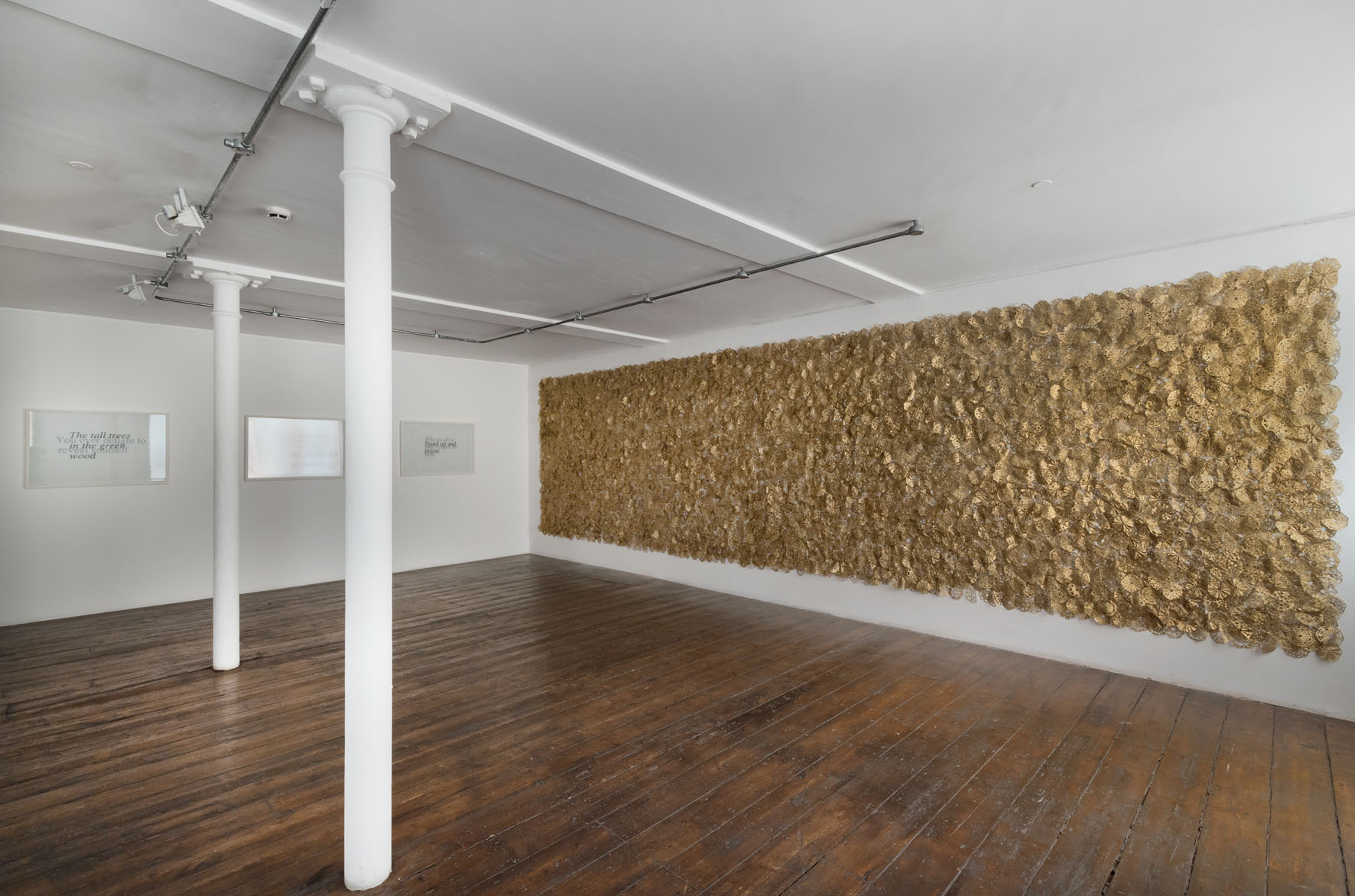
ARCHITECTURES DATA

The Freud Museum building prompted Anderson to
explore her first architecture and to measure - rather than sanctify
- its space. Her 2015 Paris exhibition, ’Data Space’, followed this
through by occupying a circular run of rooms on the 5th floor of Espace
Culturel Louis Vuitton. Anderson wove around the data formed from
copies of the building’s features – floorboards, cables,
skylights, skirting boards, cables and its lift - and installed them
as sculpture. Not only were the features transformed by displacement and their
seductive coppery sheen, but they were reshaped either by the process (e.g. the
ceiling panels distorted under the pressure of binding) or by the way
they were configured (the floorboards were shown in circular formations, the lift
cables looped intestinally). It was as if the space was inhabited by a version
of itself.
 |
| 181 kilometres, 2015 |
Perhaps the most challenging to make among
Anderson’s copper wire works is the Saatchi Collection’s pair ‘Bound’,
2011 and ‘181 kilometres’, 2015. The Freud Museum project included the
former, for which Anderson wound thread around a giant wooden bobbin,
making what she saw as a totem to the undersea cables linking the whole
planet. In the Museum context, though, one commentator saw it as reprising a
game Freud played with his young grandson in order to calm what he saw as the
anxiety of the mothers’ absence. Now it looms large, like the
inescapable childhood influences underpinning Freud’s view of our psychological
development. Anderson had to walk the eponymous 181 kilometres to
’spin’ an entire 2m wide sphere, a sculptural marathon of free choreography
which pushed her meditational intensity to new limits, and emphasised the
near-prosthetic role of the thread as an extension to her bodily
movements.
 |
| Columns, 2016 |
With comparable intensity of focus, Anderson has just
completed a permanent ensemble of sculptures at the Eiffel historical building
in Paris. It is based on the 3D ‘physical’ printing with thread of 5
architectural elements of the atrium (5 columns 5 metres high) and 15 data cables
suspended in the 2nd atrium as a 375 metre long ‘cloud’ of
connections. The project’s curator, Marie-Laure Bernadac, speaks of
‘virtual reality becoming ritual reality’ through the physical memorisation of
the architecture here, and of how Anderson points to how ‘we are only at the
Stone Age of this technological evolution which has already changed all models
- economic, social and ideological. This is not to resist the digital
world, but simply to anticipate and make tangible our physiological responses
its algorithmic and artificial memory’.
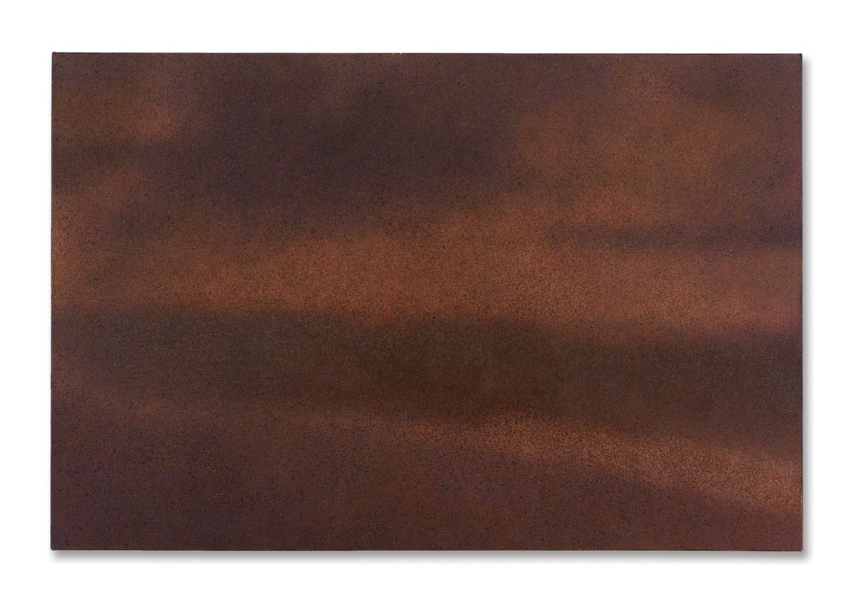
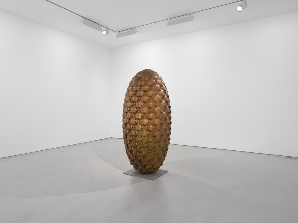
CAPSULES OBJECTS
The Capsules Objects enact the preservative aspect
of the Memorised Objects in a more specific and mournful context. As
Anderson puts it, “if an object breaks” – as opposed to the mere threat of loss
which is countered by recording an object with thread – “Something
has gone. I encapsulate the object in steel, I leave it outside for few weeks
until it rusts, then I perform a ritual and when the dance is over, everything
is repaired. The broken relation is healed”. The full series
of ‘Insouciance’ consists of 13 capsules , each containing a real
object: bistro table, bistro chair, bistro stool, menu rack, neon box, parasol,
hard disk, Ethernet cables, pair of trainers, broom, TV, DVD, coffee cup,
ashtray. Such items represent the experiences of many in the outdoor cafes
which are an intrinsic part of Parisian culture, but here Anderson presents
them as ‘broken’ – their associations altered by the terrorist events of 13
November 2015.
 |
| Insouciance, 2016 |
If the weavings can be read as mummification,
these are closer to time capsules, and whereas the copper which Anderson
uses is treated to prevent it rusting, the steel is left to rust in its
characteristic manner until time seems to personalise the memory. The rust, usually
an agent of corrosion and decay, acts as a protective barrier that the artist
uses all over her body during the ritual performances. The result is
conceptual minimalism: totem-like forms which take their shape from what
we cannot see. The obvious predecessor for that move is Manzoni, who claimed to
have filled cans with his shit. Perhaps he did, but if not then that too can
become part of his sardonic critique of value: Anderson’s time capsules,
though, really must contain what we cannot prove is there – indeed, if you move
the capsule you can hear the object inside.

The accompanying film documentation shows
Anderson along with three friends who are, respectively, a dancer, a
photographer and a writer, and captures how they respond to the capsules
objects once they reach the point of unawareness generated by constant
repetition. Anderson explains that she is “very sensitive to light and sounds,
and feel many vibrations and waves in various materials. When the rust from the
steel capsules touches my skin, it ‘outlines’ my body by creating ‘boundaries’
and I instantly feel more ‘concretely’ in relation to the world. It is truly
stimulating”.
PERFORMATIVE DRAWINGS
 |
| Nocturnal Drawing, 2012 |
 |
| Fridge - Object ID from Barcode, 2016 |
If the Nocturnal Drawings encode a
performance ‘for itself’, the Barcode Drawings go beyond the digital
to provide an alternative means of encoding objects. In her studio, Anderson
has a shelf of the barcodes she has cut from the packaging of all manner of
everyday items: a bottle of water, a globe, pizza, a fridge, a letter
from the bank, many an Amazon parcel. She has used these to work on objects’
virtual presence by drawing their digital identities by using a knife to cut
into a pastel ground. The process requires an obsessive replication of lines
and spaces, made consistent in scale and colour (red, rather than the original
black, tying in with her fascination for that colour). These small canvasses represent,
as Anderson sees it, “the soul of the object”.
 |
| Fridge - Essentia, 2016 |
As she made them, Anderson found
she was wiping off excess pastel, and was drawn to the resulting ‘accidental
drawings’ formed by the repetitive gestures of displacing the pastel from the
knife onto a cloth. You could see these are recording the performance of recording the objects. Extreme deliberation has its complementary in chance –
though for how long, before the wiping off becomes first deliberate and then
automatic, as if cycling back to chance in a new manner?
MINIMAL GESTURES
 |
| Cut Out Pieces 3, copper mesh, 2014 |
Where the memory works are partly about preservation,
Anderson’s mesh works look as if they will themselves need considerable
protection: their delicate squares tremble as you walk past them, poised on the
boundary between form and formlessness, and held together by nothing more than
static attraction. Anderson makes them by cutting up a whole sheet of copper
mesh. When combined by the assumed performance of her intuitive placement,
these automatically reconnect themselves as if feeling the need to get back
together. The meshes, like the time capsules, originate in public trauma:
seeing the type of fence used in migrant camps, Anderson imagined the freeing
action of cutting through them. It’s appropriate, then, that the wire is rather
sharp-edged, and needs considerable care in handling. The meshes’ mutability
suggests memories yet to take shape and how people, too, can re-form. There’s
also a built-in potential for separation and an apparent fragility – though the
sculptures are actually much more stable and robust than one might suppose.

Anderson, then, has created some compelling groups
of work. Looking across them, several common concerns are apparent. Abstract
forms emerge from her repetitive and minimal gestures in something of a
contrast with Frank Stella’s famous dictum ‘what you see is what you see’. What
you see is the trace of what Anderson has done, and her reasons for doing so.
Those actions relate to personal and communal histories. Both are potentially
germane to the viewer, who is – like the work – caught between an individual’s
relation to the concrete things of the world, and the communal context for
those interactions, what Wittgenstein called the ‘forms of life’ which make
sense of a person’s encounter with the world. The aesthetic that emerges has a
minimalist sophistication, but its generation is primitive, even
irrational.
And while there’s a strength to the materials
Anderson utilises there’s a concurrent vulnerability within the processes and
in the artefacts produced. We can see why protection is needed. Consistent with
the underlying minimalism, monochrome and repetition are used with rigour,
though the effect is not so much to pursue uniformity as to allow different
resonances to build up from the obsessive action. We’re more in the territory
of Ragnar Kjartansson singing the same song all day than of Charlotte
Posenenske collapsing the boundaries between art and industrial
production.
We might call the result POST-DIGITAL. Certainly it
is informed – indeed, troubled – by knowledge of the digital alternative, and
goes beyond it to seek new haptic relationships between people and the physical
world. Anderson’s post-digital rituals give us a directness of engagement which
a photo in a file cannot. Yet her practice might also be seen, taken as a
whole, to be mourning the loss of the pre-digital world, to yearn for
the times when rituals were charged with maximum power and objects were
restricted to their original selves.
From the opening on 11 November:


[1] I’ve noticed that people
tend to form their view of Anderson’s work by linking how she looks (a redhead)
with what she produces (such as objects memorised in wire which happens to
be the colour of her hair). Self and object are certainly present, but it
is more meaningful to concentrate on what she does and why.


