Sunday 22 May 2016

FAIR FACE-OFF: PHOTO LONDON vs, ART16


20-22 May saw a face-off between two youngish art fair pretenders: the 2nd Photo London at Somerset House vs. 4th-in-sequence Art16 at Olympia. Both venues have advantages and disadvantages, so average quality might be the decisive factor in judging between them, and there's no denying that the former - which balances historic and contemporary  - had much the best supplementary material and higher average quality. Sure, there was plenty of vacuity and not a little predictability, but probably 30% of what the 80 galleries showed was worth looking at if you had the time, compared with maybe 5% at Art16. Much of that 5% was Japanese: they were unquestionably the most impressive presence at the 'global fair'. And of course, with 110 galleries that's 5% of a lot, and there were some excellent editions, and interesting originals from artists well known to me, eg Rauschenberg, Kiefer, Atsuko Tanaka, Yayoi Kusama, El Anatsui, Rashid Araeen, Peter Zimmermann,  Ampara Sard, Shara Hughes, Juliette Losq, Juan Fontanive, Tony Charles and Simon Mullan... 

I was also able to track down five impressive new artists / developments at ART16...


Kojo Shiraya: Trinary, 2015 at Cojhu Contemporary, Kyoto. 

Ceramic artist Shiraya mixes Silica (SiO2), Alumina (Al2O3) and Lime (CaO) in different proprotions and fires them so that the chemical reactions - and hence the form resulting - vary according to the mix of the earth's crust's three main components.


 John McLean: Gioia, 2009 at Maddox Arts, London

I hadn't been aware that veteran abstract Anglo-Scottish painter John McLean (born 1939) had moved into sculptural equivalents, as in this 80 cm high acrylic on aluminium example, which translates - and signals in Italian - his typical geometric joy (gioia) in paint into three dimensions.


Takahiro Yamaoto: Palace, 2015 at Gallery Kogure (Tokyo) 
I've seen plenty of hyper-realistic drawings which look like photos, but even so the Japanese artist astonishes with his elision of past and present in 'Palace': a grid of 27 antique postcards (detail above) reproduced as drawn reflections to make a grid of 54, complete with signs of ageing. Yamamoto's virtuosity is emphasised by including an indistinguishable 'drawn original' among the postcards. 


Kostas Synodis at Julian Page & Joanna Bryant (London).  

There was room for a full-sized version of the young Greek-born Rotherhithe artist's cupboard-like studio opposite a set of new sculptures which looked like corten steel doing  unlikely things. That seemed even more implausible given his studio space, and they were actually resin-light but covered with iron powder. 


Zhao Zhao: Mouse Droppings, 2013  at HDM (Beijing) 

Zhao Zhao is a ex-assistant of Ai Wei Wei, so if his marble safe looked a little like some of  his former employer's works, well I guess he made those too. The 1.5m high 'Mouse Droppings' (in full and detail above) is an impressive not-quite-abstraction from studio life...


                                   _________________________________


It’s indicative of the difference in quality that it would have been possible to pick various  themes to follow through in five works from Photo London. Such as the body multiplied and combined...
              

Rudolf Koppitz: Movement Study, 1925 at Galerie Johannes Faber, Vienna

Some of the iconic images on view were over-familiar, but though I’ve seen this a few times, I struggled to recall it was by Austrian secessionist Rudolf Koppitz (1884–1936). His slice of symbolist sensuality has the modern air of a replicated individual, even though it’s just uniform coiffure and drapery. 


Ayana V. Jackson: "Drop your right hand / Why can't I turn around", 2012 at Gallery Badiou, Paris

This really is the American photographer herself three times, as she deconstructs the photographic conventions of rooted colonialist constructions of the primitive, titling her atmospherically tinted version of the three graces with an interactive dialogue as well as making the implied choice logically impossible. 


 Hans Breder: Untitled, 1971 at Danziger Gallery, New York

Multi-disiciplinary artist Hans Breder set up the Intermedia Program at the University of Iowa, where Ana Mendieta was his student, lover and model in the most iconic of his mirrored semi-abstractions of the nude which end up somewhere between Hans Bellmer and Robert Smithson. This is another from his 'Body/Sculptures' photographic series from 1969-73. 


Juliana Cerqueira Leite: Concentric #7, 2015 at TJ Boulting, London


Possibly the best stand was one of the smallest, combining multiple self-images by Juno Calypso and Juliana Cerqueira Leite. The Brooklyn based Brazilian brings dance – Martha Graham was an inspiration – as well as her primary medium of sculpture to bear in  satisfyingly rhythmic and mysterious collage compilations of poses.


Photographer Hal: #07_Rem&Marina from 'Flesh Love', 2010 at Ibasho, Antwerp

The melding gets more literal in curiously named Japanese Star Trek fan Photographer Hal’s series of couples encased in duvet bags from which the air is then vacuumed out in pursuit of a union with the perfect closeness of mythical times. Gimmicky, true, but compelling.


Sunday 8 May 2016

CABIN CLASS


Cabin Gallery, probably due to its location in Southfields, near Wimbledon, doesn't get quite the attention its shows deserve. For those who didn't quite make it, here are my recent texts to accompany those shows...

Aglaé Bassens


FRONT PARTING

6 May - 11 June 2016


London-based young Franco-Belgian Aglaé Bassens’ recent shows have, you might say, made something out of nothing, gracefully uncovering the atmospheric melancholy in empty fish tanks, viewless windows, curtains and sofas. At CABIN, though, such reifications of emptiness are outnumbered by a new stream which, you might say, makes nothing out of something. We are pretty-much defined by our bodies and our heads, but Bassens presents only partial views of them: claustrophobic, awkward, intimate perhaps, but also shuttling those subjects back towards emptiness.

Other painters have made this move, but have tended to use a hyperreal technique of objective scrutiny. Ellen Altfest provides a good example: every follicle and wisp is painstakingly captured in her tightly-cropped sections of hirsute male flesh.  Bassens, in contrast, carries on with her distinctively fluid, rapid, intuitive application of paint, which points to colour field abstraction rather than photorealism. How, she was asked recently at her extensive show at the Revue Gallery, do you create the impression of painting with single strokes? ‘I paint with single strokes’, she replied.  Yet the results, like Altfest’s, oscillate between desire and detachment.  After all, when do you really pay attention to how hair is parted other than when homing in on the minutiae of a loved one? Surely that peep-through of ear is waiting to be nibbled?  And when do you look closely at how a shirt buttons up, other than when you intend to unbutton it? The more so, perhaps, in a fresh infatuation, in which context the third subject of Bassens’ paintings at Cabin – the curtained window – may signal the potential for pulling aside any obstructions to new experience.

As Bassens says, ‘the title ‘Front Parting’ suggests an element of sensuality to these new works, or at least of self/other and male/female’. There is also a literal aspect. We see a front-parted hairstyle in Forehead, one of the apparently female extracts here. And where is a shirt, which reads naturally as male here, parted other than at the front? And a curtain too, come to that?  Yet a certain plangency remains in play, for parting also evokes loss.  A curtain, after all, can be an exercise in frustration as well as temptation. Now that I think of it, that’s the other context for the partial view: glimpses of what you’d like to be closer to, are keen to experience whole, and yet cannot. ‘We passed on the stairs, and the way she parted her hair haunts me still…’.


 There are other ways, separate from the seemingly casual handling of paint, in which Bassens’ work departs from realist models. The framing and staging of the image tends to call attention to the choices being made and presented to us. Indeed, Bassens has sometimes included the process of painting in the painting. That staging extends to the scale, especially if what seems insignificant is blown up as big as Big Shirt Painting (there’s a twist of humour there, too: what’s big, the shirt or the painting?). Moreover, to monumentalise the partial view is to make it an explicit strategy, not a playful failure to fit the whole in. ‘I was interested’, she says, ‘in being so close to something you cannot see it’, in a phrase which retains a mournful undertow, as it might equally apply to the failure to remain objective or to the flaws in a relationship revealed only by a traumatic event. Bassens also has one eye on the history of art. The window can stand for plenty in that, and there’s a long history of white abstraction – it’s enough of a cliché that Yasmina Reza’s play Art revolves around it. The shirt and curtain paintings nod to that modern trope, though what the shirts remind me of more are snowscapes. Those blues have crept in from Monet and Pissarro. Then the ear in Ear plays the role of Fontana’s slash in the canvas.

This is the point at which we could hurtle on all the way to Freud. But actually I don’t believe it’s there in the work. That’s just the sort of interpretation Susan Sontag was against, one which imposes a metaphorical straightjacket on what the artist really means. There is a sensual tug here, but it’s placed in a setting which holds our engagement in check. Such art is reflective, rather than directly empathetic, and reflective art, said Sontag, though it ‘should not be frigid’, should be set up such that ‘the pull towards emotional involvement is counterbalanced by elements in the work that promote distance, disinterestedness, impartiality. Emotional involvement is always, to a greater or lesser degree, postponed’.[i]  Sontag spoke of ‘the erotics of art’, implying that we should approach it through sensuous engagement with form rather than seek a metaphorical interpretation of what it means. She wanted ‘transparence’, which she glossed as ‘experiencing the luminousness of the thing in itself, of things being what they are’.[ii] Circling back to how Bassens hooks us in to the world by applying a fluent painterliness to unexpected subjects, ‘transparence’ may be the word which catches how she makes something out of painting what seems nothing, and why she doesn’t quite make nothing out of painting something. Sontag, I reckon, would look at this show and ask: ‘see what I mean?’.

[i] Susan Sontag: Spiritual Style in the Films of Robert Bresson, 1964
[ii] Susan Sontag: Against Interpretation, 1964
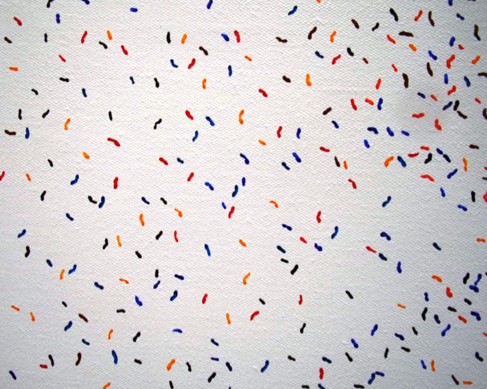
Willem Weismann


MOONBLINKING

18 March - 16 April 2016


Willem Weismann explains an old practical joke from his native Netherlands: ‘look at the squashed nose in this book’, you say, showing someone the open spread. As they peer in close to see, you snap the book shut on the nose. Just so, Weismann’s paintings trammel wittily between image, process and reality. Just so, you are lured in – typically by a harlequinade of inventory and colour – only to realise that the scenario shown is some sort of end game for the world. But also, typically, it’s difficult to get overly stressed by this: the slightly kooky figures in their rainbow splendour are hard to take seriously as tragic figures; it’s only a slap on the nozzle, after all.

In fact, there was a lot of close peering into books in Weismann’s show at The Nunnery last year.  He was implicitly comparing them with paintings: the same feeling of a dated medium, the same one-on-one artist grappling with his means of expression at desk or easel, the same reader /viewer need to slow down to take in the result, the same net-provoked tendency not to do so. Clearly, he felt a common cause, and though books aren’t prominent in Moonblinking, it’s evident that Weismann still values the ancient pattern of individualist creation with the hope of creating engaged individual responses.


As you approach Cabin, there’s a fairly typical Weismann in the window, facing out. A character, bordering on caricature, stares through binoculars. Is he spying on us? Is he surveying the scene, more benignly and a little optimistically, for visitors to the show? Or is he, as the painting’s title, ‘Signs of Life’ suggests, scanning a post-apocalyptic scene?  Whichever way, you might think him an odd fellow, scratching an obscure symbol in the sand, equipped with battered travel case and clunky old mobile phone, wearing a baseball cap with a binocular-length peak and a multi-coloured top more like a pinafore than a shirt – and which has actually served as the palette on which he’s put the colours for the painting. That last move is normal in Weismann’s world, reminding us of where we are. Weismann dreams up his scenarios in the studio, he doesn’t take them from photographic sources or models, and so the inclusion of the palette, which occurs in various playful ways, serves to make his whole self-contained system transparent.  In pointing to the painting as a painting, it allow us to read that garment / palette as clothing, as abstract patterning, as paint made explicit, as an index of the painting as a whole. 

That’s the move which Tom Morton has identified [i] as lampooning those who speculate on the ‘death of painting’. The paintings are mocking the demise supposedly faced by the medium.
If you’ve seen Weismann’s work before, though, you’re in for a conk-squish of surprise when you enter the gallery. The paintings are dark. They use black oil only, with glimpses of bare canvas serving as light. Perversely, as it seems,  Weismann has decided to see what’s left of his signature style when its most prominent feature – those slightly crazed edge-of-clashingchromatic blitzes suggestive of slight colour blindness – are removed. There are still blobby signs that Weismann has wiped his brushes on the canvas, but they merge into the gloom – if you weren’t looking for them, you wouldn’t spot them – and they could be self-parodic, for what’s the point of a palette with only one colour on it?

Kate Lyddon


ON DROOL

12 February - 12 March 2016


We know what life is: rough and smooth, ugly and beautiful, cheap and expensive. Likewise the world: land and sea, fantasy and reality, now and then. But modernity can blur those boundaries: just to take death - in the hospital, not on the gallows; few starve on the streets; most lynchings take place by social media. Wind back 600 years and the delineations were sharper: saint and sinner, master and servant, freedom and slavery. Kate Lyddon is something of a medievalist, and such distinctions course through her work. Indeed, her recent show at the Zabuldowicz Collection revolved around wood spirits and bark witches.

Lyddon, then, trades in the clash and reconciliation of oppositions. That, in philosophical terms, might make her a contrastivist of sorts. Contrastivism is an epistemological theory, which is to say it deals with how we gain our knowledge of the world. That theory’s adherents say that knowledge is not a relation of the obvious two places – not, for example, ‘she knows it is purple’ – but of three, eg ‘she knows it is purple rather than blue’. That implies that she might not know that ‘it is purple rather than magenta’ – those are different degrees of knowledge. So, in Lyddon’s case, we might say not simply ‘she knows it is beautiful’ but ‘she knows it is beautiful rather than ugly’. The contrasts are entwined. We might be reminded of the defence of God for allowing suffering: what is pleasure without the possibility of pain? Lyddon’s twist, though, is that beauty doesn’t merely operate in the context of ugliness, but that they are potentially interchangeable categories. Not only do we define the beautiful partly by reference to the ugly, but the ugly may come to be seen as beautiful.

Lyddon enacts this contrastivism through both content and materials. Her portraits, if that’s the right term for imagined faces, use the traditionally significant medium of oil on canvas - expensive enough in pre-modern times that having one’s likeness made was indicative of wealth and status. Just so, Portrait [Woebegone] is wearing a ruff and Portrait [Blood-Red] a crown. That sets up the expectation of flattery, seriousness and impressive form and colour. What we get, though, is a cast of curiously-hued oddballs who seem decidedly unlikely to have been able to pay for their depictions, or – we might assume – to want to be depicted. Their features are, on the face of it, ugly by conventional standards. Are they diseased? Lyddon takes an interest in freak shows, medical history and in disfiguring conditions such as epidermodysplasia verruciformis or Tree-man Illness. Or perhaps they’re wounded - we might think of the disturbing aesthetics of Henry Tonks’ paintings of World War I casualties.

And yet... isn't there also a certain allure here? Portrait [Peely-Wally]’s skin is a potentially cool blue, and the decoration which doesn't so much emphasise as take over the eyes could be a fashion of the future.  The nose on Portrait [Liverish] is decidedly porcine, but perhaps our aesthetics should extend beyond the human, as well as beyond the narrow expectations of gender which these androgynous characters seem to evade. These figures are beautifully ugly. Or, looking in the other direction, consider how ugly beauty can seem:  the inflated collagen lips, frozen Botox expressions and lurid orange tans arrived at in the name of beauty can push beyond its conventions into quite different territory.

And there’s another ambiguity: are these accurate portraits, or is this just how the artist has chosen to represent her subjects, reflecting a diversion into the pleasures of using her materials?  Is it that the king's face is distorted to melting point in an eerie match for his elongated earrings, or has Lyddon exaggerated the earrings and carried that over into a face which replaces reality with a different potential for beauty - the painterly?

Lyddon’s sculpture, too, contains contrasts of both material and content. On the material side, ceramic and copper play off polystyrene and cast-off table legs. All the signs are that they are valued equally, and that Lyddon enjoys the way different materials provoke different responses. Clay-rather-than-polystyrene and polystyrene-rather-than-clay work more strongly for Lyddon in the context of how they could have been each other. So far as content goes, where the portraits do, by and large, appear whole, the sculptural characters are incomplete.  Yet maybe we're in the superficialising grip of conventional expectation once more. The ‘aesthetic of the fragment’ is well known, but isn’t conventionally applied to the living or the new. Why not go further, by collaging together those chosen elements and – embracing the grotesque – arrange body parts as surreal conjunctions of found objects?

Those two aspects are plain in Lower Limb with Spoon and Straw, in which a one-legged form, resplendent as a limb can be in scarlet Lycra leggings, relies on a copper pipe as an implausibly thin stand-in for his second leg. He’s lost his torso and arms entirely, and his head to the extent that it’s rolling on the floor. Where it used to be attached, the neck’s severance reveals the crudeness of the polystyrene of which he’s made.

Put the paintings and sculptures together, and you won’t be surprised to learn that Lyddon used to make paintings with all sorts of collage elements applied to generate that clash and reconciliation of opposites: it felt like Bacon meets Klee meets Quasimodo meets My Little Pony all on the canvas with scrawled lyrics to boot. Now paintings and objects have gone their separate ways, but come together as an installation in which copper tubes and cutlery act as connectors. The pipes remind us of plumbing inside the body, and their striping of a barber's pole. It’s said that such signs originally mimicked the bandaging after the medieval service of bloodletting (barber, surgeon and dentist being less distinct roles 600 years ago). If the copper tubes, then, stand in for the body’s processes of flow and waste, then the spoons stand in for sustenance. A circuit is proposed, related to the biggest contrast of all. There’s a play on the nobility of being ‘born with a silver spoon in the mouth’, while making it plain that - however valuable the implement - it all goes down the same way. As do we, in Larkin’s words, ‘down the long slide / To happiness, endlessly’ – in High Windows’ elision of another contrast, from the life-giving force of sexual discovery towards the only conclusion of our pursuits.

Cheer up, though! For Lyddon, like Larkin, brings an irrepressibly enjoyable relish to her account of the human condition.  There’s more comedy than tragedy in her contrastivist account of how history has brought us to this beautifully ugly pass. If all human experience, bodily and psychic, feeds through Lyddon and into her art, then On Drool is ‘about life’. It sounds trite to say so, but that’s how the work takes on its own – far from trite – life in practice. And, after all, what other subject is there?


Jonny Briggs


TO EAT WITH THE EYES

20 November - 31 December 2015


The family is not what it was. Our lives are far more fluid, geographically and affectively, than they used to be. Quite likely your parents have divorced and live hundreds of miles from each other and you. Quite likely it wouldn’t occur to you to follow in their professional or social footsteps. Quite likely you have enough choices, physically and virtually, to feel that blood relationships are or could be only a small part of your life picture. Yet we’d all accept that our family background is a formative influence on who we are. Most of us keep that in the back of our minds, and move on: so successfully that there has been recent press coverage of a trend for adult children ‘abandoning’ their ageing parents.

Moving on isn’t enough for Jonny Briggs, though. He wants to break more radically. “Escape,” wrote Emmanuel Levinas [i], “is the need to get out of oneself, that is, to break that most radical and unalterably binding of chains, the fact that the I is oneself.” For over a decade, Briggs’ art has attempted to achieve that. As he puts it: ‘I try to think outside the reality I was socialised into and create new ones with my parents’. Here, of course, a paradox lurks: for can a self which is largely formed by how and where it came into being ever truly break free from the background which indirectly determines the nature of those very escape attempts?


Briggs is, of course, aware of the problem. That gives his work an edge which feeds into his own embrace of paradox at the level of individual works. And the effort does lead him somewhere, even if it he can’t get where he hoped to go. Imagine an athlete who sets himself the goal of running a six second 100m. He won’t succeed, but if he trains hard enough he may get to a place – say 10 seconds – he would not otherwise have reached.

Briggs has used several approaches to these ends, in all of which we’re aware of his presence as the artist, though it’s normally his parents whom we see. He has directed them in photographic tableaux which – through his controlling role as artist and photographer – reverse the parent-child power relationship. He has treated the home as a metaphorical body, especially when grappling with his grandmother’s cancer, and explored the cognitive psychology of ‘context dependent recall’ – the way a place can act as cue for memories. He’s turned around his memories by montaging his parents’ heads onto photographs from his childhood.  He has made us think that he has constructed realities out of collaged or photo-shopped elements, only for it to turn out that the situation is at one level ‘real after all’.

‘To Eat with the Eyes’ approaches those issues by different means: most of the works are detourned versions of historic black and white photographs of his grandparents and great grandparents.  The alterations all reconfigure the gaze of his relatives. Several are rendered monocular by a splicing which combines their eyes. The effect is unsettling - maybe that’s why we speak of ‘the evil eye’ rather than ‘the evil eyes’. The one all-seeing eye seems to stare us down, oddly, more fully than two would. There’s something forensic about the look: I’m put in mind of a security camera as much as a person. Knowing Briggs’ trajectory, though, we’re bound to read these as another attempt to alter the construction of his own identity, this time by going back to earlier generations and recasting how they see him.

The second group of photographs altered by what Briggs calls his ‘mindful vandalism’, it being more controlled than iconoclastic destruction, is somewhat ironically entitled ‘the Envisionaries’.  Here Briggs obstructs his ancestors’ eyes by pinning lips onto them. That makes for the right organs with which to ‘eat with the eyes’, and picks up the suggestion in that phrase of the consuming appetites which sight can stimulate. The prominence of the pins is, again, disturbing, and the extra mouths do nothing to change the fact that the dead can’t speak.
The contemporary colour images of Briggs’ mother provide a contrast.  They do set up oracular conjunctions, but the effect is more akin to a comical wink to indicate connivance. If they’re sharp eyes, that may be literally implied by how glass meets in the middle of them. That’s caused by the technique of cutting and conjoining not just the image, but the frame and mount as well, collaging the image as object.

The forensic note returns in what seems at first and, indeed, second glance like a rather attractive record of the woodland floor even if we guess – rightly – that this is where Briggs grew up, making it something of a primal scene for him.  Near the lower right hand corner, though, you may spot a mouth. Remember the opening scene of David Lynch’s Blue Velvet, which zooms in on an ear in the grass? This may be just a photograph of Briggs’ mother’s mouth, but it’s disquieting nonetheless, once found. It plays another version of the mouth for eye pun through the title: Peephole. But is it for dark forces to spy on us from under, or for us to look through and check we’re safe?

All sorts of arcana feed in to Briggs’ work:  he mentions that the Japanese have a word for ‘cute enough to eat’; talks of the Amazonian tribes who believe that it shows great respect for the dead to eat them; the psychological theory of transference; how much he’s just enjoyed visiting a mannequin factory; that he’s experimenting with the practice of meditating with a partner by them staring into each other’s eyes unceasingly. As such background thinking indicates, these are not casual images, and Briggs plans his effects with economically precise drawings which act as stage directions for how his photographs will be set up.  Yet the underlying issue remains that comparatively simple paradox: how was I formed, and can I escape that? Will I always be trapped in the nexus of the past, no more able to move on completely than to literally eat with my eyes?

Friday 6 May 2016

CHOICES FROM JAN - APRIL 2016 NOW CLOSED

Mark Wallinger @ Hauser & Wirth, Savile Row – Central
id Painting 12, 2015 - Acrylic on canvas, 360 x 180 cm

Mark Wallinger’s first solo show for Hauser & Wirth fills both impressive spaces and gains traction from how several works build to a vision of the self – not as straightforwardly unified, but rich in variant perspectives. One gallery is full of the 3.8m high ‘Id Paintings’ which explore the tall dark format of Wallinger’s versions of the I from different fonts, but with expressionist gestures applied with the hand and laboriously replicated in Rosrchach-like way.   The other contains the superego of a giant mirror revolvingon high, national identity linked to revolving views of an oak tree on a roundabout in Essex, and the artist as flaneur seen only as the shadow which precedes him through the city as he walks to experience it. 
Orrery, 2016 -  4-channel video installation, sound

                                          _________________________

Finbar Ward: In Absence at FOLD, 158 New Cavendish St – Fitzrovia


It hardly sounds feasible to merge Robert Ryman, Steven Spielberg and Carlos Cruz-Diez, yet they all came to mind at Finbar Ward’s novel sculptural installation of 300 small paintings.  Ryman as the face of each is a deceptively painterly monochrome, predominantly white but not without colour – a framing device of artist-ground cobalt violet. Spielberg because the obsessive line-up of fin-shaped canvasses brought a certain film to mind. Cruz-Diez bacause if you walked past the serried whitenesses then turned back, you saw the scuffed and contingent rear sides of Ward’s offcuts of found wood, many of them festooned with a notational ‘b’ for back, setting up a contrast worthy of a Physiochromie.


    ________________________


Anna Barriball: New Works @ Frith Street Gallery, Golden Square - Soho


Night Window with Leaves, 2015 -  Pigment and beeswax picture varnish on paper,            235 x 124 cm
I’ve never seen Anna Barriball apply her signature frottage with more resonance than here, moving from morning blinds; to her studio windows, pressed full of light; to a candle-smoked evening; and through to the first sunrays of a new a diurnal cycle, taken from lead window designs. She’s in there too, via the sequins on her T-shirt vibrating to her heartbeat. That suggests ultrasound, and Barriball has indeed just given birth, setting up a contrast with Night Window with Leaves, which memorialises a former neighbour. All use the exacting indexical sculpting of a small pencil to press her work up against the world, as if to avoid, in her words ‘the space between looking and representation’. 

Sunrays II, 2016 -  Pencil on paper,  52 x 53 cm
                                                              ________________________


Dunhill and O'Brien: Rockery @ White Conduit Projects, 1 White Conduit Street - Islington

 To 30 April:  http://whiteconduitprojects.uk   (artist talk 21 April)


A few weeks ago I mentioned in my weekly column that Islington made for a good gallery tour, and that’s still true now * – including this fascinating show which compares the Japanese and British attitudes to rocks. Just as Tracey Emin has confounded the usual relative expectations by marrying a stone, long-time collaborators Mark Dunhill and Tamiko O’Brien ponder two Japanese traditions of rock veneration. They apply Suiseki - the ‘Art of Stone Appreciation’ - to glacial rocks in Britain through a series of videos; and make a window display echoing the nearby Chapel Market out of cardboard versions of the Edo period’s Fujizuka – the construction or selection of surrogates of Mount Fuji for the edification of women then disbarred from the mountain itself.  Add a witty ‘surprise yourself with a rock sculpture by doing it blind’ and the show, erm… rocks.


Stone Appreciation: having discovered ‘celebrity’ rocks by purchasing postcards on the Internet, Dunhill and O’Brien  visit and measured these much photographed landmarks, such as the Bowder Stone in Cumbria.

 * it’s worth mentioning Liane Lang & Nigel Grimer at the James Freeman Gallery   and Joby Williamson at Tintype

                                                  ________________________

The Missing: Rebuilding the Past @ Jessica Carlisle, 4 Mandeville Place – near the Wallace Collection


Still from 'The Quake'
What’s just the second show in Jessica Carlisle’s handsome permanent space is a timely artistic response to the iconoclasm in Syria. It effects a mournful tone which nonetheless mines the uncomfortable aesthetic attraction which ruins acquire. Piers Secunda consistently operates in that area, as in his head with and without casts of bullet holes from a frontline Syrian village; less expectedly, Matteo Barzini’s impactful reportage film The Quake, 2015, features a soundtrack by Ennio Morricone which wrests a haunting beauty from the noise of destruction. Turning to reconstruction of sorts, Syrian refugee Tmam Aikhidaiwi Alnabilsi replicates a now-damaged mosque, and the Institute of Digital Archeology shows the maquette for what will soon become a full-size 3D print of the Triumphal Arch of Palmyra in Trafalgar Square. Add three more artists, including James Brooks’ poignant classically-infected meditations*, and the range impresses.     

Piers Secunda: ISIS Bullet Hole Painting (Assyrian Head), 2015-16 - industrial floor paint, metal fixtures

* see my Feb 2016 choices for a fuller discussion


                                                         ________________________
The Conformist @ Belmacz, 45 Davies St – Mayfair
To 16 April:  www.belmacz.com/gallery/
David Parkinson: Untitled, 1970
More fine writing (by James Cahill, incorporating quotes from brass kissing to cross dressing from Denton Welch’s weird novel ‘In Youth is Pleasure’) accompanies this hugely enjoyable answer to the question: how many rebellious non-conformists can you fit into one of London’s smaller gallery spaces? The answer turns out to be 20 plus a soundtrack from Jah Wobble, covering the gamut of fashion, advertising, fine art and jewellery, with highlights including Julie Verhoeven’s manic new film Phlegm & Fluff, corn masks by Jonathan Baldock, Helen Chadwick’s self as ruin, and the rediscovery-worthy photographs of David Parkinson (1946-75).

Julie Verhoeven: Phlegm & Fluff, 2015, Film, 04:19
  __________________________


Michael Joo: Radiohalo @ Blain Southern, 4 Hanover Square – Mayfair

To 9 April:  www.blainsouthern.com


Untitled, To (Sleep), 2015-16 - Silver nitrate and epoxy ink on canvas 91 x 71 cm


Does this show have the substance to justify its rhetoric and scale? American Michael Joo is onto something in exploring the body as a generator and consumer of energy (hence the integration of calorific values for its actions) combined with the use of silver nitrate to make painting-come-photographic events which go halfway towards reflecting our own actions into the scenario. A monumental marble billboard adds convincing sculptural / architectural language, contrasting the marble’s own painterly effect on the front with a silvered rear at a height which brings in the space but not the viewer, and playing reflected transience off against geological timescale. Yet add in the eponymous radiohalo, the faultline in New York, Buddhism, and the graphite legs of endangered cranes scratching drawings over the stairs, and I have trouble putting it all together coherently - but it’s impressive enough to be worth puzzling on yourself.

Installation view with Prologue (Montclair Danby Vein Cut), 2014-15 - picture Peter Mallet

__________________________


Preview Special: Having written the catalogue essay for John Stark's forthcoming show, I can predict it will be interesting. Moreover, it has its own comet:

                                                      _________________________


Shows to see in 2016

There are perhaps too many shows in the world to choose meaningfully for the year ahead, especially if you include commercial galleries, so this  cunningly biased list is just my planning list of some institutional exhibitions I’ll be placed to see and am looking forward to…

London

Heather Phillipson: more flinching -  Whitechapel Gallery 12.2 – 17.4
Rana Begum - Parasol Unit - July- Sept
Under the Same Sun: Art from Latin America Today - South London Gallery – 10.6 – 4.9
Ragnar Kjartansson - Barbican - 14.7 - 4.9
Abstract Expressionism – Royal Academy, 24.9 – 2.1.17
Paul Nash – Tate Modern 26.10 – 5.3.17
Robert Rauschenberg – Tate Modern 1.12 – 2.4.17

UK
Michael Simpson: Flat Surface Painting - Spike Island, Bristol – 14.1 – 27.3
Gerard Byrne: 1/25 of a Second -  Mead Gallery, Warwickshire – 16.1 – 12.3
Prunella Clough: Unknown Countries – Jerwood Gallery, Hastings 23.4 – 6.7
Tonico Lemos Auad – de la Warr, Bexhill –  30.1 – 10.4
Francis Bacon: Invisible Rooms – tate Liverpool – 18.5 – 18.9

Europe
Francesca Woodman: On Being an Angel – Foam, Amsterdam – to 9.3
Hieronymus Bosch: Vision of Genius – Nordrabants Museum, Den Bosch 13.2 – 8.5
Francis Picabia: Our Heads Are Round So Out Thoughts Can Change Direction – Kunsthaus Zurich – 6.3 – 25.9
Paula Modersohn-Becker: Intensity of a Glance – Musse d’Art Moderne, Paris – 8.4 – 21.8
Reinhard Mucha - Museum für Gegenwartskunst, Basel 19.3 – 16.10


Liam Scully: A Digital Suicide

 @ Union Gallery, 94 Teesdale Street - Cambridge Heath

To 22 April: www.union-gallery.com


What sounds like a dry technical exercise – Liam Scully’s bid to commit ‘digital suicide’ by eliminating all his online information, and compiling it into a book instead – proves very hands-on and lively. There are three reasons for that: the use as ground of pink electro-cardiographic paper resulting from another personal link, his participation in medical tests; the very free drawings which he lays over the data streams on these grounds, being versions of the images in his Facebook stream annotated to comment on the messages and images beneath; and the sheer grid-force of having 300 originals crowd out the gallery’s walls (from the book's 953 pages:the others are on video) . In sum, the serious undercurrent of reclaiming control of one’s own data becomes a worthy addition to the tradition of obsessive recording of the self in art: stick this with, say, Roman Opalka, Tehching Hsieh, Danica Phelps, On Kawara and Philip Ackerman and you'd have quite a show...


                                                     _________________________

Thomas Mailaender: Gone Fishing @ Roman Road, 69 Roman Road – Bethnal Geen - and at Tate Modern 

To 15 April (Roman) / 12 June (Tate): www.romanroad.com


In this satirically simple satire on male irresponsibility, the French artist Thomas Mailaender tells the story of a man abandoning his wife and child in order to find himself through a series of physical and sporting challenges. He writes home, boasting of his exploits, declaring his undying love and moutiing bafflement that he gets no replies. Actions speak louder than words, and each letter has a photograph of his triumphs – landing a shark, say – for which Mailaender has digitally inserted his own face onto images found on the Internet. The artist wasn’t at the opening, as he was off skiing with his wife and children – demonstrating his contrasting responsibility or paralleling it by abandoning that to his gallerist? I don’t think she can complain, as you can see the same material in a different installation in Performing for the Camera at Tate Modern.

Installation view at Roman Road: letters with photos and the whole room covered in fake brick effect
                                                   _________________________

Frequent Long Walks @ Hannah Barry Gallery, 4 Holly Grove - Peckham

Michael Dumontier & Neil Farber: I grew these trees to hold up this message of patience, 2015 - acrylic on cardboard, 18 x 18 cm
 
Hannah Barry and her artist Christopher Green, who has curated and contributed a cheekily self-effacing painting which acts as the sign between floors, have done wonders in pulling together a stellar cast of 14 for this exploration of work which possesses, says Green 'a kind of slowness' in the manner of taking a long walk in which you don't worry if your route in the fastest. Archive material from Agnes Martin and Anne Truitt - explaining how she tries to move colour out into space -  set the mood nicely. Vija Celmins, Ian Hamilton Finlay and Hreinn Fridfinnsson feel like logically enjoyable choices, but Mary Heilmann's painting-chair pairing, the dotting around of Richard Artschwager blps, and five typically laconic little paintings by Michael Dumontier & Neil Farber provide less expected aptness, and then n there are 11 photographs of kitchen compost by Nigel Shafran. Hmmm...  
Nigel Shafran: from 'Compost Pictures'

Aglaé Bassens and Eric Oglander: What You Can’t See @ Revue Gallery
14 Greek Street - Soho

To 27 March: http://sohorevue.com/revue-gallery/current/


Suddenly, as it seems, a big, centrally placed gallery I haven't heard of puts on an extensive show, complete with an impressive commissioned mural and lively catalogue, of one of  London's best young painters. Aglaé Bassens generates brooding atmospherics, alluring painterly effects, awareness of process and art historical references from near-empty content: curtains, sofas and fishless aquaria take centre stage here, the green murk in one of the latter being titled ‘Dear Algae’ in a cute reference to how often people mis-spell her (Franco-Belgian) name.  The painting shown depicts a rain-occluded windscreen and car mirror reflecting the rear window's heating elements, linking neatly to would-be-empty content of a different order: pictures taken by people looking to sell mirrors online, as selected by American Instagram star Eric Oglander for what they accidentally fracture or reveal.


Eric Oglander: from the Craiglist Mirrors project, ongoing


  __________________________

Jeff McMillan: South Face @  Handel Street Projects, 14 Florence Street - Islington & Tell it Slant @ Frith Street Gallery. Soho Square, 60 Frith Street- Soho


To 26 March (Handel) / 29 April (Frith)

Jeff McMillan: Offside Drawing, 2015 - Gloss paint and ink on paper, 28 x 21 cm

 Jeff McMillan has unusual double. Handel Street Projects has two strands of his own post-painterly painting: he has previously dipped found paintings in paint to disrupt them by semi-abstraction, now he applies the process to graph paper to fully abstract effect; and inks the back of other found paintings before leaving them outside to take on the whatever a painting’s equivalent of patina in called.  Meanwhile, at his partner Cornelia Parker’s gallery, he’s made  a wonderfully eclectic section of a dozen artists using abstract drawing in a wide sense:  from  Louise Bourgeois’  construction from a lifetime’s fabrics, to the coded outside carpentry of Zebedee Armstrong, to the folded aeroplane which had been unfolded as the basis for a drawing of sculptural potential by Massimo Bartolini -  who is himself next up in Frith Street Soho Square space.  


Massimo Bartolini: Untitled (airplane), 2012 - Ink on paper, 160 x 110 cm


 Kazuo Katase : mimesis: u tsu su @ White Rainbow, 47 Mortimer Street


To 24 March:  http://white-rainbow.co.uk


Kazuo Katase Bowl 7.4.2024 -  Pastel on hand-made paper, 105 x 140cm
Pastel is faring well this year: hot on the heels of its classical master (Jean-Etienne Liotard at the Royal Academy),  the freshest works in Chantal Joffe’s show at Victoria Miro also uses it. The German-based Japanese artist Kazuo Katase, on the back of a substantial history of conceptual installation, has used it since 2011 to boil down his thinking into an ongoing series of  empty bowls, which act as semi-hemispheres ready to be the halves of a globe in an east-west duality. Despite their uninfected rendering, they gain a zen-tinged standing-yet-floating contemplative presence through eerie lighting and the ectoplasmic mist in some images. If you asked Morandi and Turrell to collaborate in India, you might arrive somewhere like this…

Kazuo Katase Bowl 24.3.2012 - Pastel on hand-made paper. - 105 x 140cm


  __________________________

Jost Münster: New Neighbours @ Tintype, 107 Essex Road - Islington

To 26 March: 
 www.tintypegallery.com/


Installation view with Neighbour No. 7 centre
This seems a straightforward show: London-based German Jost Münster riffs on the architectural features of what could be his neighbours’ properties, layering them ambiguously into large acrylics, made liquidly on the floor, then sees how they play out as neighbours to each other.  But there are also small watercolour studies, a ‘Waiting List’ from which you can play the judge of what to develop at scale; and in one case we have a preliminary pencil study as well as a watercolour still on the list even though it’s become New Neighbour 7. And that’s a curveball: from colourful study to just black on raw canvas (and using a new-fangled acrylic pen applicator rather than a brush); and where the others use rectangular geometries, a one-line labyrinth of curl. Not everyone fits straight in to a neighbourhood, but then again perhaps the strangers, potentially, can.

The 'Waiting List' with preparatory stages for No 7 top left


 __________________________


Miriam Austin: Lupercalia @ Bosse & Baum, Copeland Estate, 133 Copeland Road - Peckham


To 25 March bosseandbaum.com 

Miriam Austin’s biggest solo presentation to date sees her take over Bosse & Baum’s substantial warehouse space, largely with her signature beautiful – though often poisonous - material of plant forms covered in prosthetic silicone to make somehwta corporeal regalia which looks as if it could be worn in performance (though when Austin performed at the opening, she was in her full body fish skin).The illustrated elements of Prosthetics for Hostile Contexts become, rather, a sculpture which itself performs, as ice drips into a mesmerising deep blue pool (with delphiniums and red cabbage stained water). Elsewhere, the gorgeous palette of frozen floral fades is offset by serried ranks of aluminium tools, elegant forms which look as if they could be just the new invention her rituals require – though it’s not at all obvious how to use them. 


Ryan Mosley: Anatomy and The Wall @ Alison Jacques Gallery, 16-18 Berners St - Fitzrovia

To 12 March: www.alisonjacquesgallery.com

Expedition to the Interior, 2016 - Oil on canvas,210 x 155 cm
Ryan Mosley may be the closest Britain has to Neo Rauch's way of painting - but where Rauch segues pre-communist and more recent elements into baffling narratives with a faded poster palette, Mosley conjoins the nineteenth century with ours in surreal situations which tend towards the hallucinogenic. Here a range of character portraits combine with more complex compositions  which feature - by way of my illustrated examples - the humps of a fluorescent camel rhyming with a beard under a black sun; and a skeleton atop a cabinet, pipesmoke forming a moon, Afro hairstyles matching another beard on people most of whom who could be just pictures, with a bottom right sector resembling  passage from Thomas Scheibitz. The result is too much enjoyment to fuss about meaning.

Posturing for Conversation, 2016 - Oil on canvas, 183 x 150 cm
__________________________

Kate Lyddon: On Drool @ CABIN, 11 Brookwood Road - Southfields

To 12 March: www.cabin-gallery.com


Installation view
Kate Lyddon has moved from making paintings with various materials collaged on to them to installations which separate the sculpture from the painting. Both elements propose that what may seem ugly could be beautiful and the conventionally beautiful be left as ugly – both in how they look and in the materials they use*. At Cabin, moreover, the paintings (mostly portraits of a sort) are connected to the sculptures (body parts of a sort) by copper tubes and cutlery: we’re reminded of the tubes as plumbing inside the body, standing in for the processes of flow and waste, and the spoons as transporters of sustenance. A circuit is proposed, relating – in a paradoxically feel-good way – to the biggest contrast of all.

*I term her position a form of contrastivism in my essay at 
http://www.cabin-gallery.com/kate-lyddon-exhibition-february-march-2016

VIP2, 2015

__________________________


Fiona Banner: Study #13. Every Word Unmade @ David Roberts Art Foundation, Symes Mews - Mornington Cresent

To 5 March:  http://davidrobertsartfoundation.com


Every Word Unmade, 2007: 26 neon parts bent by the artist, paper templates, clamps, wire, and transformers 70 x 100 cm each
 
Pretty often I reckon I’ve seen enough neon, but Fiona Banner – though not greatly associated with the medium – uses it freshly as part of what proves to be a concise retrospective in the guise of DRAF’s study programme. Her first, Neon Full Stop (1997), is wittily minimal and maximal at once, a breath encapsulated in glass which prefigures her move to big, shaped full stops – present here as bean bags. Every Word Unmade (2007) is a large and stutteringly clunky white neon alphabet ready to create meaning. It was  checked against the paper templates on which the letters were drawn, causing rather alluring burn marks. Beagle Punctuation (2011) turns punctuation marks into Snoopy. The Vanity Press (2013) is an ISBN number published as a book with that reference under Banner’s own imprint. 

Neon Full Stop, 1997 - Neon, wire, transformer, wooden box
 ______________________
 
Marie Jeschke: Can’t Remember Always Always @ l'étrangère, 44a Charlotte Rd - Shoreditch


'Kieshofer Moor, Always'
Berlin-based Marie Jeschke goes against gender stereotypes by using blown-up versions of collectible football stickers as the most prominent aspect of her main installation: they are shaped into the  form of familial symbols – dating back to pre-literate times – from Heddensee Island in Northern Germany, still used as signs on houses. That suggests one form of social identity usurping another, and Jeschke makes it personal by mounting the images on her grandfather’s images of the moors nearby, A similar back and forth features in a second room in which she immerses photographs of childhood scenes she says she’s forgotten in tanks of liquids from her current life to activate the past through the distortions of the present.

‘Can’t Remember Always Always’, with photos in liquids at front, bottles of liquids at right, processed photos behind

 ______________________


Jamie Fitzpatrick: (loudly) chomp, chomp, chomp @ Vitrine, Bermondsey Square & Richard Ducker: This is the second evening I see 13 rabbits on the grass @ Arthouse 1,  
45 Grange Rd – Bermondsey


Perhaps theatrically paradoxical sculpture is a trend when two examples open close to each other on the same night. From the class of 2015 comes widely-noticed recent graduate Jamie Fitzpatrick, with a window (dis)play in which the hierarchies of human over horse are a source of conflict, just as the authority traditionally asserted by sculptures of great men is undermined by his use of base materials, shoddily impermanent aesthetic and cheeky mechanical movement. A sort of mash-up of Paul McCarthy and Phyllida Barlow which generates some transgressive clout. 1991 Goldsmiths graduate Richard Ducker constructs a complex account of what may be his inner life or just a range of proofs that the self is a construct. You get organic sci-fi; homely aliens; turntable-spun modernism;, self-portraits as a boy; wall texts channeling spam emails, misery from Facebook and the creeds of a manic cult; and  a psychic’s reading of the artist’s three past lives. I‘m not sure it’s worth untangling, as I’m not sure I’ve untangled it, but it is worth trying to decide whether it’s worth untangling.


 __________________________


Second Edition at the Averard Hotel @ 10 Lancaster Gate - Lancaster Gate

            To 28 Feb: www.slateprojects.com

          Ken Sortais: It is In Nature Always That One Should Seek Advice, 2015                  

The dilapidated Art Deco interiors of the Averard Hotel form a characterful backdrop to a series of six pre-renovation shows organised by Alex Meurice’s Slate Projects through to October.  The current five projects are generally good, evidence the presence of Damien Meade, Neil Gall, Raphael Zarka, Nika Neelova and Rae Hicks, solo shows from whom have all been among my previous selections. French curator Karina El Helou’s ‘A City Without A Song’ makes best use of the location to build a fictional city of romance past from cast and subverted elements. She includes Taisuké Mohri’s version of a Greuze portrait with the illusion of broken glass and the corporeal-tending double-take of Ken Sortais’ latex cast of the iconic Guimard art nouveau entrance décor from a Parisian Métro station (86/141 of which survive from 1900-12). 

Taisuké Mohri: The Cracked Portrait: Greuze's Boy in a Red Waistcoat, 2015

 __________________________
Mykola RidnyiUnder Suspicion @ Edel Assanti, 74a Newman Street - Fitzrovia

To 20 Feb: www.edelassanti.com/  and  http://www.mykolaridnyi.com

From Under suspicion, slide projection of 33 frames, 2015

Upstairs at Edel Assanti is like a warzone, but is actually just Jesse Hlebo's dark and noisy curation. Downstairs is quieter and more measured… but we’re in Kharkiv, which really was on the verge of the war on the East of Ukrainecourtesy of one of the nations leading artists, Mykola Ridnyi. In Regular Places the camera is static, the city calm – but the soundtrack periodically bursts into the protests and violence which took place six months earlier. Under Suspicion lays bare the Government’s paranoia through photographs which imitate police archives by applying literally the instructions in official leaflets about what to take seriously as a terror threat - ie circling pretty much everything of interest. But as we know, being paranoid doesn’t mean they’re not out to get you.


Still from Regular places, HD video, 15:23 min., 2014-2015                          

 ______________________


Marianna Simnett: Valves Collapse @ Seventeen, 270-276 Kingsland Rd – Haggerston

To 20 Feb: www.seventeengallery.com

Still from Blue Roses, 2015
Varicose veins and hyperventilation are the unlikely main subjects of Marianna Simnett’s striking show. The former are tackled by both surgery and remote-controlled cockroaches in the repulsively inviting film Blue Roses. Simnett has performed the latter to the point of fainting: here the soundtrack derived from such actions controls the pulses of light in the 10 minute cycle of the installation Faint with Light, built onsite. The relentless anxiety generated put me in mind of Tony Ousler, but without image or words being necessary – the most economically aggressive use of white light I can recall since Alfredo Jaar's  Lament of the Images, 2002.

Faint with Light, 2016

                                                       ______________________
Frame thy Fearful Symmetry @ Collyer Bristow Gallery, 4 Bedford Row – Holborn & Rachel Mclean at the Zabludowicz Collection, 176 Prince of Wales Road - Chalk Farm

To 24 Feb: (weekdays, by appointment): www.collyerbristow.com 
To 21 Feb: www.zabludowiczcollection.com

Rachel Maclean: The Massacre of the Innocents, 2011

Curatorial duo Hi Barbara’s choices for the unusual location of lawyers’ offices combine a witty shelf of Richard Wentworth prints with a younger generation of photo-based interdisciplinary artists –  Ruth Proctor, Tom Lovelace, David Raymond Conroy, Eva Stenram, Rachel Maclean and Tina Hage – who reframe reality through performance, construction, re-presentation and manipulation. For example, those last two present themselves as the sole actor to contrasting effect; Stenram shows new twists on the questionable but compelling, quaint yet dark voyeurism she extracts from rephotographing and digitally altering sixties glamour shots; artist and ice skating coach Proctor documents her attempts to land the jumps she could nail in her competitive prime, opening up the possibility of failing better – if that’s what falling more often makes for – as she grows older.

Eva Stenram: Drape (Centrefold II), 2012


What's been missing from that long-running show has been a film by Rachel Mclean, but now you can see an excellent presentation of Lolcats, 2013, one of the current choices at the Zabludowicz Collection*.  Mclean, as ever, plays all the characters from  posh cats to  Katy Perry, cyborgs and a gothic surgeon in maximalist makeup for this grotesquely sweet 15 minute tale in which a Tower of Babel tourist park forms the setting for her pussy-girl's journey through linguistic confusion, feline worship and trippy music. It could be a critique of both nationalism and pop culture's constructions of female identity - but mainly it's wow-factor fun.


* part of the group show Use/User/Used/ which is the Collection's annual Testing Ground show curated by MA curating students 


__________________
Julia Wachtel @ Vilma Gold and in Champagne Life @ Saatchi Gallery 

To 13 Feb (Gold) / 9 March (Saatchi) 

Hero, 2015 oil, flashe, lacquer ink on canvas, 152.5 x 320 cm


You have two chances to see recent work by Julia Wachtel, an American associated with the ‘Pictures Generation’ who has since the 1980’s been exploring how our take on images appropriated from popular culture can be affected by repetition, juxtaposition, changes of scale and clashes of register – in ways which predated the Internet but now feed off it. Each multi-panel work combines painted and digital realisations of her sources to further complicate the status of what we see. To take one example from each show, Landscape No. 19 (Witness), 2014, shows her typical use of cartoon characters from greeting cards to puncture the psychology of a scene. Hero, 2015, suggests that even a superhero – let alone one sourced from a fancy dress catalogue – is helpless in the face of the global warming represented by a stranded polar bear.


Landscape No19 (Witness). 2014 -  Oil, flashe and acrylic ink on canvas, 6 panels, overall: 152 x 325 cm

                                ________________________________


Leipzig Unfolding @ Lloyds Club, 42 Crutched Friars - Tower Hill

To 17 Feb: appointments via email to freitas.lavinia@gmail.com


Christoph RuckhäberleNetsuke 19, 2015 - enamel on canvas, 40 x 60 cm
A spacious city lunch club provides the unusual location for a 50 work primer of current trends out of Liepzig's Hochshule fur Grafik und Buchkunst, which has a track record for producing painters.   The fifteen artists chosen by curator Lavinia Feitas studied with such forbears as Bernhard Hesig, Arno Rink and Neo Rauch. Christoph Ruckhäberle, perhaps the best-known name, shows small scale but high impact enamels of his decoratively posed figures. Rosa Loy, Tilo Baumgartel and Hans Aichinger provide more of the mysterious cross-historical figuration associated with the Leipzig School, but there’s plenty else: Henriette Grahnert’s jokes about abstraction; Claus Georg Stabe’s ethereally obsessive biro drawings; Martin Gross’s intricately gridded woodblock overprintings; Thomas Sommer’s landscape dioramas…

Rosa Loy: Tuft, 2013 - casein on paper, 40 x 30 cm 

                                               ________________________________
Nathaniel Rackowe: The Luminous City @ Lobby One Canada Square - Canary Wharf

To 12 Feb: www.canarywharf.com

The Consequence of Light, 2015, at Canary Wharf

London is been ablaze with light art. Nathaniel Rackowe features in the centrally Lumiere London, complements the Winter Lights show at Canary Wharf, and also has an external piece near Berkeley Square. Rackowe's work - essentially a re-purposing of urban architectural elements as art and half the way back again – may not be ideally placed in a marbled corporate lobby, but is strong enough to assert itself. There are expanded and  collapsed versions of a shed lit from within, a construction to be complemented by dancers, and the kinetic The Consequence of Light, in which the rise and fall of 48 neon tubes makes for a surprisingly epiphanic evocation of sunrise and sunset.  Another innovation is the use of dichroic glass, also seen at  Hay Hill. It contains no pigment but takes on different hues from different angles due to coverings of ultra-thin metal crystals.

Portal, 2015, outside the 12 Hay Hill Club
                                                          ______________________
Rebecca Meanley: When Paint Takes Over @ Art Works Project Space, 114 Blackhorse Lane – Blackhorse Road tube


Untitled no 1 (dark ground), 2015 - oil on canvas, 146 x 186 cm

Rebecca Meanley looks for that moment when she loses control of what may seem a rather well-managed process of building from a dark ground made from multiple colours – no black allowed – into brighter hues brushed over wet-on-wet. The tricky bit then, I suspect, is judging which losses of control are fruitful. She talks of the ‘sheer inability to know beforehand ‘ but seems to get it right in retrospect in the four big canvases here: the space develops a luminous depth akin to Sean Scully’s, the thin strokes flicker between Twomblyesque and vegetal, the scale is right to immerse us in  a forest of speculation. Are we plunging into sombre thoughts or rising to liquid hope?
Rebecca Meanley with Untitled no 4 (dark ground), 2015 - photo, Olivia Bradford

__________________________

James Brooks: Geometra @ Canal, 60 De Beauvoir Crescent – Haggerston

To  6 Feb:  www.canalprojects.info

Still from Stoic Meditations of Marcus Aurelius, 2016
James Brooks’ subtle drawing-originated practice delights in using coded realities as the basis for apparent abstraction, and the seven methodological strands of Geometra also link the classical world to contemporary communications and terrorism. The result is the simplest-seeming complex show you could wish for. The audio slideshow Stoic Meditations of Marcus Aurelius combines three elements: seven black and white images of Syrian ruins as they were before the current conflict; seven selections from the ancient text chosen for resonance in the context; and a musical score for harp and flute derived from the sequencing of letters in the quotes. We’re flickering between chance and calamity, yet the 22 minute whole is ambiently meditative.


Still from Stoic Meditations of Marcus Aurelius, 2016
                           ______________________
Mark Davey: Blend @ The Ryder, 19a Herald St – Bethnal Green


'Hold', 2015 Painted steel, fluorescent lights, chain-link fence, stainless steel 73 cm x 60 cm

It’s a good time to visit the five galleries on the Herald Street block: several strong shows include such original turns as Kaye Donachie’s face-off of painting and cyanotype  at Maureen Paley and Simon Fujiwara’s shaved fur coats at Laura Bartlett. Nor is the newest of them outclassed: The Ryder’s garage-with-door space proves well suited to Mark Davey’s industrial yet corporeal sculptures, which bring human hesitancy to the mechanical as they trace a neo-romantic path around the walls: from the hypnotic rise and catch of the pair of anthropomorphised neon tunes which constitute Us; to the chain-link and light of Hold (for which, Davey says, he chose two of the 400 available colours of plastic filters) to the poignant dual simplicity of After You Left.

'After You Left', 2015 Painted steel and copper 22 cm x 42 cm


Nika Neelova: Faults Folds Faults @ Vigo, 21 Dering St – Bond St


untitled (folding chairs) I   2015 Steel, brass, aluminium   90 x 70 x 24 cm 

There is no more temporally resonant exploiter of casting then the London-based Russian sculptor Nika Neelova. Here she conjures a geology from the deconstruction and reconfiguration of seemingly casual everyday forms and practices: a foam version of her studio's gate takes on a lunar surface; the outlines of her studio become re-positionable steel drawings in space; chair frames are re-imagined as wall hangings, in brass which melds its way to aluminium; copper and brass dust are the muted colours of plaster versions of chair legs; and a floor heap which looks like glass but proves to be plastic versions of crowd control barriers which can regulate nothing.  Over time, Neelova suggests, ‘the folds have merged with the object, adopted their forms, discarded their purposes and have become static, hibernating into their future (non)existence’. I think of them as post-modern fossils. 


untitled (folded studio)   2015 - Steel structure based on the perimeter of the studio, folded (welded steel, hinges)   220 x 390 x 140 cm and untitled (gate)   2015 - street dust cast in foam, steel armature (welded steel, cast foam, dust)   200 x 220 x 2.5 cm
________________________________

Mark Fairnington: Collected and Possessed @ Horniman Museum and Gardens, 100 London Road – Forest Hill

To 24 Jan - www.horniman.ac.uk/


Face Monkey, oil on panel, 10x10cm, 2012

The Horniman Museum, already a fascinating place, is currently enhanced by an extensive retrospective of Mark Fairnington's photo-realistic yet uncanny paintings inspired by this and other museum collections: they include life sized portraits of bulls, close-up tondos of eyes, panoramic views of specimens in storage, mounted insects trade at human scale and curious heads from the Wellcome collection.  Fairnington has also delved into the Horniman collection to find on exhibited material show alongside his paintings., pointing up the constructed nature of the all that we see here.


The Ambassadors, oil on canvas, 204x256cm, 2007 (detail) 
________________________________


Derek Mainella: Infinity Poison @ castor Projects, 306 New Cross Rd – New Cross Gate


Untitled (Yellow/Pink), 2015 - oil and acrylic on canvas, 145 x 125 cm - in the dark

Artist Andy Wicks has set up a project space in a café basement, and the first show there makes the best of its windowlessness by showing paintings lit only by the video flames made by a futile attempt to burn MDF furniture, the ‘infinity poison’ of the title. Canadian Derek Mainella’s attractively constructed semi-fluorescent abstracts loll out to suggest tongues, faces and trippy pills. As you join them ranged around the IKEA fire, you can also eat a banana, the artist having linked the environmental effect of hard-to-dispose-of modern materials to the  genetic vulnerability of the inbred plantain variety on which he recently lived almost exclusively. Quite a few exhibitions of paintings look better in the dark: this one’s meant to, but actually I liked the works as exposed by my flash…

Untitled (Yellow/Pink), 2015 - oil and acrylic on canvas, 145 x 125 cm - with flash
. _________________________


Yoan Capote: Isla @ Ben Brown Fine Arts, 17 Brook’s Mews - Mayfair

Isla (Ecepticismo), 2015  Oil, nails and fish-hooks on linen panel on plywood, 145 x 168 x 12 cm

What may sound a rather trivial, if impressively obsessive, idea – to attach fishhooks to twelve seascapes – proves visually effective and politically resonant. The aesthetic comes from the variety of light and weathers depicted and how the hooks – 10,000 on a typical picture, fired black to make them pliable – sculpturalise the sea’s seethings and create shadows around and within the image. The resonance comes from how we in the gallery as island look out through the windows of paintings hung to make the sea’s horizon consistent, and are reminded that the Caribbean acted as Cuba’s Iron Curtain during the Cold War – during which Yoan Capote grew up in Havana.
.
 _________________________


Rob Pruitt: Therapy Paintings @ Massimo de Carlo, 55 South Audley St - Mayfair


Installation view

Rob Pruitt’s last London show was of ‘suicide paintings’. Things seem seem to be looking up, though, as his latest set finds a generative process in therapy.  Pruitt doodles on a small pad as a way of freeing himself up during each hour-long session. One wall holds 36 of these, some of which Shaw has then blown up by computer to various sizes up to 7 feet high, and overpainted in restrained colours true to the sketches’ medium of super-standard dark blue biro. Surrealist free association meets the magnification of small gestures used by such abstract painters as Kline and Hartung to produce compositions with more life than you might expect.  Sculptures of cats accompany the paintings by way of extra assurance, and it all feels pleasantly odd. 


The original 10 x 15cm ballpoint drawing and the  215 x 165cm acrylic, ink oil and water painting for Therapy Painting 8/31/2015

                                                 _________________________


About Me

My photo
Southampton, Hampshire, United Kingdom
I was in my leisure time Editor at Large of Art World magazine (which ran 2007-09) and now write freelance for such as Art Monthly, Frieze, Photomonitor, Elephant and Border Crossings. I have curated 20 shows during 2013-17 with more on the way. Going back a bit my main writing background is poetry. My day job is public sector financial management.

Followers