Wednesday 21 June 2017

THE HYPER-PAREDOLIAN DING YI


THE HYPER-PAREDOLIAN DING YI

Ding Yi at Timothy Taylor, London

19 May – 24 June 2017

Ding Yi, now in his 50’s, is one of the most established Chinese painters, but does not conform to the expressionist or  pop-inspired approaches which often seems to dominate the category, at least at auction. Rather, he has been painting abstracts using the cross – both ‘x’ and ‘+’ – as his sole content since 1988. The crosses’ origins lie in the most basic marks in offset printing (Ding’s student job was in the printing industry). That morphed into an interest in textiles – much of Ding’s late 90’s work was painted onto Paisley tartan, nodding to its import history in China.  Over those three decades Ding has altered almost everything – ground, medium, colour, scale, regularity, infection – but all his works have been called Appearance of Crosses. That title suggests a façade, a field of sense data, and site of mutable interpretation: they may appear like crosses, but what are they really?


Ding likes to set himself constraints, and the show at Timothy Taylor consists of seven new paintings which are consistent enough to make clear the particular set he was working within in 2016. All seven are 240 cm square, and described not as ‘acrylic on wood’ but as ‘mixed media’, signalling that the basswood is an active material – not just a passive ground. All  use black, white, grey and a chromatically close pair from what Ding says are ‘the six available fluorescent colours’: four of the new paintings use green and yellow, three use red  and orange (the other fluorescent colours – blue and pink – don’t feature here).  The paint is applied in pre-determined layers: in order of application we see a background of hot fluorescence which erupts through extensive black, which is applied second but then partly cut away, so evoking a woodcut. The top layer is of crosses in greys and whites of varying intensity, which destabilises the super-position of raked and diagonal grids.


Appearance of Crosses 2016 – 10


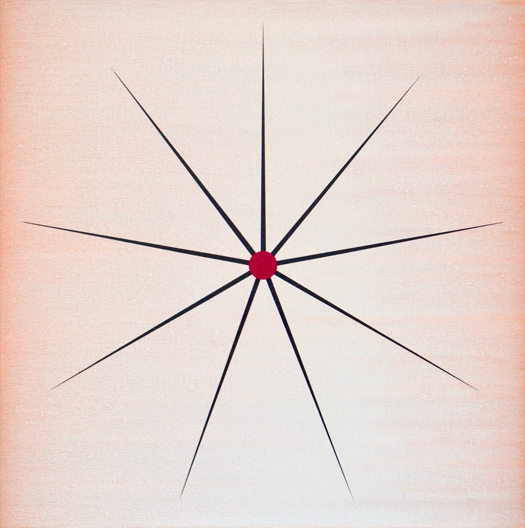
It is possible to read many subjects from the world into Ding’s abstractions: the graphic constituents of printing processes and the warp and weft of magnified cloth, yes, but also magnifications of atomic diagrams or cellular activity, computer screens full of coded information, illuminated advertising hoardings, scaffolding, a cityscape, the night sky… Moreover, the shapes made by the more prominent crosses operate at the macro level to suggest diamonds, TV static, or – in a neatly totipotent move – a cross or star (Appearance of Crosses 2016 – 7). It may be that little of this is deliberate, though Ding says that, despite being an abstract artist, in recent years he ‘has started to take note of the urban development of Shanghai’. That has seen its population grow by 10 million to 26 million just this century. That make it natural to assume an urban influence on his current work, especially as its fluorescent colours suggest the excitement and artificiality of city life.

Appearance of Crosses 2016 – 7

Ding’s work has its most obvious western resonance in Mondrian’s also-square Broadway Boogie Woogie, 1942-3. Ding acknowledges the influence, alongside Chinese traditions. Yet it is interesting to consider other possible parallels. Ding paints one work at a time in strict sequence and without assistants, which is a test of stamina and persistence given the many thousands of crosses, the accumulations of actions and time, inscribed on each, Not for nothing has his approach been described as ‘excessive minimalism’: large works can take up to two months to complete. Yet endurance isn’t a focus as it is in Roman Opulka’s number paintings. Nor is Ding meditatively repeating a set intent, as does Peter Dreher in his thousands of paintings of a water glass. And though the crosses might be seen as meaningless writing, Ding’s marks remain more separately nuanced than in work – such as Irma Blank’s or even some of Cy Twombly’s - which accumulates writing into abstraction.  


Appearance of Crosses 2016 (detail)

Ding’s method is closer, perhaps, to the sensitive exploration of grids and stripes in Agnes Martin or better, given the prominent brushwork and backlit glow his work shares with these Appearance of Crosses – of Sean Scully. The latter, also shown by Timothy Taylor, is indeed a friend of Ding’s. I was also reminded of Peter Halley, who has explored relations between cell-like structures for thirty years, often uses fluorescent paint, and is explicit about his apparently abstract paintings representing ‘a conversation between being connected and not being connected’.


Appearance of Crosses 2016 (detail)


Ding’s crosses, then, may have become simply the language he uses, but their accumulated units prove ambiguous enough to allow both microscopic and macroscopic projections from the world, and at the same time to trigger multiple echoes of other abstract painters. Given that breadth of potential for suggestion, Ding’s work might be termed ‘hyper-pareidolian’.

 
Appearance of Crosses 2016 – 8


The theoretical setting, full of ambiguity between expression and meditation, is good. What about the paintings themselves? They look, from a distance, as if they could be computer-generated, but proximity shows how Ding dynamises his surfaces (he did have a ‘mechanical’ period in 1988-91, but told me he now likes to demonstrate his human engagement).
Appearance of Crosses 1989 -7
 Appearance of Crosses, 2016 4-10 aren’t regularly patterned. Rather, Ding responds to his initial marks in an ongoing call and response, typically working from both sides of the panel inwards. He reveals his hand by varying both the thickness of the underlying layers of paint, and the weight of his touch as crosses are applied (so that the underlying gradients are differentially picked up). The retinal effect draws the viewer in to the exploration of absorptively-scaled fields. And that led me back to Shanghai: it’s easy to think abstractly of the sheer numbers of people and buildings involved a doubling of the population, but if each individual mark stands for a person, Ding’s coruscating visions of the city, for all their plenitude, speak of individuals, too.  That might, despite Ding’s distance from ‘political pop’ or ‘cynical realism’ be taken to reflect the tensions very obviously present, in the sharp transitions of Chinese society, between control and freedom.

Tuesday 20 June 2017

PAUL'S ART STUFF ON A TRAIN 211 - 220


'How to Look at the Royal Academy Summer Show': Paul’s ART STUFF ON A TRAIN 220

Ah, the RA Summer show! People insist on assessing it as if it were an exhibition, when it is essentially an Art Fair: one without gallerists, but with the usual features of variable quality, too much to take in, and visual incoherence. As such, there will of course be plenty to annoy you, but you will also have, every now and again, one of the best fair experiences – you see a work, wonder who made it, are surprised to find it was x. But then you think yes, that makes sense as an extension of their practice. Here are four such experiences from this year’s admittedly larger volume of ‘not another of those’ moments:


No. 747 Carol Robertson – ‘Pointstar – Magenta’: Oil on canvas, 50 x 50 cm, £4,000 (sold)

Carol Robertson has long used the wholeness and completion of the circle to explore colour and form in delicately radiant colours. So you might not recognise a dynamically pointed and gently throbbing star as hers – but she arrived at it from a circle, and as she says ‘the points of a star hugely increase that external line as one follows the radiations outwards from their luminous centre-point’.


No 499: David Nash – ‘Red Over Black’: Pastel on paper in charred frames, 159 x 223 cm, £24,000

I might not have linked David Nash with this intense duochrome, but for the frames: he’s known for his sculptures using burnt (as well as unburnt) wood. So it’s as if, in an attractive paradox, it’s not the work itself but how it is framed which makes it the artist’s work, so it would be worth very little indeed if unframed. 


No 949: Richard Wilson – Bridge: Postcards on paper, 132 x 116 cm, £12,000

Richard Wilson is known for installations which transform buildings, such as the revolving ‘Turning the Place Over’ (2007) in Liverpool. Postcards of Tower Bridge seem a long way from that, but there’s a suggestion that the structure could be seen as a proto-Wilson. So is £12,000 pretty reasonable for large work by a major artist, or rather pricy at £159 each for 80 common enough postcards?


No. 13: Michael Craig-Martin – ‘Untitled (Yellow Laptop Fragment)’: Acrylic on aluminium, 90 x 90 cm, £40,000 (sold)

The sharply delineated, intensely coloured objects of Michael Craig-Martin, who curated the summer show a couple of years back, are pretty distinctive. If we can understand the quality of ordinary things, he has said, ‘we are closer to the substance of life’. But I’ve not seem an item as partial and abstracted as this laptop, which pushes tellingly at the boundary of recognisability. 


‘Bricked In‘: Paul’s ART STUFF ON A TRAIN 219

Monique Frydman installation view

Parasol unit’s USP is to give foreign artists not just their first UK show, but a very substantial one. Just so, thirty years of the French painter Monique Frydman arrive fully formed over both floors (to 12 Aug). Frydman was a friend of Joan Mitchell’s, and I can see how she could be dismissed as on overly polite peddler of ersatz Ab Ex. The paintings’ interest, though, is in their narratives. There’s a treble sense of memorialisation: first because they are derived with some finesse from time-honoured painters (Monet, Bonnard and Sassetta make explicit appearances); second because she starts by making frottage over spools of rope, the traces from which remain; and third because the paintings often conjure peering into pools (or, in the case of ‘L’Absinthe’, an alcoholic haze). Put that together with the biographical fact that Frydman, a Jew, was born in hiding in 1943, and it’s easy to see her as turning away from reality in an explicit enough way to speak, indirectly, of its horrors. Frydman was an explicitly political artist in her youth, and there’s also a push and pull between what might traditionally be seen as male (heroic scale with aggressive means of making marks) versus female (pastel colours, lyrical outcomes with echoes of tapestry). So much the worse, as I read that, for such conventions. In formal terms, it’s the ‘Witness’ series which do this most radically, by improbably alternating brick and canvas. Back with the suppression of memory, these innovative works also suggest, via their title, that something precious has been bricked in. It’s a powerful implication. 


Monique Frydman: ‘Witness’ series


Monique Frydman: ‘L’Absinthe’, 1989


Most days art Critic Paul Carey-Kent spends hours on the train, traveling between his home in Southampton and his day job in London. Could he, we asked, jot down whatever came into his head?


‘Skin in the Game’: Paul’s ART STUFF ON A TRAIN #218


In the immediate post-YBA years you used to hear of people opting for art as a financially promising ‘career option’, rather than a passion. Whether they did or not, the opposite of that type must be 83 year old Indian Mali. He gets to plenty of other people’s shows, and his own 30th solo presentation is at the for-hire Espacio Gallery (159 Bethnal Green Road) to 11 June. ‘Ink on the Body, Ink on the Paper’ is lightly conceptual fun. Mali has focused on book reading as a subject for many years. One series shows readers of books of paintings echoed in the image, and Frida Kahlo receives such a tribute here. For the most part, though, in another paradoxically non-verbal spin on the theme, we see women with tattoos ‘reading’ a book of tattoo designs. The images have a self-generating genesis: Mali meets his subjects, most of whom are themselves artists, at his own openings. Over the past five years, whenever he’s seen a likely tattoo bearer he’s proposed a posing session in the back of the gallery. Not surprisingly, then, several of his models were present, including one who came with the tattooist responsible for her yin / yang double crow image, and another whose back displays the whole of ee cummings’ sonnet starting ‘i like my body when it is with your / body’. Her pose reversed the image-book norm so that – in cummings’ words – ‘it is so quite new a thing’. 


‘Surprised by Paintings’: Paul’s ART STUFF ON A TRAIN #217


Several current shows of paintings took me by surprise…

Wayne Thiebaud: ‘Fall Fields’, 2017
Wayne Thiebaud is a favourite of mine from American viewings: now White Cube Mason’s Yard has (to 2 July) more of him than London has seen before. The gallery has been moving from YBAs towards OFPs (Old Foreign Painters), recently showing Anselm Kiefer (72), Larry Bell (77) and Park Seo-bo (86). Thiebaud, though, is 96 – but he looked none the worse for it at the opening, and this creamily typical landscape was painted this year.

SJ Peploe: ‘Still life of pink & red roses in a Chinese vase’ c 1918-22
SJ Peploe would be 164 were he still alive, but that’s not the surprise at Richard Green – the Scottish colourist died in 1935. Rather, it’s that the gallery has managed to track down 24 very fresh-looking examples from such a popular artist, including 13 of his favourite subject of roses. 

Augusto Bonalumi: ‘Blue’, 1970
Milan’s Cardi Gallery opened a London base on Grafton Street, Mayfair a few months ago. It looks modest from outside but actually has five floors of high value, mostly Italian, work, making it much the tallest private gallery space in London! This subtle Bonalumi a la Klein has just the one tweaked corner to give the game away.
 
Lo Spadino: ‘Allegory of the Seasons (3)’, c. 1700
There’s older Italian fare at Colnaghi’s new rooms, most strikingly at present a set of four infectiously absurd anthropomorphic still-life paintings of the seasons by the Roman Giovanni Paolo Castelli, nicknamed Lo Spadino (1659-1730). They cheekily crank up, fifty years on, the famous manner of Arcimboldo’s masterpieces with, I suppose – if ‘spadino’ is ‘sword’ – rapier wit. 

‘Crystal Surprise’: Paul’s ART STUFF ON A TRAIN 216


Terry Rodgers & Lalique: 'Sirènes', 2017


I like it when contemporary art crops in less expected places. Just so, the window display of the Lalique store on Conduit Street, Mayfair currently showcase new crystal work by Terry Rodgers. The American artist’s lushly painted, edge-of-queasy scenes of bacchanalian excess among beautiful people tread a tantalising line between exposure of – or complicity with – excess and inequality. Works such as ‘The Palace of Automorphic Delights’ are fictions presented as realism, through which Rodgers looks to render what he calls the ‘delicate balance between our inner and outer lives’. That translates well into crystal, he believes, as that ‘acts as a mirror whose distorting reflections reveal hidden aspects of reality’. Rodgers has updated the classic 1927 Bacchantes vase created by Rene Lalique (1860-1945), paying tribute to the female followers of Bacchus, god of wine. They were said to be wild, intoxicated women apt to tear animals to pieces, though Lalique depicted them rather gracefully. So does Rodgers, in his ‘Sirènes’ reinterpretation composed – as his paintings are – by combining various photos he’s taken of models posing in the studio. On the vases they wear only jewellery, with the bling highlighted in aluminium on the more expensive editions. Crystal, in case – like me – you weren’t too sure, is glass with an admixture of lead oxide which generates a higher refractive index than ordinary glass, the effect of which is added sparkle.


René Lalique: Bacchantes Vase, 1927


Terry Rodgers: ‘The Palace of Automorphic Delights’, 2009 – 84″ x 126″, oil on linen


Most days art Critic Paul Carey-Kent spends hours on the train, traveling between his home in Southampton and his day job in London. Could he, we asked, jot down whatever came into his head?

‘The One with LeWitt’: Paul’s ART STUFF ON A TRAIN 214


Kazuko Miyamoto: ‘Stunt (181 Chrystie Street, 1981)’, 1982

This striking lifesized image seems to show a woman, naked except for a mask, taking the piss out of a typical Sol LeWitt. Indeed so: Kazuko Miyamoto was LeWitt’s longtime assistant, and this is her breaking off from fabricating a test piece for him in her own studio. ‘Stunt (181 Chrystie Street, 1981)’ is a unique composite of 44 photocopies, made at a time when that was to push the medium to its limit as well as mimicking the kind of structure typical of her employer’s work. Having seen that, ‘Male I, 1974’ makes a lot of sense: would-be-platonic form meets the use of thread to define space à la Sandback, but the outcome – as the title mockingly implies – is a hairily masculine take on how, in Miyamito’s words, ‘being Japanese you are minimalist anyway’. White Rainbow shows her with Lydia Okumura, another artist of Japanese origin who had a winning way with the use of thread. They worked together in 1970’s New York, where Miyamito was a member of the all-woman gallery A.I.R. for many years. The jocularity, incidentally, was born out of mutual respect: no-one owns more of Miyamoto’s works than LeWitt’s estate. And, with sleek serendipity, you can see a comparable LeWitt from 1972, quite possibly one made by Miyamoto, in one of the opening presentations at Thaddaeus Ropac’s hugely impressive new mega-gallery (though Oliver Beer’s 2D sculptures and voices playing the architecture are the main reasons to visit 37 Dover Street).


Sol LeWitt: ‘123454321’, 1972

Most days art Critic Paul Carey-Kent spends hours on the train, traveling between his home in Southampton and his day job in London. Could he, we asked, jot down whatever came into his head?

'Turn of the Old?' - Paul’s ART STUFF ON A TRAIN 213


Rosalind Nashashibi, still from ‘Vivian’s Garden’, 2017 – a 30 minute exploration of the lives of Vivian Suter and her mother Elisabeth Wild, two Swiss / Austrian émigré artists in living in Panajachel, Guatemala

Perhaps, at 59, I should declare an interest – but I think the Turner Prize has moved in a sensible direction by removing the ‘under 50’ rule, and positioning itself more clearly as a prize for artists whose practice advances significantly in the 12 months of judging, in this case the year to 24 April 2017. Such an advance can occur at any age, and the 2017 year’s shortlist are all over 40: Rosalind Nashashibi (43), Andrea Büttner (45), Hurvin Anderson (52) and Lubaina Himid (62). The nature of the advance and its timing are also, evidently, interpreted flexibly: Nashashibi is recognised not for the making of ‘Electrical Gaza’ (which was shown at the Imperial War Museum in 2015, making it the wrong kind of ‘old’), but for the different way she presented it in Austin, USA in 2016; and for the very new film ‘Vivian’s Garden’, which was shown – in Athens – only during the last two weeks of the qualifying year. The definition of break-through is also flexible: it would be easy to argue that Nashahshibi should rather have been listed for her ICA retrospective in 2009. Perhaps none of that matters: she’s an interesting artist, whatever the technicalities. The list is, incidentally, a triumph for Hollybush Gardens, a small gallery which represents both Himid and Büttner. Oddly enough, I’d say that the most impressive of their artists over the year in question was Charlotte Prodger, so maybe it could have been three!


Rosalind Nashashibi, still from ‘Electrical Gaza’, 2015 – 18 minutes presenting Gaza as a place from myth; isolated, suspended in time, difficult to access and highly charged


'When I’m 64+6’: Paul’s ART STUFF ON A TRAIN 212 


Gillian Wearing: ‘Rock ‘n’ Roll 70′, wallpaper

Inspired, perhaps, by the surge of the selfie, there was a glut of self-portrait shows last year, and the trend continues. The Whitechapel has just opened ‘Self-Portrait as the Billy Goat’, and the Saatchi Gallery addresses the phenomenon with all guns blazing: some of ‘From Selfie to Self-Expression’ (to 30 May) is fascinating, some good, but the overall effect is a cacophonous mess. Maybe that’s as it should be in the spirit of a media-saturated age, but the NPG’s combination of Claude Cahun and Gillian Wearing is a better show. Not only is Cahun interesting in herself, but the way Wearing links her to her own practice enhances both artists. ‘Behind the Mask, Another Mask’ (to 29 May) concludes with digital imaginings of what Wearing will look like, God willing, at 70. In one triptych she leaves a space for the actuality to be inserted in 2033, next to her current and imagined future appearances. Oddly enough, if you’re in Chichester for the excellent Victor Pasmore retrospective at Pallant House (to 11 June) you can compare Wearing’s version with Victor Willing’s ‘Self-Portrait at 70’. That was painted when he was 59, having suffered from multiple sclerosis for twenty years, and he died ten years short. Willing’s travails are also topical: they were prominent in the recent biographical film made about his wife, Paula Rego, by their son Nick.


     Victor Willing: ‘Self-Portrait at 70’, 1987
Most days art Critic Paul Carey-Kent spends hours on the train, traveling between his home in Southampton and his day job in London. Could he, we asked, jot down whatever came into his head?


‘Opening Up’: Paul’s ART STUFF ON A TRAIN # 211


Dolly Thompsett: ‘After Boucher’, 2016 – mixed media on patterned upholstery fabric, 66 x 81cm

A couple of weeks ago I talked about good galleries, regrettably, closing. True, but that isn’t to say that the total number of galleries is reducing. On the other side of the coin, I visited four spaces for the first time last Thursday evening! All were showing artists I’ve previously met at other galleries, illustrating how things move around. First up was MadeinBritaly, an Anglo-Italian gallery near Warwick Avenue, where artist-curator Laura Santamaria held the closing event for Drawings from Lightning, a multi-artist commission with several exhibitions and a publication which demonstrated her considerable organisational energy. My next stop was more central: the previously nomadic Dellasposa has taken up a permanent collaborative share with a café near Shepherd’s Market, opening with tweaked puzzle paintings derived from Chardin still life paintings – Darren Coffield’s cool take on the digital misrepresentation of reality. Then to Sloane Square, where the Pontone Gallery has recently opened in a more traditional – and rather impressive – gallery space, which suited Dolly Thompsett’s teeming riffs on history, nature and pattern rather well. Finally, the FieldWorks Gallery, appropriately placed beneath the railway arches by London Fields station, started with a show made on site by the first artist in residence of the associated studio spaces. The upcoming Bea Bonafini (showing this June in the Zabludowicz Collection's 'Invites' series) made an engaging mix of painting, ceramics, tapestry and installation, much of which incorporated the furniture she found on site in an admirably efficient bit of appropriation. 


Darren Coffield: ‘Dead Game 3 (After Chardin)’, 2015


Laura Santamaria: ‘Cosmo celebrates its experience through the Flame and me’, 2015 – blacksmoke on paper, 700 x 500 mm each


Bea Bonafini: Installation view of 'A World of One's Own'


Most days art Critic Paul Carey-Kent spends hours on the train, traveling between his home in Southampton and his day job in London. Could he, we asked, jot down whatever came into his head?

Thursday 15 June 2017

MONDRIAN / NOT-MONDRIAN - THE QUIZ


Or should that be 'Mondriaan'? He changed the spelling, dropping an 'a', when he moved to Paris in 1911...   In the 100th anniversary year since the founding of De Stijl, I visited Amersfoort, Eindhoven, Amsterdam and The Hague – where the Gemeentemuseum, which holds 300 of Mondrian’s works, was showing them all. Mondrian (1972-1944) was everywhere. Or was he? You need to keep your wits about you to distinguish the real thing from various related items. Can you sort the Mondrian from the Not-Mondrian in the following? Answers at the end...


1. 


2.


3.


4.


5.


6.


7.


8. 

9.


10. 


11.


12.


13.


14.


15.


16.


1. Theo van Doesburg: Bestand - Seascape with Ships, 1906


This could plausibly be an atmospheric early Mondrian landscape drawing, but no - I’m starting off with a Van Doesburg, given that he probably receives less of the attention than he should as a significant painter who founded the magazine De Stijl in 1917. 
2. Mondrian: Black and white heifer in the meadow, 1904
Mondrian’s various early styles are pretty well-known: academic beginnings, murky landscapes, fauve-tinged windmills, symbolist women, cubist experiments, trees edging into abstraction. All the same, you might not have guessed this was his cow, a subject for which Van Doesburg is more famous…

   3. Mondrian: Composition with grid 3: Lozenge composition with grey line, 1918

There may be some exaggeration in the tale that Mondrian and Van Doesburg fell out over the latter’s use of diagonal lines, but it’s true that the theosophical underpinnings of Mondrian’s mature style stressed the horizontal and vertical. So this transitional work from 1918 carries is unusual in carrying a whiff of Van Doesburg.
 
   4.  Mondrian: Copy after the Pietà de Villeneuve-Lès-Avignon by Enguerrand Quarton, 1912

An early work? Not especially, for Mondrian took commissions to copy medieval works throughout his career as a way of making money. He loved jazz, dancing and women – whom he was keen to impress. That required a higher income than the sale of his original work could yield.

   5.  General Idea: Infected Mondrian, 1994

Having infected Robert Indiana’s iconic hippie version of ‘Love’ by making a visual match which said ‘AIDS’, Toronto collective General Idea went on to ‘infect’ Mondrian with green, the colour he was famous for not using in his mature works.


6. Mondrian: Chrysanthemum,1921


Mondrian also painted copious watercolours of flowers: some 150 are known. He made these, too, mainly because they were saleable, but they have an emotional intensity which goes beyond dutiful execution.  Piet, incidentally, never could strike up a permanent relationship, feeling each time a woman got close that she became a distraction. ‘I can’t work like this’, he complained in one letter before dumping one girlfriend, Willy Wentholt, in 1923.

7. Not-Mondrian: Streetscape in The Hague

The Hague is, in celebration,  a little too full of red, blue and yellow merchandise, signage, shop fronts, museum attendants' ties and architectural features - most prominently the Town Hall. My assumption is that these cinema steps, for example, were not designed by Mondrian himself.

8. Marlow Moss: White, black and red, 1953 
Marlow Moss was unusual among other ‘neo-plastic’ painters: British, a woman, and very much a two-way influence as it was she who ‘invented’ the double line in 1931, which Mondrian adopted the following year.

1  9. Cesar Domela: Composition néo-plastique no. 5 E, 1924
In 1925, Cesar Domela (1900-92) became the youngest member of De Stijl. He worked closely with  van Doesburg and  Mondrian, nowhere perhaps more obviously than here.

10. Mondrian: Composition with Blue, 1937

Mondrian introduced the double or 'tram-line' in 1932,  looking to increase the sense of  optical movement. I think this is the first painting in which a treble line appears.


11.  Mondrian and not-Mondrian: Victory Boogie Woogie, after Mondrian, 1946

The Gemeentemuseum has Mondrian’s last, unfinished, work ‘Victory Boogie Woogie’ (1942-44), as it was left in his studio at a stage when taped plans had not yet been fully replaced by paint. The Stedelijk showed that in 1946, but could not obtain it. The Director asked the museum’s restorer, Willy Kock, to make a version of how it would have looked once finished as apparently intended. Willy Kock, yes - some people would laugh at that name… So anyway, the close-up is from the copy, now on display in Amsterdam. Here's the full original from The Hague:


   12: Mondrian: Self-Portrait, Eyes, 1908-09

   In this  brooding  charcoal and crayon drawing Mondrian, already in his forties, casts himself in a surprising romantic light.

1 13.  Folkert de Jong: Naar Mondriaans Boogie Woogie

This pseudo-Mondrian appears in Folkert de Jong’s manic installation at The Hague’s GEM, in which he provides his own update on the De Stijl manifesto, deploys Styrofoam caricatures of the principal figures, and lobs in a car and 60 kilos of Wilhelmina peppermints.Van Doesburg (see below) appears as a bandit carrying one of several foam versions of Victory Boogie Woogie which play the Second World War origins of Mondrian’s last painting  (which was intended to celebrate its end) by turning it into a radar image of buildings as used for a night bombing raid.


14: Mondrian: L'Éphémère est éternel by Michel Seuphor (1926, reconstruction 1964)

Eindhoven’s Van Abbe museum has one of a number of exhibitions across the Netherlands which survey of de Stijl’s influence on design. That included this reconstruction of a stage design, which one might have thought a likely ‘inspired by’ piece, but was actually made from Mondrian’s 1926 design.

1 15. Not-Mondrian and Mondrian: Composition in White and Black II, 1930 

The Van Abbe museum, among its rather odd modes of display, featured recreations of famous shows in art history mixing genuine works with copies made to order. Here they showed one of each, captioned by that old Walter Benjamin puzzler: is the suspiciously clean copy of on the left itself an abstract painting or a representational copy?

16: Not-Mondrian: Street scene in Amersfoort

Even the utility features started to look suspicious in Piet Mondrianlaan, in Piet's birthplace of Amersfoort. And the flower containers in the background are blatant, though nothing compared with the display of Mondriana at Mondrianhuis.


About Me

My photo
Southampton, Hampshire, United Kingdom
I was in my leisure time Editor at Large of Art World magazine (which ran 2007-09) and now write freelance for such as Art Monthly, Frieze, Photomonitor, Elephant and Border Crossings. I have curated 20 shows during 2013-17 with more on the way. Going back a bit my main writing background is poetry. My day job is public sector financial management.

Followers